Mind the gap
Editor's note: Adam S. Cook is director of research and development at Pilot Media Inc., Norfolk, Va.
We see satisfaction studies everywhere: studies for employees (from human resources and department-to-department on support) and customers (on pricing, products, quality, services, etc.). It’s ridiculous. For more than 10 years I’ve seen these surveys drawn up, delivered and analyzed (keep in mind, I use the word analyzed loosely here). I’m not sure a single one ever drove a hard decision that had a true impact.
Current satisfaction surveys are easy and convenient (because they’ve always been the same) but for the most part can be misguided. For example, an employee survey shows a decline in company communications over the last year. What do decision makers do? They choose to incorporate more internal company events and picnics to help open the lines of communication. Then, the next year we see an increase in satisfaction for company communications. We celebrate the improved satisfaction. Makes sense, doesn’t it? Hang on. How do we know that company communications (more specifically, events and picnics) are even important to employees or, worse, if they have any impact on an employee’s overall satisfaction or loyalty?
I’ve been quietly pushing a survey method that embraces a new line of thinking. When I look at current surveys, they already seem to have solutions in mind. I can’t tell you how many times I’ve seen surveys that were designed with the goal of rationalizing a decision that was already made. It’s time to take a hard look in the mirror and that starts by asking the “right” questions.
A side note on satisfaction surveys and their intended purpose: You don’t need satisfaction surveys to figure out you have a poor product, service, managers, benefits, etc., or to figure out you have loyalty or growth issues. You need a survey to help understand what’s causing these issues. I can share improvements in satisfaction scores until the cows come home but if we’re losing customers and employees left and right, these results clearly don’t mean a thing. This is another indicator that we’re not asking the “right” questions.
Where should you start? First, ask respondents how important different factors are to them. You can include an open-ended response area to capture any factors you may not have included/listed.
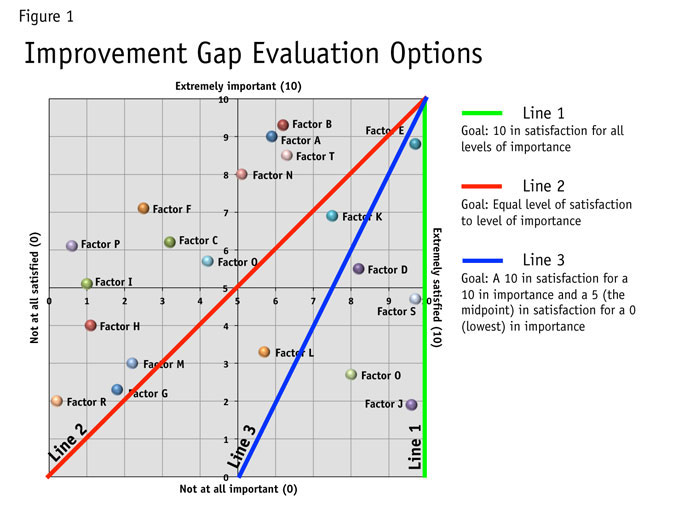
Second, ask respondents how satisfied they are with the execution/delivery of these same factors. Responses in importance and satisfaction allow us to plot points on a grid (as seen in Figure 1). A zero-to-10 scale is used throughout my examples, but any scale should work.

Life without importance measures always leads us to improving things with the lowest satisfaction. What we need to know is how important factors are before we start developing improvement plans.
Third, establish a standard or goal (here’s where the magic begins). I typically ask people, if we’re using a 0-to-10 importance scale and something is rated as a 10 in importance, what should we be aiming for in satisfaction? Easy, a 10. Now, what should we be aiming for in satisfaction if the importance rating is a 0? Here’s where I typically get one of two answers.
-
Some would say a 10. We should be striving for a 10 in satisfaction no matter how important something is to employees or customers (see Figure 1, Line 1). If this were the case, we wouldn’t need to ask the importance question. If we have a lot of things that are not very important and we work really hard to knock them out of the park, aren’t we taking time and resources away from those things that matter most and need improvement? I’ve taken a look around me lately and I don’t have a lot of help to deliver 10s in everything, so I need to prioritize. In this case, Factor R from Figure 1 would receive top priority for improvement but it’s the second-least important factor. I can understand setting a high standard but a sweeping high standard without considerations for importance diminishes our ability to prioritize, especially with limited resources to improve areas of satisfaction.
-
Some would say a 0 in satisfaction is acceptable for unimportant factors. If it’s not important, we don’t need to spend any time satisfying customers. The problem is, we never want bad satisfaction, even if that factor isn’t as important. Plus, it’s important to some, just not the majority, in the case of looking at average scores (see Figure 1, Line 2). When setting the bar too low or when dissatisfaction is acceptable, we open the door to neglecting the minority and delivering bad service, or no service, which can come back to haunt us in the long run.
My compromise is the middle. If it’s not important at all and we’re going to provide the product or service, we should still, at the very least, strive to deliver moderate/mediocre satisfaction (a 5 in this case). By setting the bottom mark to moderate satisfaction we are setting a tone that satisfaction is always important but to a certain degree across different factors (see Figure 1, Line 3).
We have a line
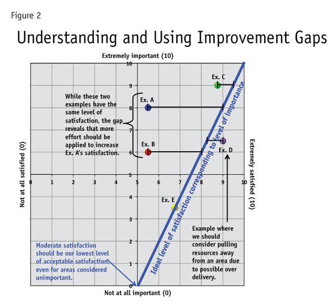
Great, now we have a line. A maximum of 10 in importance equals a 10 in satisfaction and a minimum of 0 in importance equals a 5 in satisfaction. I call this “ideal level of satisfaction corresponding to the level of importance line” or the “satisfaction goal line.” If something equals X in importance we now have an idea of what we would like to achieve or should be achieving in satisfaction. So why is this line important? It gives us a baseline for identifying areas of potential improvement. The further away from the line results are in satisfaction, the greater need for improvement (see Figure 2 for an example of variations in gaps).
How do you calculate and use the gaps? We now need to calculate the distance from the actual response to the ideal level of satisfaction (see Figure 3 for formula).
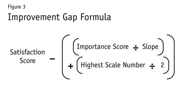
Your ability to calculate the slope of a line makes all the difference here. If your scales for importance and satisfaction are equal and you use my maximum and minimum standards, the slope will always equal 2; otherwise, you’ll need to be able to calculate a slope when using a different line or unequal scales.
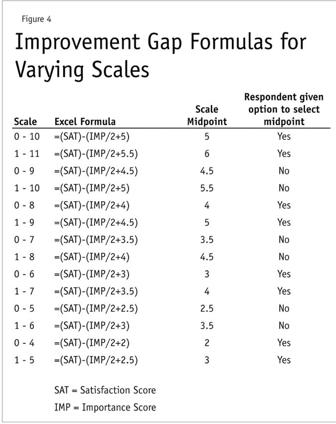
Figure 4 shows how the formula varies across different scales of equal range in importance and satisfaction.
A different lens
Now what? We can rank the importance scores and we can rank satisfaction but now we can also rank gaps (or largest areas for improvement). Gaps are just a different lens for us to look at satisfaction scores. This gives us an idea of areas that need the most improvement and can help us in prioritizing efforts but the rank order isn’t ironclad for prioritizing. Like I mentioned before, levels of importance need to be considered. Just because we need to improve something doesn’t necessarily mean we should make it Priority One. The largest gap areas highest in importance should be our focus and priorities. If there are “positive” gaps, this may actually mean we are over-servicing customers (as demonstrated in Figure 2, Ex. D). Resources and efforts can be reduced in these positive-gap areas without significant harm to our overall service and satisfaction.
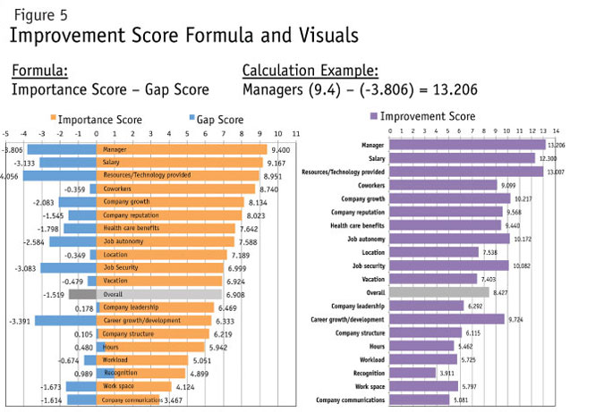
Here’s where I really geek the process up. If we simply used gap scores and importance rankings to evaluate priorities, we wouldn’t be able to account for variances in the importance scores. This would also leave a lot of subjective decision-making on areas of focus. So I created one last calculation or score: the improvement score. It occurred to me that I could use the length of the gap and importance scores to mathematically assess priorities (see Figure 5 for formula and visual examples).
Let’s look at an example. If we were to perform a gap analysis on 11 factors (A-K) and received results back as seen in Figure 6, all the gaps would be equal (-2 in this instance). If all gaps are equal, where would we be best served to focus our improvements? Answer: the areas highest in importance.
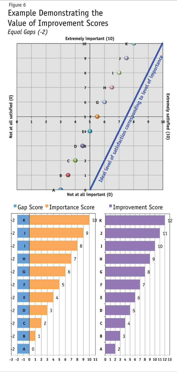
Some idealists would say if we can increase the levels of importance in areas in which we do well in satisfaction, we can close our gaps. I say good luck. Changing one’s perceptions or values is a lot more difficult than our ability to change satisfaction levels. Let’s focus on increasing satisfaction in the largest gap areas. Better yet, choose the largest gap areas that are greatest in importance. This should yield a greater return in overall satisfaction.
Does the 0-to-10 scale need to be used? I prefer 0-to-10 but just about any scale should work. With some research platforms or delivery mechanisms, we’re forced to use scales like 1-to-10 or 1-to-5. That’s not ideal but it’s still directionally correct. I would recommend a minimum of a five-point scale. The more points you can get away with using the better direction the results should yield. Also try to use a scale where there’s a true midpoint for respondents. A 1-to-10 scale doesn’t have a whole-number midpoint (5.5) whereas 0-to-10 does (5).
Once the improvement scores (large gap areas, high in importance) have been calculated, decision makers need to develop a strategic plan for reducing those gaps. Selecting one-to-five areas is ideal, because once you start pushing closer to 10 areas you may find that you bit off more than you could chew. The next task is a plan for moving the needle (closing the gap). Don’t let decision makers think the improvement scores are the be-all and end-all in prioritizing. Ultimately, leaders and managers also need to make final decisions based on additional factors like resources, costs, time or feasibility.
Sorry, those Staples Easy Buttons don’t exist in the real world but the improvement score is what I would call an Easier Button. Once a plan has been developed and put into action, we can now measure whether changes were able to move that needle. Again, the aim isn’t to get better results in satisfaction on the next survey, it’s to improve actual satisfaction, which is better measured through increased productivity, reduction in turnover and growth in revenue. For media companies like where I work, an increase in audience size and frequency is the ultimate metric.
What the process looks like
I’d like to give you an idea of what this process looks like in reality by using a process of: establishing an objective; developing the questions/survey; tabulating results and charts; analyzing the results; and developing a plan of action and continually tracking. The following case is a hypothetical example and does not reflect actual survey questions or responses.
1. Establishing an objective. Identify areas or threats for possible employee dissatisfaction or potential turnover.
2. Developing the questions/survey. A sample question might be as follows:
How IMPORTANT are the following to you when it comes to working for Company X: (using an anchor scale where 0 = not at all important and 10 = extremely important)
Location
Company reputation
Company growth
Company structure
Company leadership
Company communications
Health care benefits
Vacation
Hours
Salary
Manager
Coworkers
Career growth/development
Work load
Job autonomy
Job security
Work space
Recognition
Resources/Technology provided
Others not listed that are “extremely important” to you:
How SATISFIED are you with the following when it comes to working for Company X:
(using an anchor scale where 0 = not at satisfied and 10 = extremely satisfied)
Use the same factors listed in the importance question with a subtle change to the last answer option:
If listed other areas of “extreme importance,” how satisfied?
Include basic questions for: job function; department; whether they are a manager; years with company; full-time vs. part-time; plus any others of importance for evaluation. And if possible/necessary: age; gender; race/ethnicity; plus any others of importance for evaluation.
Started to wobble
I recently came across a survey conducted many years ago for our daily newspaper’s sports department. At first, the survey looked like the gap method described here. It asked questions about how interested readers were in different sports and then asked questions about how well we were covering those sports (using satisfaction). The points were even plotted on a grid. Then the house of cards started to wobble.
Three potential mistakes were made. One, the analysis was completed on adults in general, not our customers/readers. Two, after the points where plotted on the grid, a “quadrant evaluation” (sometimes referenced as a quadrant analysis) was completed. I’m a believer that quadrant evaluations are best for basic groupings or segmentation but not for analysis or prioritizing. Three, while it would appear that asking how interested readers were in different sports is the right direction, there was never a connection to our product.
Confused? As a hypothetical example, let’s say professional hockey (NHL) finished at the top of the list in areas of interest. Yes, they were interested and their satisfaction was low but was it important that we cover it in our sports section? As we came to find out many years later, IT ISN’T important. Ouch!
First, I’m not sure if our readers showed high levels of interest in professional hockey but even if they did, it never occurred to anyone that those readers prefer getting their NHL coverage from another source. Even worse, if it was non-readers who felt this way, we ended up changing our product to appeal to them at the cost of losing our most loyal readers who wanted better coverage in another sport.
Potentially misguided results are what you will most likely receive when using general “interest” questions; although with some work and testing there may be a way around it (maintaining some flexibility is always important). I’m going to stick to using importance questions directly tied to our current or potential products and services for now.
3. Tabulating results and charts (see Figures 7 and 8 for examples). Now, if we were using the old method we would have only looked at satisfaction scores. In this instance, decision makers would have pointed to career growth/development as the area in which they needed to improve performance because it was the only factor that fell below a 5 (or the midpoint) in satisfaction. Then they would have patted themselves on the back for such a strong overall satisfaction rating. Others would have looked to the same satisfaction ranking and said we need to work on the lowest three scores. In this case, that would have been career growth/development, company communications and work space. This is better than the previous mentality but still misguided.
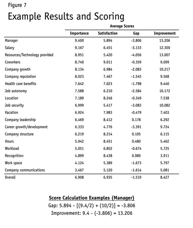
If we only looked at the gaps, “resources/technology provided,” “manager” and “career growth/development” would have been the primary focus. As you can see, there are already differences in priorities when using the gap but we still need to consider importance. This is where the importance score delivers its greatest value and helps focus our efforts in Step 4, analysis.
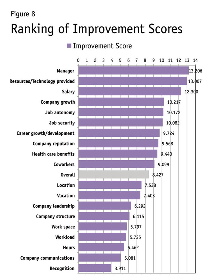
4. Analyzing the results. Use the improvement scores, calculated from gap and importance scores, for evaluating and prioritizing areas of improvement (see Figure 8). It’s also wise to look at improvement and gap scores across different departments, job descriptions, length of service, etc. You should be able to see how the focus changes when looking at the results through multiple lenses.
5. Developing a plan of action. After identifying the areas of focus rising to the top in Figure 9, we now develop a plan for shrinking/reducing those gaps. In this instance, resources and/or budgets allocated for “recognition” can probably be reduced and moved to help improve other areas (salary, bonus or resources). Manager evaluations and training would need serious considerations in this case. Specific strategies may need to be addressed if there are differences in scores and rankings across different departments, job functions, etc.
6. Continually track. After the strategic plan has been implemented, we’ll want to go back to the field to measure progress and help identify any new directions the company should take. When we do this, we have established an ongoing program for measuring and directing improvements, one where we continually learn and then adapt. (This learn-adapt, learn-adapt, learn-adapt or “LA, LA, LA concept” was coined by John Caples, one of the greatest advertising copywriters and author of Tested Advertising Methods.)
Be an eye-opener
I can attest to seeing this method’s successful use for internal purposes, with outlining strategic direction, finding product improvements and with identifying new product opportunities for my company as well as others we work with locally. We’ve also found it to be helpful in uncovering areas of focus for advertising and branding efforts. At the very least, the importance measures will be an eye-opener to decision makers and will aid them in resource priorities and time allocation. For more information and visual examples on the improvement gap method, visit my blog at www.fightinanalyst.com.