Words to live by
Editor's note: Serge Luyens is vice president of development at Ascribe, a Cincinnati-based provider of technologies to analyze open text responses in surveys.
The amount of open-ended text market researchers are collecting is growing year after year and the sheer volume of data is in danger of overwhelming our ability to handle it. I can understand the demands from clients to see these open-ends analyzed, because they can offer a treasure trove of insights. The best way to avoid drowning in data is to make greater – and smarter – use of technology to help handle this text. Fortunately, recent developments in open-ended text analysis have helped simplify and standardize how text data is analyzed, with the aim of producing high-quality analysis and reporting.
For many researchers, this means learning new methods and developing new analytical techniques. But I predict that these new methods will become as much a part of the researcher’s analytical toolkit as the crosstab or the significance test is today.
What big data lacks
As big data increasingly competes with surveys as a means of measuring activity and consumer sentiment, there is also a growing awareness of what big data lacks: the ability to offer any externally-validated explanations for the trends and patterns it may reveal. Research, uniquely, can fill that gap by allowing those “why” questions to be asked. Furthermore, market research has the opportunity to get closer to the truth, as the constraints that forced researchers to use open-ended questions sparingly are eased by technology at a time when the public appears more acculturated to free-format opinion-giving, thanks to social media.
Open-ended questions lead to an unlimited set of possible responses, which, in turn, mean richer, unbiased and more explorative information. They are richer because respondents are able to express themselves in their own language and the language used can convey nuance and emotion. They are unbiased because they are not influenced by what the researcher had in mind as possible responses. And they are more explorative because of their diversity.
Open-ended questions range from the “why” that follows nearly every Net Promoter Score 10-point rating scale, to the semi-structured questions that abound in research communities, to developments in mobile and social media research and auto-ethnography.
Researchers accumulate mountains of textual data but many practitioners struggle to find analysis methods that offer similar levels of rigor, consistency and convenience as the time-honored analysis methods they applied to quantitative or qualitative data. Tools are either too basic – such as word clouds – or overwhelmingly complex and take too much effort to apply, such as some of the advanced statistical text-mining tools. Too often they do not integrate well with existing analysis and reporting processes, especially when combining open-ended responses with other survey data.
Two broad approaches
Language allows humans to express the same idea in countless ways and many words have more than one meaning. To extract information from open-ended responses these must be summarized or aggregated in some way. Two broad approaches are possible: statistical or semantic.
The statistical approach means aggregating the raw data in a largely mechanical way, using word and phrase frequencies without worrying about the concepts. Analysis can then be performed on the aggregated data in a variety of ways.
The semantic approach means aggregating intelligently prior to analysis, using concepts rather than the literal words and phrases as its organizing principle. This aggregative process requires human or sophisticated computer intelligence to recognize the ideas.
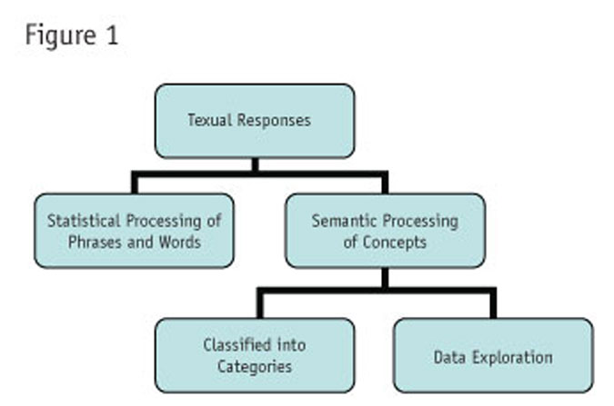
The semantic approach itself can be applied in one of two ways: either classifying the responses into sets of predefined categories, or performing semantic data exploration. Figure 1 summarizes these approaches.

Market researchers have long been using a semantic approach through the largely manual process of categorization or coding, almost to the exclusion of other methods. Mistrust of alternative methods has possibly been reinforced by a lack of understanding of the science that lies behind them. However, statistical and semantic methods, especially when performed using computer software, can offer researchers many advantages. Used in combination, they can yield more insights and can build confidence in the findings.
It’s most useful to explore these approaches by examining how they work, how best to apply them and the results they can achieve.
Words and phrases
As humans, we create and interpret text in sentences. For textual analysis, however, it is better to operate in terms of words and phrases. The first step is to produce tables of frequencies. Words and phrases may be defined externally in a dictionary or may be interpreted on the basis of what is found, using spaces and punctuation as delimiters. A complication with survey data is the desire to accumulate frequencies at a respondent as well as an overall level.
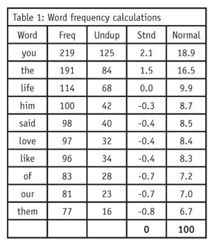
Table 1 focuses on words, though the process is identical for phrases. The first column shows the frequency of that word across all responses. The unduplicated count is the frequency of respondents mentioning that word (or phrase) at least once. Both measures can be useful in interpreting the importance of any word or phrase. The last two columns represent the standardized and normalized frequencies, which are useful measures in sorting and presenting them.
Ideally, in word frequency calculations, researchers should apply editing rules in order to combine words (e.g., “car” and “automobile” to appear just as “car”) or to link words that should be considered as one word (e.g., “New York”). Survey researchers should be able to filter these lists by respondent demographics or answers to other survey questions.
More impact
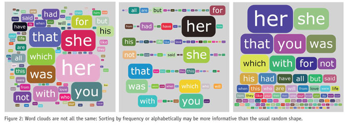
Graphical representations undoubtedly give word frequency data more impact, as the popularity of word clouds demonstrates. In a word cloud, each word’s size is proportionate to its frequency. Using different sorting sequences, word clouds can be presented in several ways (see Figure 2).
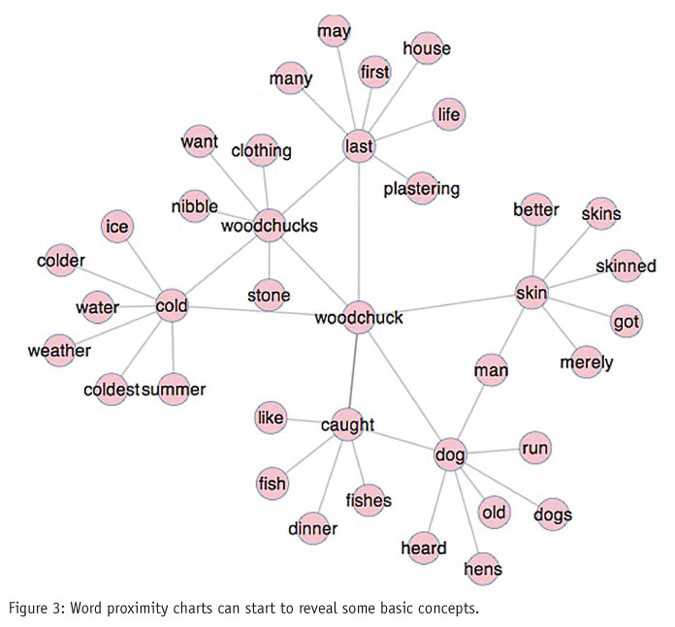
Word clouds, however, tell us nothing about relationships between words. By looking at the relative proximity of words, meaningful concepts begin to emerge. This analysis relies on using statistics to impute the proximity between word pairs – how often they occur together or within a few words of each other. Again, there are many useful ways to plot this information beyond the single example presented in Figure 3.
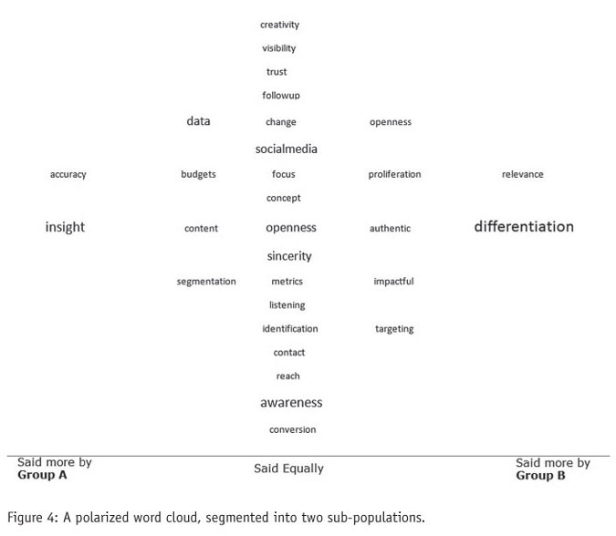
Researchers are usually interested in finding the differences between segments of the populations we are studying. In Figure 4 a different kind of word cloud is used for two different subpopulations in the sample. The words favored most strongly by one group over the other are shown furthest from the center.
A co-occurrence chart goes further by representing the strength of the relationship between words, using frequency of co-occurrence. In this type of chart, the size of the circle shows the frequency of the word and the width of the line linking two words is the frequency of co-occurrence of that pair.
Need to be interactive
For these kinds of tools to have any analytical power, they need to be interactive. Being able to drill down is one such interactive capability that can be used to isolate a word and filter all relationships on that one word, or reveal the context by presenting the original verbatim texts, or both.
These statistical or mechanical methods have the advantages of being fast, not requiring human intervention and leaving results free of any bias that coders or researchers might introduce. They can be a useful first step in analysis but, without a conceptual foundation, what they reveal can be inconclusive.
The alternative semantic approach starts by pre-processing the open-ended data, with either human or computer time to identify concepts, before doing any sort of aggregation. The semantic approach considers a sequence of words as being more than the sum of its parts.
Most market researchers are familiar with this approach as the manual activity of coding. However, the same outcome can now be achieved using computer-assisted or fully automated machine learning methods, saving considerable time and effort. In either case, answers are assigned to categories. The set of categories is conventionally called a codebook or codeframe and these may be arranged in groups (also called “nets”), giving rise to a hierarchical codeframe.
This method has dominated market research as the principal means of handling open-ended text because the end result is easily analyzed quantitatively. However, this quantification has also limited the kinds of analysis possible. New software-driven approaches that retain a closer relationship with the underlying textual data can now permit more nuanced analysis and insight generation.
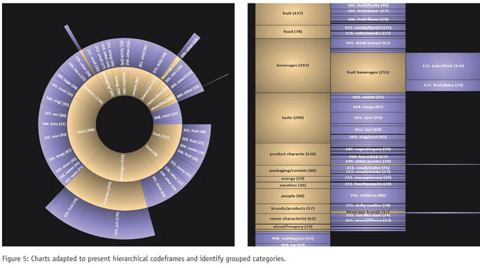
Conventional presentations of multilevel coded data, though simple to produce, are not easy to interpret. They can mask the most important findings. Conventional charts are particularly problematic because the net categories will always dominate and potentially obscure more important observations. Yet, the nets cannot be omitted, as they provide structure to the data.
A better approach is to build a chart around the relationship between the nets, subnets and categories. The charts in Figure 5 exemplify this. In both, the summarizing nets appear in one color (gold) and the elementary categories in another (lilac). Both emphasize two different relationships: that of nets and their child categories, and also that of categories to other categories, which is the comparison that is obscured when using conventional treatments.
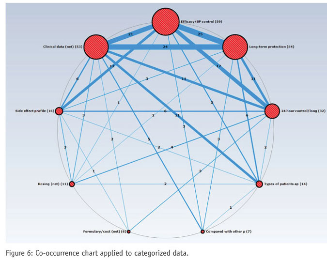
It is often in the relationships between different answers or groups of answers where the most valuable insights are found. This can be done, to some extent, by creating a two-way crosstab of the open-ended variable. But, a better approach is to chart these relationships with a co-occurrence map (Figure 6). This allows researchers to go beyond the relative popularity of the concepts (shown by the size of the circle) and identify concepts that are strongly associated as well as those rarely associated in the minds of participants.
Describing the outputs
Data exploration of textual responses falls under the hood of text mining or text analytics: a portmanteau term that includes extracting information using statistical, computational linguistics and machine learning techniques to reveal patterns and trends. Setting aside any defense of the science of natural language processing, it’s important to focus on describing the outputs that are useful to researchers.
There are two broad categories of outputs: concept extraction and sentiment extraction. A concept is a generalized idea. Most codeframes perform the task of identifying and isolating concepts. Concept extraction will essentially create the codeframe for you. Sentiment extraction, on the other hand, refers to the identification of subjective information.
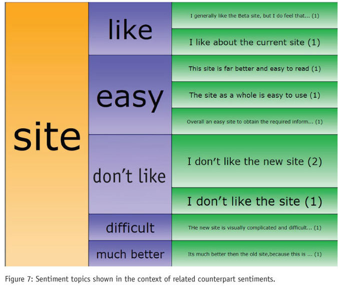
For example, a verbatim comment from a Web site survey that reads “I like the current site, there are nice graphics and there is no ambiguity” might yield site, graphics and ambiguity as concepts, whereas the overall sentiment is one of positive affinity. Sentiment extraction takes into account adjectives and other modifiers (e.g., “nice graphics,” “no ambiguity”) to derive a score. This can be expressed as a polarized scale (e.g., from -2 to +2, with 0 representing a neutral response). What is especially useful is that these scores and categorizations can then be applied to the data and used alongside other data in conventional analysis.
Sentiment analysis can be pushed even further by decomposing the sentiment phrase into a sentiment topic (the subject of the sentiment) and a sentiment extract (the feeling towards it). In the current example, this would mean that the sentiment “I like the current site” would be decomposed as sentiment topic = site and sentiment extract = like, and independently of this, the sentiment topic = graphics, sentiment extract = nice. Only a subset of text analysis tools in use today can extract sentiment at a concept level.
Ultimately, such information is only useful if it can be presented clearly, and specialized charts can convey the relationships better than tables or histograms. The example in Figure 7 presents sentiment topics in the context of related counterpart sentiments. What cannot be seen from this static image is the interactive part of the chart that lets the user drill down and explore the relationships between concepts and sentiments, functioning as an analytical tool as well as a presentational device.
Limited information
Statistically processing raw textual responses has the advantage of being fast and easy. However, word frequency data conveys only limited information about concepts and sentiments, making it difficult for researchers to interpret. Processing open-ended responses semantically by creating categories of responses, concepts and sentiments and then manipulating these statistically and presenting them graphically and interactively yields more relevant information to the survey researcher.
Manual and human-assisted coding endures because humans are good at identifying concepts and sentiments and because researchers are so familiar with these processes that their shortcomings, such as coder bias and inconsistency, tend to be forgiven. But the scale of the task facing researchers today is a game-changer. It will mean, for researchers and coders alike, that many of these unfamiliar methods for analyzing text are about to become a lot more familiar.