Editor's note: Edward “Paul” Johnson is director, analytics in the Orem, Utah, office of SSI, a Shelton, Conn., research firm.
How is my brand perceived? This is the question that plagues many of my clients. There are some standard metrics which measure overall perception such as the Net Promoter Score or measures of aided and unaided awareness. However, most of these lack color and depth of detail. They can measure the brand health overall but don’t diagnose the causes and reasons behind the brand’s state of health.
To delve deeper into the details, many companies will ask how well they perform on different aspects of the business. To get a complete picture you often need to ask a rainbow of questions and it isn’t uncommon to have 30 or more of these attributes. Furthermore, for strategic reasons our clients often want not just perceptions of their own brands in absolute terms but also how they match up to the competition. This detailed information can lead to great insights but there is also a danger of information overload.
I have seen clients take many approaches to understanding brand information. Some look through reams of paper crosstabs complete with summary tables. Ironically, even though they are cutting down many trees with all this paper, they still get lost in the forest! Let’s look at an example.
Let’s say I am a brand manager of a clothing retailer. I want to see how the general population perceives our brand as well as the competitive brands in my category. Also, I want a complete look at the attitudes and drivers that I believe can contribute to my brand health and image. Through a remarkable amount of self-restraint in an effort to not get lost in the data I limit myself to just the list of 24 dimensions in Table 1. I do want to compare my brand to a broad scope of competitors though, so I collect data on 20 competitors.

To keep the integrity of my data, I do a few things to ensure I get an accurate image of each brand. These checklist items are important to do whenever you are measuring brand perception because any analysis is only as good as the data you get from the respondents.
- Only ask respondents about brands they are aware of and have interacted with. This is particularly important with rarer brands. If respondents don’t feel they know the brand, they may not associate anything with the brand, leaving me with no data on it.
- Only ask respondents about a few brands even if they are aware of and have interacted with a majority of the brands. Respondent fatigue can be a real problem, so I recommend a maximum of four or five brands per respondent. This helps keep the survey length down and prevents information overload on one screen.
- Avoid scale effects. Instead of having each brand rated on each attribute with a Likert scale, I ask them to specify which of the brands exemplify each attribute. This minimizes the amount of satisficing a respondent will do in a survey.
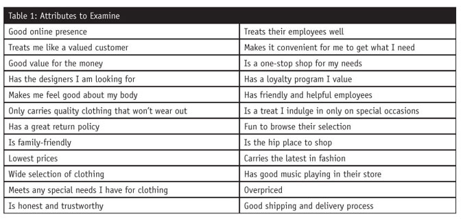
I now have a table for every one of these dimensions. When examining each separately I can gain some valuable insights. For example, the graph on the “good online presence” seen in Figure 1 clearly demonstrates the advantage Amazon has in the online space. You can also clearly see that Ross in particular doesn’t have a strong online presence in the minds of the general shoppers.
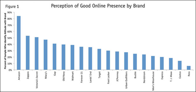
Each of these individual “trees” is valuable but when you try to plot them all in one graph, suddenly it is hard to see the forest. Figure 2 shows all 20 brands on all 24 dimensions graphed as a line chart. It quickly becomes a mess, making it difficult to decipher any trends or even see which stores are similar to each other.
Luckily, there is a way to simplify this graph and still provide valuable insights. This can be done through correspondence analysis and a perceptual map. Correspondence analysis takes the counts of brand identification with each attribute and summarizes them into two or three dimensions at a time. These dimensions form the basis for a coherent plot that quickly allows a brand manager to see what’s important in the competitive landscape.
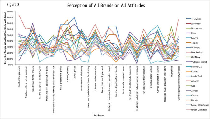
An example of a two-dimensional correspondence analysis map is shown in Figure 3. I used R, free software that anyone can download, to make the correspondence map. You can see what the dimensions mean by looking at the red lines. First you look at which arrows are pointing in the same direction to see which attributes go together in the public’s mind. In this graph “good online presence” and “good shipping and delivery” tend to go hand in hand because they are both pointing up. Furthermore these two attributes are perceived as opposed to “wide selection,” “latest in fashion” and “has the designers I’m looking for,” which are pointing down. In general a brand is perceived as being good at one or the other but not both.
Looking from right to left, I can see that being family-friendly works in conjunction with value shoppers who focus on price and convenience (pointing to the right), while people going to clothing stores to indulge or treat themselves tend to prefer a more hip environment (pointing to the left). These trends are useful for mapping how consumers think of brands in general and what attributes go well together in their mind. Also, it is interesting to see what gets stuck in the center. For example, treating employees well doesn’t score highly on any of these dimensions, so no stores are really strong in this area.
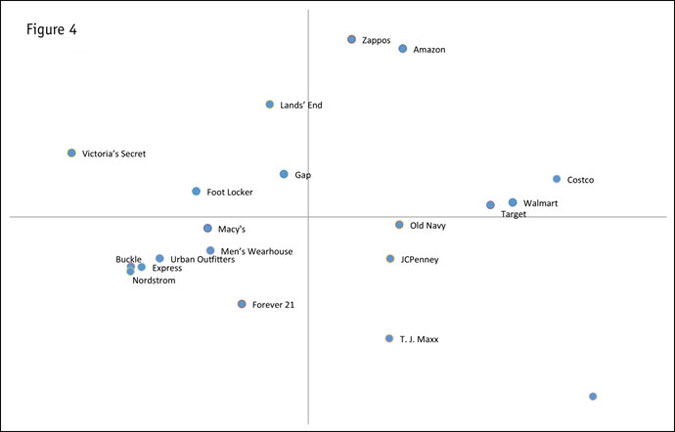
Figure 4 shows how the brands plot on these dimensions. You can easily see some clusters in this chart. For example on the left a little under the X axis you can see that Nordstrom, Buckle, Urban Outfitters and Express all group together in a higher-priced group that is more hip. We don’t see Nordstrom scoring better on the customer service items such as “treats me like a valuable customer.” This can be an important warning sign if they believe their value-add is in customer service. It is also not surprising that on the right-hand side we have Target, Walmart and Costco as the value brands. You can also see that Ross is doing a good job in the value/family-friendly segment, distinguishing themselves this way even better than other brands such as T.J.Maxx or JCPenney. You can uncover these insights by looking at just one graph rather than combing through each set of crosstabs.
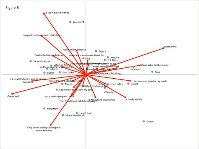
Subsequently, you may find that a particular dimension is not relevant to your brand. For example, let’s decide that after reflection, the online presence dimension doesn’t add value to the analysis. You can easily replace “online presence” with the next dimension in line. The results are in Figure 5. You can see that on the y axis, you now have quality of the clothes on the bottom and the new hip crowd environment with the latest fashion towards the top.
Important insights
There are important insights here once again. First you can see that Nordstrom is no longer with Buckle, Urban Outfitters and Express. It really is differentiating itself on the quality of the clothes while the other stores are clustered in the middle on the quality-versus-environment scale. We see the same relationship between Costco in comparison to Target and Walmart. Additionally, it is evident that Forever 21 is dominating on “latest trends” and “hip environment.” Similarly, Ross is outpacing its competition in the value space.
I recommend mapping the third dimension as it reveals important insights. Luckily R can also do three-dimensional plots that you can turn around. Rotating the graph around can help make the right relationships stand out. I have known clients who even want to go to the fourth dimension to gain more insights. This can make the analysis more complicated and you no longer have a one-snapshot glance at the data but it is still infinitely superior to examining every individual tree in the forest.
Less is more
Correspondence analysis and the resulting perceptual mapping can help to quickly identify the important trends in the data. Those trends can transform a mound of data into actionable information relatively quickly when compared to searching through crosstabs or trying to make sense of a line or spider plot with too many brands or dimensions. Sometimes less is more, especially when examining key aspects of your business.