Editor's note: Eric Ramon is owner of The TabLab, a Portland, Ore., research firm.
The new edition of WinCross, the tabulation software package from The Analytical Group, Scottsdale, Ariz., is out. This version is number 14 and each one has become easier to use – which, for a freelance data processor like me, can be worrisome. I mean, how good, how easy will WinCross be by version 30? Will we be able to merely look at a questionnaire and get tables instantly? I sort of hope not because I’d like to stay in business but, at least for now, I can relax a little.
If you can’t already tell, I love this program. It makes sense. It’s fairly easy to use and allows a lot of room for creativity. I’ve found that pretty much anything I want to do with crosstabs can be done in WinCross. To be sure, SPSS is powerful in its own way but I prefer WinCross for handling crosstabs. I find that SPSS is not as user-friendly. I get tired of looking something up and getting 50 possible matches for my problem, none of which really have anything to do with it and, furthermore, none of which tell me anything other than SPSS is the leader in statistical software.
But about WinCross...
The “what’s new” document is 36 pages long, with plenty of new features or modifications. Let’s see what’s there, shall we? The first thing I came across that was extremely useful was in how sample balancing is handled. “Sample balancing” is what some people call “data raking” or what I think of as “weighting using more than one variable.” Previously, I would plug in my target percentages for each value, for however many variables were being used for the weight factor. On occasion, however, there’d be a missing value and I’d get an error message that said something like “There’s nobody in at least one of the many cells, fool!” OK, I exaggerate. But that’s what it felt like, though, and there’d be no clear indication of what was missing. For example, there might have been nobody classified as a Pacific Islander and I might have wanted Pacific Islanders to be 1.5 percent of the weighted total. Or there might have been nobody in the 35-39 age group. I wouldn’t know this until I ran frequencies on each variable. That’s not much of a chore but it’s been annoying.
Well now, as each variable is clicked on, WinCross scans the data and gives us counts for each value and doesn’t show missing values. There’s no way to ask for a non-existent group to be weighted. We can see where we have to adjust. It might seem minor but it’s typical of the changes in the new version. When you add up all these features you’ve got more convenience and you save time in getting tables set up and out.
Here’s another nice new feature: The glossary tests now let us specify what variables we want to look at, besides just testing for certain logic. In the old days we might have asked, for example, for a listing of respondents who had the same code in two different fields. The report we’d get back would show a confusing layout of the whole record. If the length of each record happened to be 1,500 “columns” we’d have 15 lines to look at. We’d have to go to a data map to figure out where those responses were, then hope we were looking at the right line. Now we can ask for the record number, the first field, the second field and we can see it in an easy-to-understand format.
Some of the newer items don’t interest me much although I can see how some people would love them. Enhanced text reports are either spiffy or cluttered, depending on your taste. The report look is customizable so I could end up loving it. You can color lines, which makes it easy to read across. This is an odd- or even-line thing, rather than a frequency or percentage shading. Sometimes your off-white (or whatever color you choose) cell is one, sometimes it’s the other. One nice item, however, is that significance testing shows up in different colors. I’m used to seeing a capital letter if there’s significance at the 95 percent level and lowercase at the 90 percent level. That’s still true but it sure is easy to spot when one is red and the other is blue. You can also enhance the report in other ways. I’m currently experimenting with the elements. Maybe I’ll find one that’s pleasing.
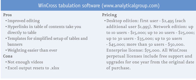
Another feature I like is a new option for the reports: hyperlinking! Click on the table name in the table of contents and you go right to your page. That’s useful. No pulling the sidebar down, overshooting your table, scrolling back up ... now you go right to it. The only problem I have with the Excel features is that it appears the output defaults to an .xlsx file, even if you’ve already run it as an .xls. If you want to make changes and re-run you’ll have to remember, if you want that older .xls format, to change it each time, even in the same session. Other new options include freezing the banner and putting significance in the same cell.
Make life easier
There are all sorts of other little improvements that make life easier. The NET feature has always been useful. Previously, we could give the instruction NET 4, which would then add up the number of respondents in the four items listed immediately below it. But if we wanted to show the items first, followed by the net, we had to spec it out, which could sometimes get complicated. Now they’ve added a NET-. This does exactly what I’d want it to do. So NET -4 lets us show that net below the items with WinCross doing the heavy work.
Many of us write our WinCross specs as a text file. Let me say here that I love that! I happen to use EditPad and I can make changes quickly. For those who want to edit their table specs in WinCross itself, there are now more options. You can find and replace and specify what type of section you want to change. If you want to make a global change to the way rows are defined you can choose “Table Row Logic” and that’s the only place your changes will occur. Similarly you can save bits that you can use as templates.
An example of this template business is the banner template, which lets you build your banner by choosing variables. It’s pretty cool and if your columns come straight from the questions this will save time. By “straight from” I mean sometimes they won’t. Sometimes you’ll want to combine things, like “males 18-34.” In that case you’ll still need to go in and edit an individual banner point but using the template can get you started. And you can then save the template for inclusion in a later survey.
Which brings up this new item: a feature called Express Tabs, which mimics an old-style SPSS table. An important note here: This only works with SPSS data that already has value labels. Click on a question name as your banner, click on another question name as your rows and up pops the crosstab. It’s virtually instantaneous. Very impressive! Since you can select more than one question for either your columns or rows and since you can save your banner (!), I find this a better, faster way to create a banner than using the Banner Template feature. But take your pick, they’re both useful.
WinCross also now has a feature called Tip of the Day. On start-up you get a useful reminder of how to do this or that. For example, I called up a tip just now and it brought up a screen about the video tutorials. If you need to see how something is done you can watch those. So thanks, Tip!
Help is superb
As with just about any kind of software, it’s all about the features and, as I’ve outlined above, WinCross has many good ones. Another important aspect is tech support and I can report that the help for WinCross is superb. Many companies are distant, difficult to get ahold of, have less-than-adequate manuals and/or help forums and seem to take their customers for granted but that’s absolutely not the case here. The folks at The Analytical Group seem to listen to the feedback they receive and get on it, continually improving the program. I’ve got a wish list with a few items that I’ll be sending them. Who knows? Maybe they’ll use them in Version 15!
