Editor's note: Tim Macer, managing director of U.K.-based consulting firm meaning ltd., writes as an independent software analyst and advisor. He can be reached at tim@meaning.uk.com.
Who doesn’t use PowerPoint? It is now used to create 53 percent of all research deliverables, according to my firm’s annual technology survey1 of market research companies. It now fulfills a role that goes well beyond the backdrop to any stand-up presentation and has become the preferred means to provide data- and chart-heavy reports to clients and to consumers of data.
It’s a tool that has outgrown its purpose. Anyone who has tried to get it to produce dozens of identical charts will tell you how frustrating a process this can be. Throw in a few research-specific demands – such as the need to show sig tests on charts, color-code your client's brand with the same Pantone-matched hue on every page and then update every chart after a final check finds one case that must be deleted – and your long-suffering PowerPoint user will be on the verge of despair.
Two different tools on the market – OfficeReports and Rosetta Studio – take very different approaches to making PowerPoint do what market researchers want it to do.
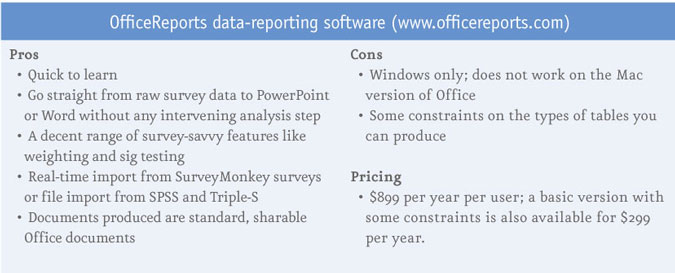
OfficeReports is a new survey reporting tool, from the Denmark-based software company of the same name, which cleverly resides entirely within PowerPoint, as a very large software plugin. It does not work by converting tabular output to PowerPoint; rather it converts PowerPoint into a fully functional crosstab tool which presents all of its output as PowerPoint slides. It also does the same for Microsoft Word. In either case, once the software is installed – and an OfficeReports license will give you both flavors – it appears as an additional menu item on the ribbon, with a small number of tools on display.
You could be forgiven for thinking it does little more than Excel’s pivot table function, as its just reveals a few key functions in the ribbon, such as the one to import a data file. Nothing could be further from the truth. This does everything a seasoned researcher would expect a desktop crosstab tool to do. Filters, weighting – applying and generating weights; multi-response data; a whole slew of sig tests; top-two boxes – you name it and OfficeReports seems to have an option to do it. It also copes well with very large datasets: I saw it running on a file with half-a-million records without difficulty.
It accepts SPSS data and Triple-S data and the most recent addition is a direct API connection with Survey-Monkey, so it will pull in the data from any active SurveyMonkey survey. It does this on demand and will refresh and update on demand, if the survey is still growing in size. Once you have established a linkage, then whenever you open that PPT file in future, it will ask you to locate and open the file and it will update the deck if the data have changes.
However, if you send the presentation to someone who does not have OfficeReports installed, it just behaves like a normal PowerPoint deck, because the data records are always held externally and the slides will simply refer to what was last placed there.
The charts it uses are actually Excel charts and they have integrated these well with the templating capabilities in Excel to help you achieve a consistent look and feel across your work. You can save tables or charts you have created as templates and, at a high level, you can also save any presentation you have perfected as a template and use this or apply it retrospectively to other presentations. This all provides a good means to ensure consistency of appearance and saves valuable time when trying to create good-looking reports under the pressure of time.
It is easy to overlook the fact that a lot of the work in creating reports and presentations lies in getting the information in the right format to present – and this is where the tool is very strong. It has a very intuitive set of options for creating derived variables and for editing variables to merge categories, omit items or create nets and subnets.
If you are familiar with Word or PowerPoint in the unembellished form, like me, you will probably find it an un-canny experience that it has suddenly been transformed into a tab package with all the tools you need to do proper, in-depth analysis. It won’t necessarily do every kind of table that the high-end DP packages will, but by the time you add in what you can do with Excel macros, it probably lacks very little. My only gripe is that it will not work on the Mac version of Office – it only works with Office for Windows.
The OfficeReports user experience
Sociable Pharma is a consulting company based in London that specializes in pharmaceutical research and analysis. The company picked OfficeReports to help produce PowerPoint reports more easily. “We run market research surveys ranging from 10 to 80 questions,” says Neil Dodgson, Sociable Pharma’s managing director, “and the reporting can result in anything from 10 slides to 200 slides.”
Asked how easy it is to learn, he says: “You do have to get your head around how it works and understand the concepts behind it. It needs some explanation. But we’ve had a couple of training sessions by Skype and we’ve quickly got to grips with it. While some specialist knowledge is still needed to import the SPSS and get that part right, anyone with a knowledge of Office can run the reports with the survey in front of them.
“It is a newish product and so you need to know that’s what you’re getting. But on the positive side, we have gotten some very real time-saving benefits and every time there has been an issue, I’ve had very quick turna-round [from OfficeReports].”
Sociable Pharma has also found the templating feature to be a particular benefit compared to using Office on its own. “It is helpful to know you have generated 50 slides and they don’t all look slightly different,” he says. “The feature to ‘create more categories like this,’ which allows you to replicate definitions when creating derived variables, has also been a time-saver.”
More automation required
Sometimes the demand to produce PowerPoint can be overwhelming, especially when there are a lot of very similar reports, each with its own modifications, and when those reports repeat over time. For these, much more in the way of automation is required, in order to repeat what is similar but also manage to incorporate all the differences effectively. This is precisely the problem that Rosetta Studio exists to overcome.
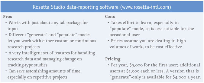
Rosetta Studio is a report automation tool that takes outputs from most crosstab reporting systems and produces PowerPoint output. Version 4, released just over a year ago by Rosetta Studio International, a subsidiary of ATP Canada Software and Services Ltd., Newmarket, Ontario, ushered in a completely refreshed interface, which now uses the same arrangement of ribbons and grouped palettes of tools found in Office.
The software has two different modes of operation: populate and generate. In populate mode, you start with a report already created in PowerPoint and the software effectively pulls the data into to that PowerPoint document. In the generate mode, you write your PowerPoint report from scratch within Rosetta Studio and it effectively pushes the results you select out to PowerPoint.
In either mode, the first stage is always to import the data. Rosetta Studio is a tool for rearranging plain old tables into slides and charts, so data in this context does not mean raw survey data but rather tabulated reports. It will scan just about any tabular report and intelligently identify all the components of the report, down to the rows, columns, labels and whether an individual figure is a frequency, percentage, mean average or significance value.
Dealing with significance tests in PowerPoint itself is always a laborious, manual process but Rosetta Studio allows you to treat significance values in a number of different ways – from color-coding the results to showing the significance level or reattaching the letter-codes that allow significant differences in pairs of values to be presented.
In populate mode, you essentially create a marked-up report template which will pull the data into place at the time you run or “populate” the report. The mark-up is achieved by writing a tag which refers to a value or a block of values in the underlying set of tables.
You then go through the PowerPoint slides and tag each value or group of values that go into either tables or charts in PowerPoint with a reference to where the data can be found in your set of tables. Tagging in Rosetta Studio is very sophisticated – apart from instructing it which table, row or column or subset of a table that a chart or table should be populated from, tags can also be contingent on items, such as finding or not finding specific texts or values in the tables. It effectively gives you a programming language for creating PowerPoint reports from a given set of tables.
This tagging, which is the first step when working in the populate mode, can be a fairly onerous process. You would only go to the effort of tagging and using the populate mode if you knew you were going to produce the report many times over. Hence a few years back, the generate mode was introduced, where you create all your slides from within Rosetta Studio without needing to do any tagging. You can then go into PowerPoint itself and finesse them into shape.
This is where it gets quite smart. When you generate a report in Rosetta Studio, rather than just doing it in PowerPoint, Rosetta knows exactly where each figure in any table or chart comes from and it maintains that link. So even when you move things around, remove values or update colors or text, you can still go back into Rosetta and get it to push all the data out again. So if you are working on an early set of tables and the final set arrives, you simply need to perform an update run and all of the values in your manually-finessed set of PowerPoint reports will be refreshed.
If that is not enough, you can go the full circle, because you can convert any generated PowerPoint report into a populate-ready report by getting Rosetta Studio to replace all the values with tags. This way, you can slip into populate mode without actually writing any tags. Reports can also be batched up and there is some run-time syntax that lets you sequence a whole series of reports to be run with different data files or report variants.
The Rosetta Studio user experience
GfK uses Rosetta Studio in several of its offices in the U.S. and four other locations worldwide. Deborah Nastri is senior research manager in GfK’s brand and customer experience division. She reports, “We introduced Rosetta Studio at the beginning of last year, with two days’ training from Rosetta, which was spectacular. We used the program for a year-long tracking study with six monthly and six trimester deliverables.”
While the reports may only run to around 60 pages or fewer, they tend to be dense with charts and figures, Nastri says. Her team learned both generate and populate modes but their work is exclusively around a con-sistent set of repeated reports, so they use generate mode, which means a greater overhead in setting them up the first time. “It took us about two weeks to get everything programmed,” she says. “But once we had done that, it was easy to use. The time savings have been spectacular. I would say it has cut 35 percent to 40 percent off the time we would have spent on these reports.
“I haven’t had any issues with the program but you need to be knowledgeable about how to set up your pro-ject to use it efficiently. That is not a fault of the software – it’s about ensuring that it accommodates the chang-es correctly.”
She also describes a very responsive Rosetta support team willing to give advice on additional tips and tricks that can save more time. “I’ll e-mail them if I have any questions and I always get a very quick response. They also frequently send out updates with small improvements they’ve made.
“Before Rosetta Studio came along,” she says, “I had to put in a lot of evening hours to get the reports ready in time. Once this program came along, that pretty much went away. You are definitely able to deliver your reports in a shorter time.”
Reference
12013 Confirmit Market Research Technology Report by meaning ltd., meaning.uk.com