Editor's note: Based in Pittsburgh, James Rohde is research supervisor at MARC USA, an integrated marketing communications firm.
Tracking studies have a problem. They are designed to measure changes yet offer little agility to focus on changes once they occur. As a result, far too many people are familiar with findings like: “Things are better than last year but little else has changed so we don’t know why.” Which is better than the alternative: “Things are worse than last year but little else has changed so we don’t know why.”
One of the contributing issues is that nearly all of the information reported from tracking is based off a direct question and answer from respondents, such as “Where have you shopped in the past four weeks?”
While we use a variety of tracking studies at MARC USA, we are rarely asked for a base rate of visitation or satisfaction for any brand. Instead, clients are asking for strategies. Most of our clients have a well-established history with their customers and often an established line of tracking research that is already in place. This means overhauling the research plan is not usually an option.
So, how do you find a new strategy using the same data? From the analytical standpoint, the initial roadblock is that tracking studies don’t often inspire the critical question until AFTER the results are tallied. So if we stick to simply reporting data collected through direct respondent questioning there will be very little strategic insight.
Thankfully, tracking studies provide a lot more than the answers provided from direct questions.
The solution starts with correcting this article’s first statement: Tracking studies do not have a problem; they are meant to provide context and lots of it.
With such a wide range of market changes that any one tracking study needs to monitor, the scope of possible analysis can be daunting. Given that it is just not realistic to look at all possible combinations of data to find our answers, the real challenge is focusing the analytical scope on what is important.
So, how do we narrow the analytical scope in a systematic way? Following is a case that highlights a founda-tional analysis to narrow the analytical focus but still provide a deeper analysis within the broad topic of “brand.”
The concept of narrowing down the scope of a topic to focus on key issues is hardly a new idea. Nearly every researcher on the planet does something similar when it comes to basic survey design. There are always founda-tional questions to help narrow the focus for the respondent, for example:
Q1) Where have you shopped for ___________ in the past 4 weeks?
Brand A
Brand B
Brand C
…etc.
It’s an important question that is not just common but a necessity for the study to continue; we need to keep the impending attributes in the context of the brand. Yet, while the question is used to narrow the focus for the respondent, it is usually little more than a footnote during the analysis.
So now, in order to add some strategic direction, we have lists of attributes, designed to track perception, that we are forced to burden with the task of creating differentiation. Unfortunately, few brands exist on levels of such overt consumer awareness that the unique positioning of the brand consistently translates to unique perceptual ratings – hence, competitive sets.
It’s not that brands are not offering their own unique strengths; it’s just that looking at the highest brand level does not typically add the level of insight that can influence the tactical strategies that are already in place.
However, by maximizing the use of the information, we can zero-in and add context to the most critical brand interactions. This exercise assumes that your study has some base quality controls in place. For example, that your sample is robust; reflective of the people you are interested in; consistently defined across iterations; and the general methodology is not drastically altered wave to wave.
The data on grocery shopping habits shown in the table is meant to simply illustrate the process and is not real data.
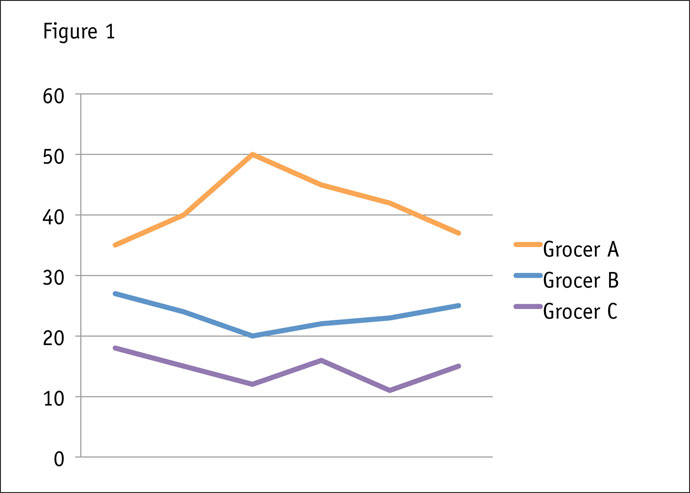
This has a habit of looking something like Figure 1.

We can tell that since our last iteration: fewer people are shopping at Grocer A; more people are shopping at Grocer B; more people are shopping at Grocer C. Certainly important information but it tells us little more about our brand that the finance department would not have reported – and likely reported more accurately. The chart shows us where people shopped but nothing about the relationship between the brands; in other words, all we see is how many people checked the box.
However, leveraging the data from this same question, we have the ability to add the required context to take our understanding of the market to the next level. We have to leverage the fact that our results are measured in the context of an individual, not just the dollars spent. So when looking at the number of people who shopped Grocer A, it is important to see what that means in the context of both Grocers B and C, as shown in Figure 2.
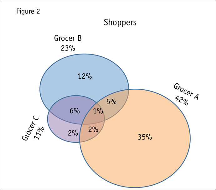
Now we have leveraged the information in a way that is unique to the perspective of the customer’s re-membered history and important to how we understand the overall tactical strategy. Understanding the degree to which people are interacting with the various brands is something that gives us a bit more depth into under-standing our current environment.
If we went no further, we could do some basic profiling to get a feel for who is being reached within the brands and how they differ. It is possible that there could be something here to help us define some new strategies although we still don’t have enough to do anything within the context of the strategies that are already in place.
The next step is to understand more about not just how the brands overlap but how that interaction is chang-ing.
For the sake of argument, let’s compare the last two time periods of our study by looking at Figure 2 and Figure 3.
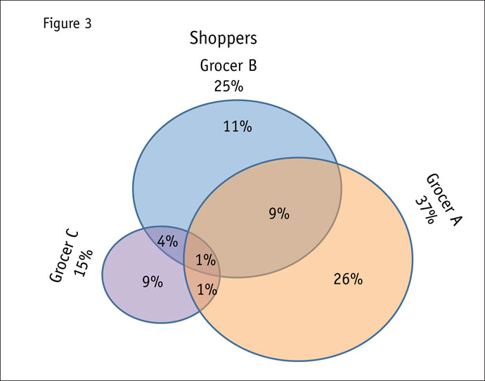
The goal is to determine who is interacting with whom and shed light on the changes. At first glance we can note the following: fewer people are shopping at Grocer A; more people are shopping at Grocer B; more people are shopping at Grocer C; more people are shopping both Grocer A and Grocer B; fewer Grocer C shoppers are shopping other grocers.
Again we have added a new dimension and see that in addition to profiling the static overlaps there is some-thing to be found in identifying how those profiles may have changed. There has clearly been movement.
Of course, it’s not just the overlaps themselves that are changing but also the size of the circles. So not only do we have movement between the grocer brands but also a more general shift in the number of people shopping any grocer.
This means we also have to expand our look to include brands outside just grocers over the same period.
While some could be tempted to start the process of a five-set Venn diagram, in practice this ends up being a difficult chart to understand (not to mention build). Instead, if we focus on each individual brand to understand the dynamics, there is a greater chance we will be able to articulate what has changed over our given period.
Let’s start with Grocer A as an example (Figure 4). Using a waterfall chart we are able to demonstrate the movements between brands over our two time periods. This offers a bit more context to the total number of consumers shopping our brands. Now we can add: fewer are shopping Grocer A than in the prior wave; more people are shopping both Grocers A and B than in the prior wave; Grocer A is sharing slightly more shoppers with Drugstore A; Grocer A is sharing fewer shoppers with Drugstore B.
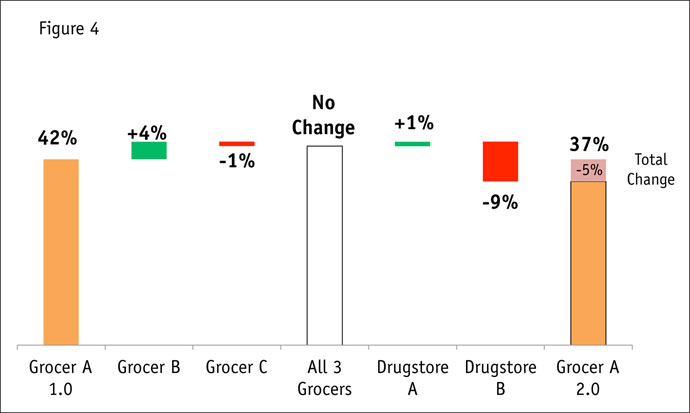
Given that the number of people shopping Grocer A is down, we can say that people are moving away from Grocer A and spending with competitors; specifically, Drugstore B. So while we knew that fewer people were shopping Grocer A, we also know that Grocer A has started sharing more customers with other grocers and has not been competing as strongly for shoppers from Drugstore B.
To be clear, all we are doing is using the data collected in asking people where they have shopped in the past four weeks. We are comparing those responses to the results of the same question from the previous wave. However, instead of showing two static snapshots, the focus is placed on the changes that took place between a single brand and the remaining competitors.
Let’s try Grocer C (Figure 5). Again, some of the information in the waterfall chart is data that we see in the Venn diagram; however, we are able to more clearly specify the shifts between the two time periods: more people are shopping Grocer C; fewer Grocer C shoppers are shopping other grocers; more Grocer C shoppers are coming from Drugstore A; more shoppers are coming from Drugstore B.
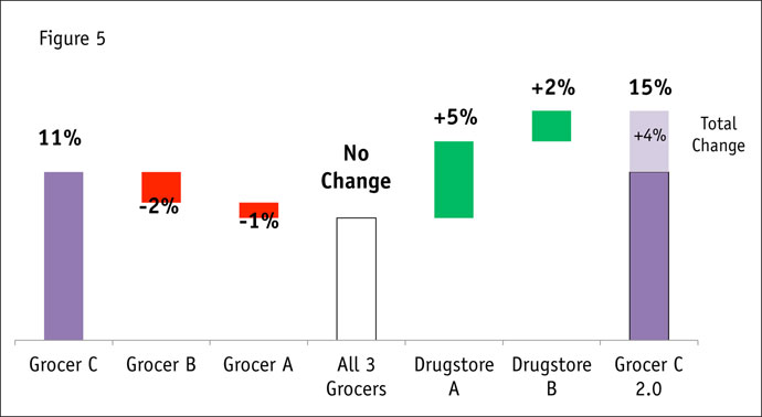
By focusing strictly on the changes between the time periods, we see not only that more people started shopping Grocer C but that they have been competing less with grocers and more with drugstores.
In and of itself, this helps to determine who your dollars are coming from and the extent to which they interact within the total space. We are now able to understand not just when a brand is growing or shrinking but where that fluctuation is coming from or going.
At this stage, we know that Grocer C is pulling shoppers from drugstores while Grocer A is starting to lose out to Drugstore B, even while pulling consumers away from Grocer B.
The next question is why. However, this is a much more direct question than it was when we started.
As opposed to a blank slate, we know the interaction that we are trying to explain and have a vehicle to identify the consumers demonstrating the behavior we would like to replicate.
That said, there is still a lot that could be layered on top of this to make it even more powerful if you have the data to do it. For example, if you have any data about the dollars spent at each brand in the past month, all these numbers can be weighted to reflect shifts in spend.
Identify the areas of opportunity
The point of this exercise is to begin to identify the areas of opportunity as they exist in the context being used to measure your brand. In any tracking study there are points that need to be fully explored and there are points that just need updates from the last iteration.
A successful tracking iteration differentiates the two and allows the brand to evolve, even when its not quite time to evolve the study.