Editor's note: Norman Frendberg is president of Consumer Insights, Rochester, New York.
Successful products and services usually deliver one or more consumer needs. Both manufacturers and service providers face the questions: "What human needs are being met?" and "Which features should be emphasized when designing products and advertising?" The answers to both queries are critically important since future sales volume depends upon these issues.
Studies are frequently conducted to select the "best" product/concept/advertising from several choices, where "best" is defined as the highest scorer on both of two dimensions. For example, the "best" attributes to emphasize in positioning new products are those that are perceived as both important to the consumer and not adequately provided by existing products.
 If we developed a comprehensive list of the human needs a product could satisfy, some of them would be perceived as more important than others, while some needs would be met by products currently on the market. The human needs that represent the most direct opportunity are those which are concurrently most important to consumers and perceived as lacking in existing products.
The relevant data includes two respondent evaluations for each of the appropriate human needs. One evaluation is an importance rating and the other rates the brand used most often. Quadrant analysis is one way to simultaneously analyze the two dimensions of brand rating and importance.
This analysis is accomplished by plotting the importance and brand rating scores for each attribute on one graph. One axis represents the importance measure, while the other axis illustrates the brand rating. By plotting the coordinates of importance and brand rating for each attribute, we are able to visually depict their relationship. This visualization will enable us to both analyze the data and communicate insightful evaluations to management.
Let's continue with a quadrant analysis example based on importance and brand rating. The data used to create this plot come from two questions such as the following:
1. I'm going to read you a list of statements that you might consider when buying fresh melons. As I read each one, please tell me if that statement is "extremely important," "somewhat important, " "slightly important" or "not at all important" to you when selecting fresh melons.
2. Now, I'm going to read the same list of statements. This time, please tell me how well you feel each statement describes "Brand X" fresh melons, which you told me you purchase most frequently. Does this statement [read first statement] describe "Brand X" melons "completely," "very well," "somewhat" or "not at all"?
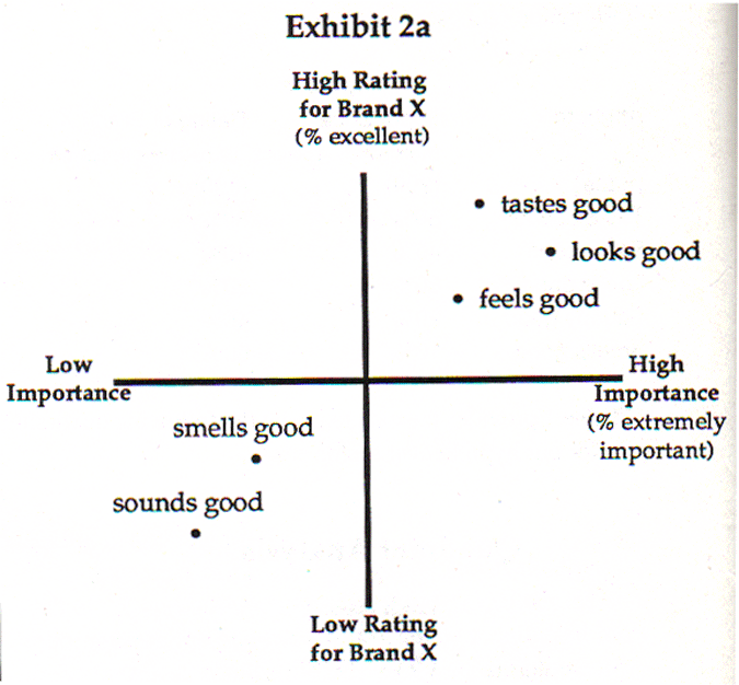
Table 1 below shows the hypothetical attribute scores on both measures: importance of fresh melons and "Brand X" fresh melon ratings.
Table 1
| Attribute | Importance | Rating of Brand X |
| % extremely important | % describes r completely | |
| Base | (200) | (200) |
| Tastes good | 80% | 80% |
| Feels good | 40% | 40% |
| Looks good | 80% | 20% |
| Sounds good | 20% | 40% |
| Smells good | 10% | 60% |
The attributes with the highest "extremely important" scores are located on the right half of the map, while those with the lowest "excellent" association are located on the bottom half. The quadrant on the lower right side of the map could be referred to as the "direct opportunity quadrant," since it represents those attributes that are perceived as very important, but lacking in the current brand.
This plot facilitates the analysis and communication of the results to marketing management, i.e., it identifies "feels good" and "looks good" as offering special opportunity because they are considered important and rated low for the existing brand.
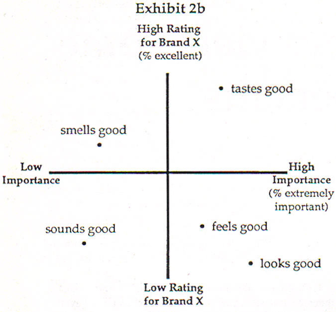
The data and corresponding quadrant analysis are not always as straightforward as the previous melon example. Occasionally, the attribute measures are highly correlated, i.e., those attributes that are rated high on importance also score high for the brand rating. This situation results in a quadrant map that may look like this:
The map in Exhibit 2a is less useful in the creation of actionable marketing insights. However, with a slightly different calculation method, we are able to use quadrant analysis even when there is a high correlation between the measures.
The calculation method changes only for the brand rating. The new "describes completely" percentage for a particular attribute is calculated only among those respondents who rated that attribute "extremely important." Using the melon example - 4O% of the 200 (or 80) rated "feels good" as "extremely important." Among that 80, we would calculate the percent who rated "Brand X" as "describes completely" on "feels good."
Thus, the new calculation approach for each attribute is as follows:
- Importance - among total sample percent rating attribute "extremely important."
- Brand rating - among only those rating the attribute "extremely important" and percent rating "describes completely."
The resulting quadrant map will appear more like Exhibit 2b, which is more useful in generating marketing insights. Furthermore, this exhibit may enhance the market researcher's ability to understand "truth" since the brand ratings are key among those users regarding the attribute as important.