Absorbing some changes
Editor's note. Jack Weber is senior manager, marketing information, James River Corp., Norwalk, Conn.
The James River Corp. recently pondered a fundamental question: Is a 60-foot smiling man with an ax in his hand the right identity for a brand?
Last year, James River decided to reexamine its Brawny paper towel brand from the ground up. At the time, Brawny's volume was fairly flat and the brand had gone virtually unadvertised for more than two years. Brawny was locked in a head-to-head struggle with ScotTowels for the No. 2 position in the market, behind Bounty.
Management at James River had undergone a change, and the new crew decided it was time to take a closer look at Brawny. The company was willing to make whatever changes were necessary - even if it meant eliminating the Brawny man himself. Afterall, some quarters thought the Brawny man might be hurting the brand. Did consumers wonder why there was a man on the package? Did they even like him? Was the towel supposed to be big or just the man?
With all of this in mind, James River's marketing research and marketing departments, along with its advertising agency - DDB Needham, New York - began a nine-month project that looked at all phases of the Brawny brand franchise - the basic positioning, the brand's identity and personality, packaging, advertising - even the product itself.
Who is this guy?
Project participants endeavored first to get a handle on the strengths and weaknesses of Brawny man. Qualitative research was initiated to gain a better understanding his "personality." Focus group sessions were conducted with Brawny buyers (both very loyal and somewhat loyal) and with folks who didn't buy Brawny.
In these groups, inquiries focused on Brawny's personality and the personality of the Brawny buyer. Using a variety of techniques and role playing, the focus groups fielded such questions as:
- Who or what is Brawny man? A big lumberjack? A giant? Something else?
- What kind of a man is Brawny - a big out-of-date oaf or a man who could fit into the '90s'?
- What kind of woman would Brawny man go out with? What kind of restaurant does he like to go to?
- Does he have a family? Any kids? What is his home life like?
Focus group participants' answers immediately showed that most consumers weren't sure exactly who or what Brawny is (he's a giant), but that he definitely was an appealing character. Far from being an old-fashioned icon, Brawny was seen as kind and warm - somebody with whom it would be easy to get along. But respondents weren't in unison on Brawny's home life - many thought he was a single guy, others saw him going home at night to a log cabin and a happy family. In all cases, though, his social skills and self-esteem were positive, and descriptive comments ranged from "pleasant" and "reassuring" to the cliche, "He's the strong, silent type."
The next series of exercises ended up offering probably the most interesting information about the Brawny man. Respondents were asked to place themselves and the Brawny man in different scenarios. For example, women were asked what kind of party guest Brawny would be. Brawny was seen universally as a close-to-perfect guest: a pleasant conversationalist, possibly a little shy, but always wel1 behaved and popular. Luckily, he was described as neither a wallflower nor a boorish drunk with a lampshade on his head.
In the next exercise, women were asked to imagine what would happen if they were stuck on an elevator with the Brawny man for 20 minutes. Though this scenario produced a bit of nervous giggling (apparently, the Brawny man also has a good deal of sex appeal), it became clear that Brawny's true strength was that he was clearly viewed as a savior, a knight in shining armor. Participants felt that he would be dependable and reliable - someone who would figure out how to get them both out of the elevator, or would at least help calm down whomever he was stuck with.
These observations helped the project team feel good about the Brawny man's personality and his role for the brand. Further, it became clear Brawny and his personality were actually a very good fit with a paper towel: helpful, reliable and willing to get the job done.
Packaging changes
Although the qualitative observations produced positive feedback, James River next wanted to further quantify what the Brawny man brought to the brand in general and to the package specifically. First, the company looked closely at the value of the Brawny man logo. The project team set up a quantitative test that studied the Brawny package with and without the man, as well as alternative packages with varying sizes and representations of Brawny.
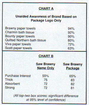
The company's efforts produced an important and surprising result: The Brawny man symbol has almost universal recognition. Ninety-four percent of paper-towel buyers recognized his face alone (without a brand name attached) and could idenitify him as Brawny. James River tested a number of logos from products in the paper towel and bath tissue categories and did not find any symbol that was more widely recognized. What's more, the Brawny package with Brawny man on it scored much higher in terms of both purchase intent and imagery than the brand did when participants rated it on its name alone. Given these findings, everyone working on the project agreed that while the brand could benefit from some slight modifications to the Brawny man, he is not an identity James River would want to abandon.

James River shared the first round of packaging and logo research with the packaging development firm of Peterson & Blyth, which led to the development of a number of new alternatives that were tested in the second round. A packaging screen was conducted so that the company could better understand the message and appeal of each alternative. This test led to several modifications to the Brawny package.
First, Brawny man's trusty ax was taken away from him; the first round of testing had proven that it was not important to his persona, and it didn't add anything to the package. Next, he was shrunk by about 10 percent to make it easier to display the decorative prints on the towels. Brawny also got a new hairstyle - his third in 19 years. (Some consideration was given to the idea of eliminating or shrinking the forest behind Brawny man, but the research indicated that would be a mistake, as consumers clearly liked the trees and the general outdoor feel of the package.)
An integral part of the new packaging was a new consumer-preferred Brawny brand logo that was bigger and centered on the package, making it easier to read. Water droplets were added to better communicate absorbency. All of these changes helped create a harder-working and more visually appealing package for the brand.
"Thirst pockets"
Even though members of the project group knew they had a winning brand character and an improved package, they continued to wonder about Brawny man's basicreasonforbeing. Brawny was introduced in 1975, and for the past 10 years the brand's positioning and tagline had been "The Big Tough Towel" - indicating both Brawny's high level of strength and absorbency and the fact that each of its sheets is bigger than other brands' (by about 25 percent). There was some thought, though, that while this positioning (reinforced through years of advertising and packaging) did a good job of communicating strength and toughness, it may not have been working hard enough to communicate absorbency - one of the key attributes in the paper towel category.
Focus groups were set up in strong and weak Brawny markets so the company could get a better handle on category needs as well as specific feelings about Brawny. The results proved interesting:
When it comes to paper towels, spills and absorbency are of primary importance, which is why most paper towel brands already talk about both things in their advertising: Bounty's ad campaign has for years consisted of vignettes of children creating spills, feeling bad/sorry, and mom forgiving them because she had Bounty. (These led some viewers to wonder what wou]d have happened to the kid if the towel roll was empty.)
James River also learned through some tasks performed by the focus groups that consumers who had never tried Brawny were impressed with its absorbing performance in comparison with the "ordinary" towels they had been using. And all types of consumers (current users and nonusers) saw agreatbenefitto Brawny's unique emboss, a series of "thirst pockets" on the towel.
After the groups further explored effective ways to talk about Brawny, a series of new positionings was developed and tested. Each positioning was tested monadically, allowing James River to learn the true value of each positioning in a closer-to-real-life scenario, then compare the new ideas cleanly to the "Big Tough Towel" positioning.
The positioning test showed that there were opportunities to increase the appeal and purchases of Brawny, and the results led to the new positioning statement: "Thirst Pockets for Spill Relief." This phrase not only became the cornerstone of the advertising campaign that was to follow, it also was immediately incorporated onto the front of the new packaging.
Back on the air
Armed with the qualitative and quantitative test results, DDB Needham began developing several different creative executions playing to the brand's new theme. Qualitative exploration was conducted with consumers, which helped the company develop a specific execution and the tone the advertising needed. The resulting ad, "Classroom," featured a kindergarten teacher who needs, and uses, Brawny paper towels with her messy finger- painting students. She notes her frustration with the spills and messes she encounters and the ability of Brawny's thirst pockets to take care of them. (Talking about the thirst pockets, the teacher says, "Sometimes I wish they'd absorb the kids" - a line viewers, especially mothers, particularly enjoyed.) The advertisement ends with the tag, "Brawny gets to the mess before the mess gets to you."
An animatic and a finished execution were developed and tested to measure communication, recall, persuasion, imagery and general appeal. This testing confirmed the ad's basic likability, which had surfaced earlier, in the groups, and also indicated the strong communicating ability and appeal of the "Thirst Pockets" tag.
The advertising campaign broke in the second half of 1993 with an 11-week flight; spending totaled $8 million to 10 million. Utilizing continuous tracking, the advertising was monitored to determine if the message was getting across. The results of the tracking study showed that the advertising campaign was indeed leading to sign)ficantly increased Brawny awareness levels: top-of-mind and unaided brand awareness and unaided and total advertising awareness. Needless to say, James River was quite happy with the results of the new positioning and advertising.
Brawny's future
From aresearch standpoint, the Brawny project was a wonderful opportunity to both thoroughly investigate the strengths and weaknesses of a major brand in an existing category and explore avenues for change. Myriad techniques and individual projects, all building upon one another, were fashioned to help develop a new positioning, package and advertising campaign. Most importantly, it all worked!
What's next for Brawny? In early 1994, Brawny introduced two national line extensions to better meet specific consumer needs. Brawny 100% Recycled and Brawny Pick-A-Size (a variable-sized sheet) address consumer demands for flexibility and variability in paper towel size as well as recycled content and reduced waste. Other ideas are always being tested to determine new line- extension opportunities. As for the base brand and its campaign, the "Classroom" advertisement was back on television in early 1994, with plans to introduce a new execution later in the year, solidifying even more the "Thirst Pockets" message.
With all that, it's a busy time for Brawny and certainly a time of change. But one thing definitely won't change - that strong but sensitive smiling Brawny man in the plaid shirt. Whatever else happens, the Brawny man is here to stay!