Editor’s note: Tim Macer is managing director of London-based meaning ltd. He writes as an independent software analyst and advisor.
You could be forgiven for thinking that research technology has not fully kept up with the voracious demand from clients these days for customized information flows which are relevant to them. The research process in most firms is well geared up to cranking out everything-by-everything tables. But the process of creating highly polished, user-friendly reports in Word, showing some selected findings and a few key indicators presented in chart form, or even turning tables into charts in any systematic way, too often involves hours of painstaking manual effort.
E-Tabs, a software package that facilitates the distribution of crosstab reports as electronic, navigable and searchable documents, goes some way to meeting this need, especially as it now incorporates a decent charting engine too. But if you are involved in any kind of continuous research program, and especially if you need to produce a series of very similar reports, each filtered by a different market, product or operational territory, then you are still in for a lot of cutting and pasting if you use E-Tabs.
This entire problem of producing repetitive “similar but different” reports is one that the new E-Tabs Enterprise sets out to solve, and it manages to do so in a very ingenious and satisfying manner. Built on the E-Tabs engine, it can be fed directly by the conventional but uninspiring print files issued by all the commonly-used crosstab packages such as Quantum, WinCross, Mentor or Uncle. In fact, the plainer the better. Set it to work, and it will slice up an existing set of tables and serve them up as a series of individualized PowerPoint presentations, Excel workbooks, Word documents or HTML pages.
This kind of custom publishing of results seems to fall down a crack between the tools that are widely used. Many crosstab packages let you script things and automate production but do not give you the total flexibility of output, forcing people to use the layout abilities of Word, Excel and PowerPoint. The problem is, the MS Office tools don’t readily understand standard research tables as data sources, and thus require a lot of manual intervention just to extract the right figures. I have seen researchers resort to cutting and pasting whole blocks of figures one at a time. But if you try to automate using the macro-making facilities in either Word or Excel, you’ll need the skills of a Visual Basic programmer.
A step beyond
What takes this tool a step beyond Office macros or more targeted initiatives such as SPSS’s MR Studio is that you do not need a lot of technical know-how in order to set up truly complex reports. There is no scripting or syntax to learn and everything is easily controlled directly by the user. Most of the time, you work in the familiar environment of the target program you wish to report in: PowerPoint, Excel, etc., plus the special tagging tool that is a key part of Enterprise . It also means the documents it produces are particularly convenient for your clients to receive, as they will be standard Microsoft Office documents.
There are just three steps involved in the journey from tabs to personalized charts in a client’s in-box or custom PowerPoint presentations. In the first, the output is “parsed” using the established E-Tabs engine. This rationalizes the raw tables, so all the different elements can be referred to and picked up: totals, questions, texts, and just what relates to what, column by column and row by row.
Step two is where you map out your report. Typically, you create an example of the exact output you want in PowerPoint. Better still if you have an example already, as you can simply use that. From this you create a template in which every value or item of description that will change is stripped out and replaced with a tag. Tagging is very sophisticated in Enterprise . The simplest tag will locate and pull in one value from the original tables, or one text caption. More complex ones let you pull in selected sections of a table, discard parts, present what remains in a different order and even perform calculations.
You also need to describe each tag you define in your template. You do this in another window, under the control of the Enterprise tool. I feared this would be the program’s Achilles’ heel, as this has the potential to be horrendously complicated. Instead, you prepare a very straightforward definition for each tag using helpers. These present the available options at each stage as a context-sensitive drop-down list.
Because tags typically refer to data by their relative location rather than an absolute position - and this can include locating the item by its text label, or self-counting items on a page - many routine wave-on-wave changes in trackers can be handled without any need to redefine the tags or the template.
The third step is to run the job. Rather like a mail merge, you can use the same template on different editions of the data, and you can have it produce it repeatedly for different recipients, using different data, or using the same data but different aspects of it.
The power of the program lies in being able to deconstruct standard crosstab reports into their component parts, then loop through the resulting gallery of data, selecting key items on a conditional basis, and reassembling them in a completely different order in whatever combination of Microsoft Office documents you choose. It also lets you perform manipulate functions on your data, to calculate new values formulaically from existing figures scattered anywhere around your tables.
Even after that, there is further scope for automation. You can choose to send selected reports directly to the printer, or zip them up to dispatch them by e-mail, so that the personalized reports automatically get sent directly to their recipients. Alternatively, you can upload them to a Web site or a corporate intranet site.
A downside?
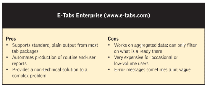
So, is there a downside with the product? Technically, not really. The tagging process is for the most part very straightforward, but if you get confused, the error messages can be cryptic in letting you pinpoint the source of the trouble, and if you come back to it after a while, you have to think quite hard about what you were doing, as tags are labeled numerically and you don’t have the option to give things your own more meaningful names.
For the occasional user, the biggest bugbear will be the cost. You have to be producing a lot of charts and PowerPoint presentations to make E-Tabs Enterprise a worthwhile investment. A single seat will set you back $25,000 a year and each additional named user license costs another $5,000 annually. Mindful of this, E-Tabs has recently introduced a slimmed-down version - which omits some of the power functions such as conditional selection and calculations, and only outputs to PDF - for around half the price.
A better way
Carrie McCracken, team leader of research support services at Millward Brown USA, Naperville , Ill. , is currently implementing E-Tabs Enterprise to automate the production of repetitive reports and charts for delivery to clients. “We have 10 people in our department at various levels and, so far, everyone has been picking it up rather easily,” she says. “We always thought there just had to be a better way - one that would be more efficient and allow us to focus more on those things that add value to the client.”
Millward Brown already makes extensive use of E-Tabs, but it still left a gap to be plugged with manual intervention, so that, according to McCracken, “you would still have the concern that you have copied and pasted from the correct place; this gives you a higher degree of accuracy.”
Another plus for Millward Brown is the software’s support for Word tables, both as input and output.
McCracken is impressed: “I like the way E-Tabs Enterprise thinks beyond the strictest interpretation of pulling data out of tabs.”
Very clever
Ken Brewster, head of data delivery at London research firm MORI has been using Enterprise to automate chart production. “Mainly into PowerPoint,” he says, “but also Enterprise gives me the benefit of going into Word. I can use it to create marked-up questionnaires, and tuck the figures and toplines into the questionnaire in Word.”
One feature that especially appealed to him is the way the program reveals the actual figures from the underlying tables when you define each tag. “It means you are certain you are pulling the right data from the table and that makes it hard to go wrong,” he says. “The post-processing aspects are also very clever - you are be able to manipulate the data and combine columns of figures from entirely different sources. I think they have put a lot of effort into this. I have been impressed so far.”
Brewster has successfully put Enterprise to use on a project where there was a need to create 40 individual, filtered reports containing context-specific summaries. It had the added twist that it needed to include data from a previous study two years ago, then benchmark all the filtered values against overall values. “I worked out that this would have required about 45 man-days to do the reporting, including the checking,” he says. “I have estimated five days of my time to do it in Enterprise , plus two days checking by execs. It is the sort of job that would be mind-numbing without this, and of course, that is where the errors creep in.”
