Winning the next generation: The new shelf reality
Editor’s note: Jennifer Pleva is associate director of brand strategy, trend and insights at WovenWorks, where she helps brands make sense of a changing world. With 18 years of multidisciplinary experience spanning trend forecasting, brand strategy, research and creative development, Pleva brings a blend of analytical thinking and creative fluency to her work. Her background in design and trend forecasting, including over 13 years at Target, gives her a grounded understanding of how strategy ultimately comes to life. Find Pleva on LinkedIn.
Walk through any grocery store today and you'll see shelves filled with products competing for attention. At first glance, the shopping experience looks much the same as it did a decade ago. The shelves are still crowded. Brands still have only a few seconds to earn consideration. Packaging is still the primary in-store touchpoint between brand and consumer.
What's changed is the shopper. Today’s emerging consumers discover recipes on TikTok before writing a shopping list. They learn cooking techniques from Instagram creators rather than family cookbooks. Food has become something they photograph, share and use to express identity. They arrive at the shelf with expectations shaped by thousands of visual interactions every day, making decisions more quickly and relying on imagery, authenticity and emotional connection in ways previous generations never did.
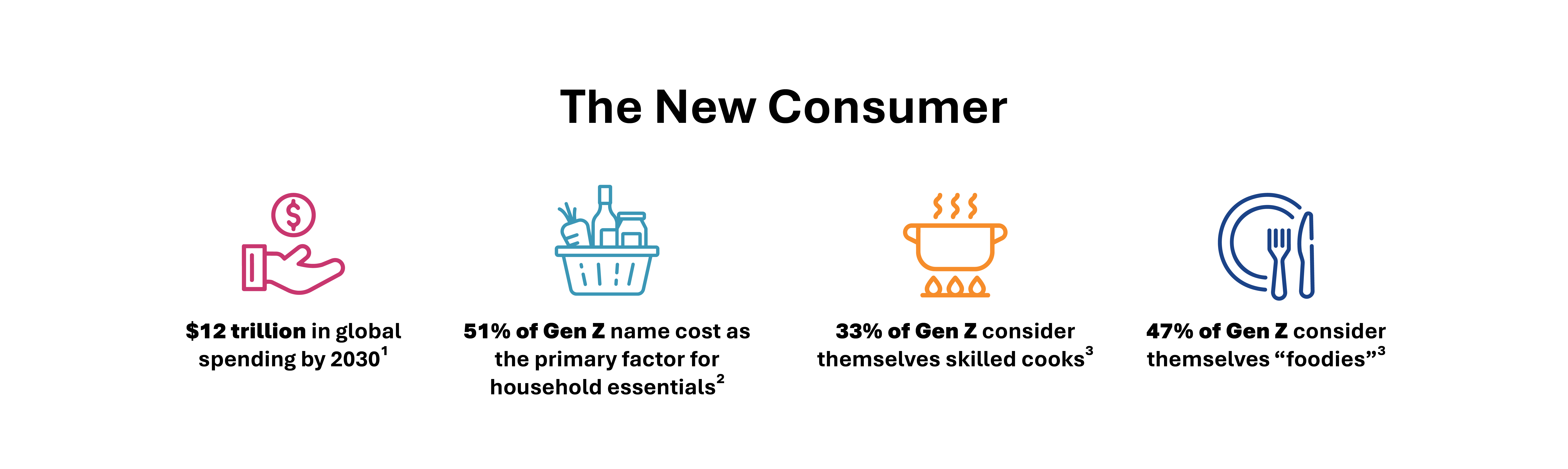
Gen Z is projected to account for more than $12 trillion in global spending by 2030, making the generation an increasingly important audience for brands to understand. But their significance extends well beyond purchasing power. Younger consumers are reshaping how products are discovered, evaluated and ultimately chosen.
The iconic brand challenge
For heritage brands, these shifts create a particularly difficult balancing act. The question is no longer whether to evolve, but how to increase relevance without sacrificing the trust and recognition that made the brand successful. Change too little, and a brand risks becoming irrelevant. Change too much, and it risks becoming unrecognizable.
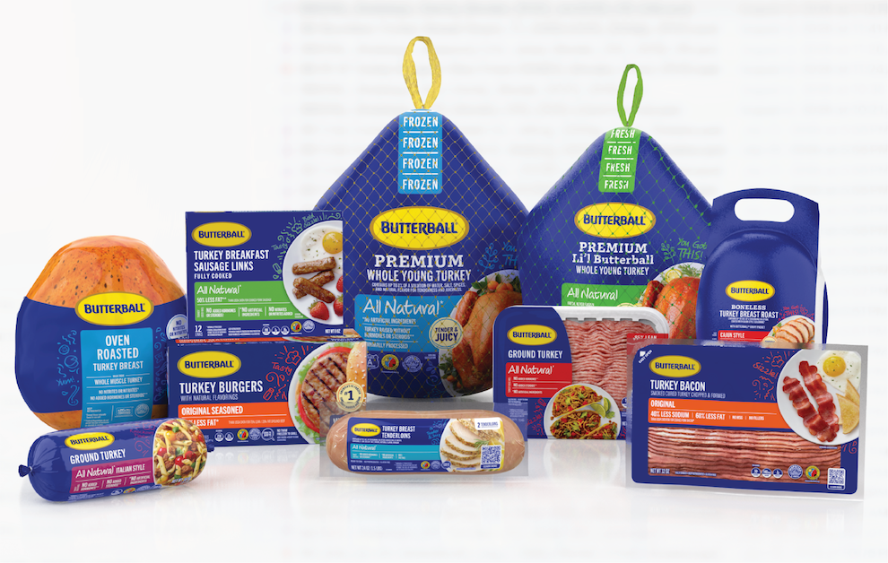
Few brands illustrate this challenge better than Butterball. Butterball entered its packaging redesign from a position of considerable strength. Previous brand research placed it among the top-performing U.S. brands for trust, quality and perceived value. Its blue-and-yellow identity was highly recognizable, and its connection to Thanksgiving was deeply established. Yet that strength also created limitations. The brand had become so closely associated with a single holiday, while its expanding portfolio needed to compete across everyday occasions. At the same time, younger consumers were entering the category with new and different expectations.
Butterball’s challenge went beyond creating a new look. It was an opportunity to determine what consumers truly valued about the brand and translate that equity into a packaging system that felt contemporary, relevant and unmistakably Butterball.
The research engine
Research is often treated as the final gate in the innovation process, a way to validate creative work after most of the important decisions have already been made. WovenWorks approached Butterball differently. Rather than relying on a single research event, we designed an integrated learning journey that enabled insights to continuously shape the packaging system's evolution. Each phase reduced uncertainty and informed the next creative decision. Research was embedded throughout the entire process.
The work began with discovery. WovenWorks immersed in Butterball's business, category dynamics and shopper behaviors to understand both the strategic challenge and the broader cultural context surrounding food today. Stakeholder input and category analysis helped identify where the current packaging system was succeeding, where it was creating friction and what the future system would need to accomplish.
From there, the team moved into design exploration. Each design concept represented a distinct strategic hypothesis for the brand pushing and pulling on heritage, emotional connection and clean modern expression. By making the concepts intentionally distinct, the research could evaluate not only which cues performed best, but which vision for the future of Butterball resonated most strongly with consumers.
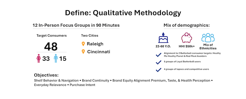
Qualitative research became the engine of exploration. Through iterative focus groups, consumers reacted not only to concepts but to evolving ideas. Designs were refined between sessions, allowing each round of research to build on the previous one. Instead of simply selecting the strongest concept, the process continuously improved design by responding directly to consumer feedback.
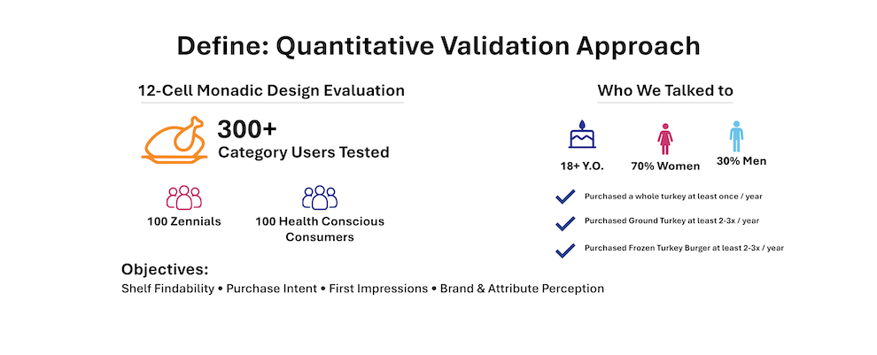
Once promising directions emerged and were refined, quantitative research measured how those refinements translated into stronger performance under realistic shopping conditions. Behavioral shelf exercises, visceral System 1 reactions and considered System 2 responses, pack element appeal, communication clarity and brand equity assessments measured how shoppers noticed, interpreted and selected packaging.
Each stage informed the next. No major decision rested solely on internal preference or creative intuition. By the time the final packaging system emerged, all meaningful choices from color and photography to messaging, hierarchy, navigation and emotional expression had been shaped through consumer learning. Research was not simply validating the work. It was driving the design.
Decoding today's shopper: Four insights that shaped the Butterball redesign
The goal of this research wasn't simply to identify a winning package design. It was to understand how evolving shopper behaviors, particularly among younger consumers, influence the way heritage brands communicate at shelf. Throughout the process, the team uncovered four principles that consistently influenced how shoppers noticed, interpreted and ultimately chose packaging. While these insights shaped Butterball's redesign, they also reflect broader shifts in consumer expectations, offering guidance for brands seeking to remain relevant with the next generation of shoppers.
1. Meaning at first glance
We entered the research knowing that today's consumers, particularly younger shoppers, are highly visual. Accustomed to digital environments, they rely on imagery, color and design cues to make rapid judgments. What surprised us wasn't that visuals mattered, but how much meaning shoppers assigned to them before reading a single word. Photography, color, typography and hierarchy weren't simply attracting attention; they were communicating quality, taste, modernity and lifestyle relevance.
During qualitative sessions, participants consistently responded to visual cues before claims or product details. They dissected the browning of the turkey, the appearance of side dishes and even their emotional reactions to color and typography, demonstrating that seemingly subtle design choices carried significant meaning. As one participant remarked, "That seasoning looks super inspirational ... it looks delicious ... I'm hungry."
Quantitative testing reinforced these observations. The recommended True Blue concept improved shelf visibility while increasing perceptions of modernity and deliciousness, demonstrating that visual hierarchy influences not only whether shoppers notice a package, but also how they interpret it.
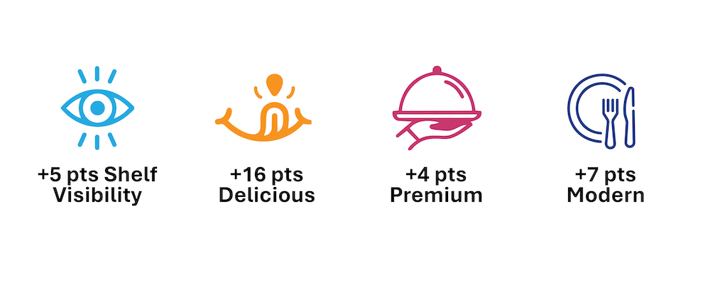
The implication extends well beyond Butterball. Packaging doesn't simply capture attention. It begins communicating a brand's story, value and relevance the moment it enters a shopper's field of view.
2. Authenticity is the new equity
As brands work to engage younger consumers, authenticity is often discussed in terms of transparency, clean ingredients or heritage. Butterball's research revealed a different dimension of authenticity, one rooted in emotion. When participants described what Butterball meant to them, they rarely began by talking about logos, colors or packaging. Instead, they spoke about family traditions, love and the reassurance the brand provided during important meals. Those conversations drove the direction of the redesign. The design team looked for ways to express that emotional equity more intentionally. Color, type, illustrations, handwritten touches and supportive messaging such as "You've got this" weren't chosen as decorative elements; they became visual expressions of the confidence, warmth and encouragement consumers already associated with the brand. Quantitative validation confirmed that these more expressive designs modernized perceptions without diminishing trust or purchase intent, demonstrating that emotional connection and contemporary design can reinforce one another rather than compete.
The broader lesson is that authenticity isn't always found in a brand's visual assets. Sometimes its strongest equity lives in how consumers feel. Research that uncovers those emotional associations gives designers something far more valuable than a logo to preserve; it gives them a relationship to nurture.
3. Confidence is designed
One assumption entering the project was that better decisions require more information. The research said otherwise: consumers weren't looking for more; they were looking for reassurance. This tracks with a broader shift among younger consumers. As cooking confidence declines and more recipes are learned from social media, packaging has taken on a new role. It's no longer just information; it's a guide, helping shoppers cut through uncertainty and feel sure they've made the right choice.
That pattern held throughout the qualitative research. Participants consistently gravitated toward cues that reinforced confidence, signals of health, quality and appetite appeal, over functional distinctions like fresh versus frozen. Surprisingly, even the use of the word "premium" reflected this. The new design concepts communicated premium visually, through stronger photography, cleaner layouts and thoughtful hierarchy. But when the word itself disappeared, participants noticed. As one respondent put it, "Without premium, the turkey doesn't feel as special." The word wasn't just a claim; it was doing the work of reassurance.
The broader lesson extends beyond Butterball. Confidence isn't built by adding more information. It's built by combining thoughtful design with the cues that matter most, visual reassurance, intuitive hierarchy and messages that help consumers feel confident in their choice.
4. Packaging inspires possibility
Perhaps the most significant implication of the research was that consumers weren't simply evaluating a package; they were imagining the experience it represented. For younger consumers especially, food has become more than nourishment. It is an expression of identity, creativity and connection. Packaging must do more than communicate what a product is; it must help consumers envision how that product fits into their lives.
Throughout the qualitative research, participants naturally moved beyond discussing the package itself. They talked about recipes they could make, occasions where they would serve the product, and whether the photography reflected meals they actually wanted to prepare. As one participant noted, “I want that chili … I look at that ground turkey and need ideas for what to make.” Appetite appeal did more than signal quality. It sparked ideas, inspired meal occasions and helped shoppers imagine when, where and how Butterball could become part of everyday life. The package became a catalyst for possibility rather than simply a container.
The research also revealed how visual cues could unintentionally limit those possibilities. Holiday imagery, script typography, cranberry sauce and traditional Thanksgiving cues reinforced Butterball's seasonal leadership, but they also narrowed consumers' perception of when and where the brand belonged. As one participant put it, “Traditional family fixings feel festive and special … too holiday for year-round.” Learning from this, the redesign broadened Butterball’s narrative. Contemporary photography, versatile meal inspiration and a cleaner visual language invited consumers to see Butterball as more than a holiday tradition. The brand became a trusted choice for everyday meals and shared moments throughout the year.
The broader implication extends well beyond Butterball. Packaging isn't simply selling a product. It's selling the possibilities that product creates. Consumers weren't simply buying turkey. They were buying the possibility of the meal and the moments that the package helped them imagine.
From insight into impact
The Butterball redesign demonstrates what becomes possible when research is integrated throughout the design process rather than reserved for final validation. By uncovering what younger shoppers value and just as importantly, what they don't, the team was able to modernize one of America's most recognizable food brands without compromising the trust it had built over decades.
The final packaging system improved shelf visibility, strengthened perceptions of modernity and deliciousness and generated a 25.7-point increase in consumer preference.
Among younger consumers, the redesign produced an even stronger response, delivering a 32-point lift in meaningful brand perception while maintaining Butterball's equity for trust and quality. The brand also now ranks among the top 1% for worth more, top 3% for trustworthy and top 5% for high quality, reinforcing that modernization and heritage can strengthen one another when guided by consumer insight.
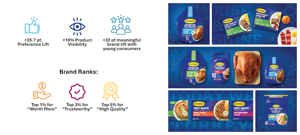
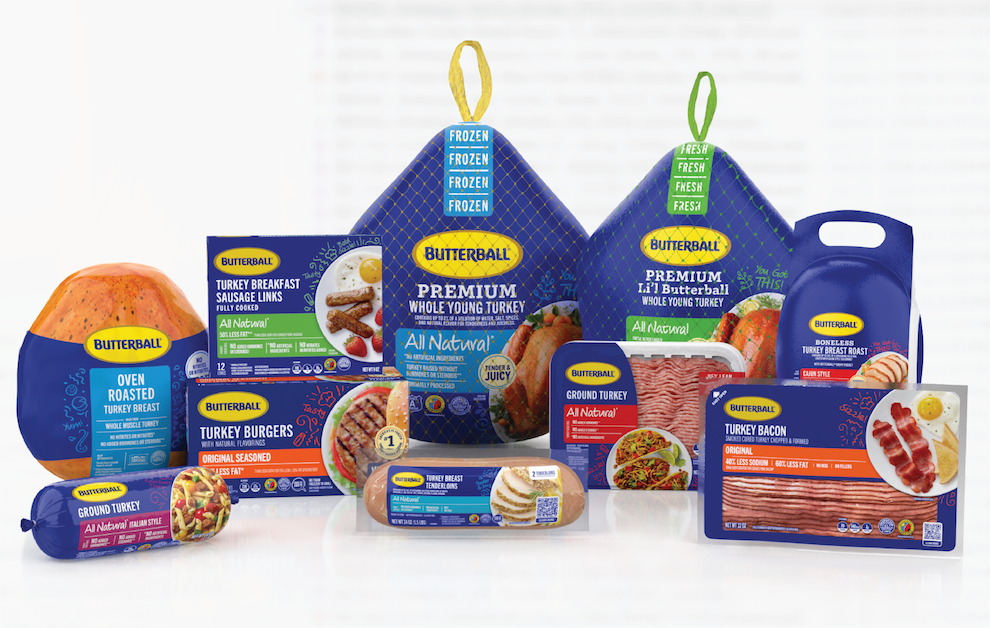
Perhaps just as importantly, the work extended far beyond packaging. The redesign became the foundation for Butterball's broader brand expression, influencing its marketing, social media and overall visual identity. Research didn't simply guide a new package. It gave the organization the confidence to evolve an iconic brand with clarity, consistency and purpose.
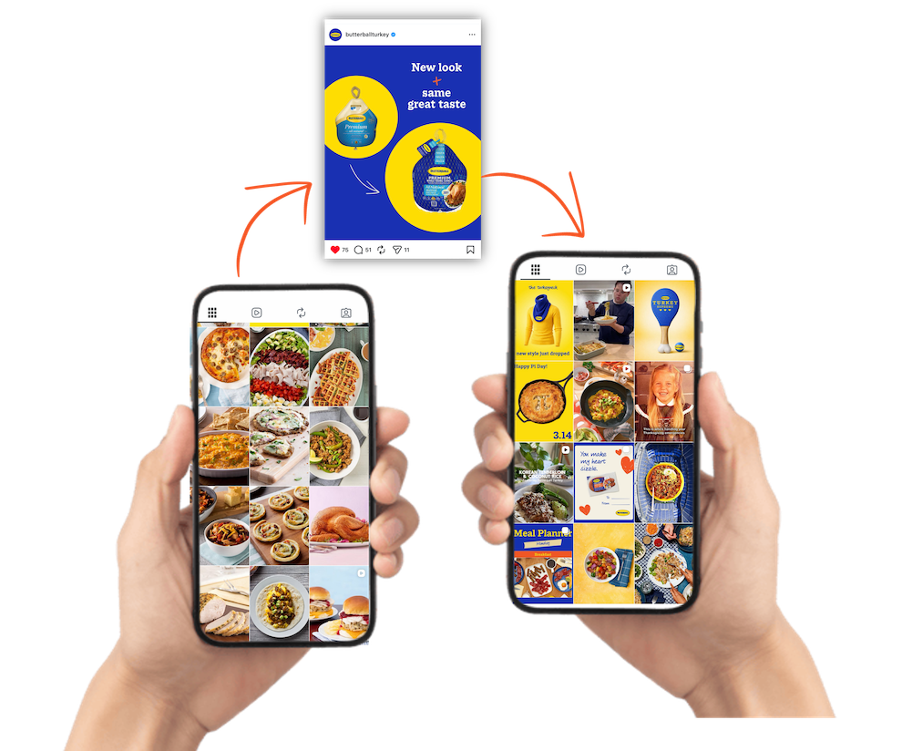
The greatest value of packaging research isn't identifying which design consumers prefer. It's uncovering what makes a brand worth choosing, giving organizations the confidence to evolve without leaving their heritage behind. Research didn't simply help Butterball redesign its packaging. It helped redefine how one of America's most iconic food brands shows up for the next generation of shoppers.
References
- “NIQ and World Data Lab unveil ‘Spend Z’ Report.” NIQ. June 18, 2024.
- Walsh, Georgie. “Gen Z spending habits: The trends marketers need to know in 2025.” GWI. 2025.
- “Culinary Confessions: Cooking Habits of Gen Z & Millennials.” Home Run Pizza. August 16, 2023.