Editor’s note: Rob Podhurst is president of Podhurst Associates, a marketing research consultancy located in Huntington, N.Y.
Statisticians and data scientists have provided us with a host of powerful and sophisticated tools to help us gain insights from the data we collect. Communicating these insights to non-researchers has always been a critical challenge to market researchers.
I am not a statistician. As a general researcher, I have long recognized that how I present analytical findings can make a real difference in their actionability and perceived value. Let’s face it, statisticians often speak a language all their own and a lot of us, myself included, may have trouble understanding what they are talking about.
Over the years, I have found that certain ways of presenting statistical analyses help my clients to better understand what the data mean and to make better use of the results.
Make it visually compelling
It’s true that a picture is worth a thousand words (or numbers!). Anyone who has ever written a research report knows that charts, graphs and schematics work better to communicate data than a bunch of words and numbers. The same holds true for statistics.
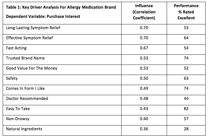
Let’s take a common statistical approach, key driver analysis, as an example. This technique looks at the influence that a set of independent variables (such as brand or product attributes) have on a dependent variable (such as purchase likelihood). Influence is often measured using multiple regression or simple correlation. By comparing influence levels with performance (i.e., actual ratings on the independent variables) we can identify key drivers – areas of high influence and high performance – as well as areas of high influence and low performance, indicating areas in most need of improvement. I’m sure there are many ways to do key driver analysis, but here I’m just focusing on the presentation.
Table 1 below shows the results of a simple key driver analysis, with the attributes ranked on influence in the first column and the other column representing top two box purchase interest:

We can certainly present the data in this way. The table shows how purchase interest is most likely to be driven by efficacy factors (duration, effectiveness and fast-acting). Further, while performance on effectiveness is relatively strong, performance on both duration and fast acting tends to lag.
Is there a better, more compelling way to show this? One approach is to map the data on a graph:
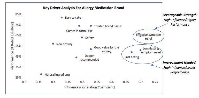
This more visual way of showing the data makes it much easier to understand. Instead of trying to interpret numbers, the reader can focus more on the marketing implications. Efficacy clearly stands out as a key strength of the brand while duration and fast-acting are easy to identify as areas where improved perceptions can lead to increased market share.
Create simplified scores to explain complex numbers
Everyone knows that 50% means half and that five is greater than four, but a lot of the coefficients and other statistics generated by multivariate techniques are not so easily understood. When communicating with marketing people, I usually do not try to explain what certain numbers specifically represent, first because my audience doesn’t really care and, second because I don’t always have a good understanding of them myself. Instead, it is often more relevant to simply designate certain levels as high, medium and low or, even better, create a basic index which puts them on a 100-point scale (like in a test at school). These are frameworks that everyone understands and using an index like this has an added benefit. It lets me combine different statistical techniques to provide a more comprehensive picture of what is going on with the data.
Let’s take an example of trying to determine what factors drive the decision to purchase or not purchase carpeting at a particular retailer. People who shopped for carpeting at this retailer were asked to rate their experience on several factors having to do with price, product, service, etc. Several different statistical techniques were then applied to the data, including linear regression, logistic regression, discriminant function analysis and ANOVA. The statistics are summarized in Table 2:
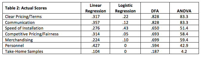
Obviously, some coefficients in each column are higher or more differentiating than others, yet the rank order varies, depending upon which technique applies. How to interpret this? Converting the data using a simple index (by dividing each number in the column by the highest number in that column) makes the task a lot easier:
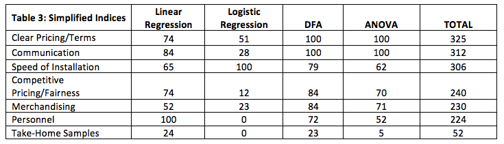
Now it is very clear that there is a top tier, made up of clear pricing/terms, communication and speed of installation; a second tier made up of competitive pricing/fairness, merchandising and personnel; and a bottom tier made up of take-home samples. The client now has clear direction on what to prioritize to better convert shopping into actual sales.
Demonstrate lift
Marketers love the concept of lift. It clearly and visually shows the expected outcome of a new product, brand or particular action on sales. I find that graphical representations of lift works particularly well on data from TURF analysis and choice modeling.
TURF (total unduplicated reach and frequency) demonstrates the incremental increase in purchase interest gained by adding more choices to the mix – flavors, sizes, varieties, other SKUs of a product, different promotional offers, ad claims, etc. It is often depicted by listing the combinations that generate the highest combined purchase interest up to a point of diminishing returns.
This example looks at different advertising claims for a personal care product:
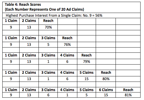
Claim No. 9 has the highest purchase interest across the 20 claims tested. Adding a second claim (No. 13) lifts purchase interest to 70%, a third claim (No. 5) to 76% and so on. The incremental lift gained from adding claims can be graphed on a simple line chart as follows:
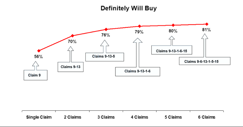
This chart shows that a point of diminishing returns is reached after four claims. Adding additional claims does not substantively add interest in the product.
Another example of using lift to make it easier for non-statisticians to gain useful insights for marketing decisions comes from conjoint analysis, a type of choice modeling that helps determine the best combination of features or other characteristics of a product or offering. It is a fairly complex technique that can be used to estimate purchase interest in any potential combination of variable levels under consideration.
Statistical outputs generated by a conjoint model typically include relative importance, utility scores and some depiction of the feature combinations that generate the highest interest. However, the combination with the highest purchase interest does not always represent the optimal solution, as marketers need to make trade-offs against production costs, pricing, etc. A good way of depicting these trade-offs can be seen in the chart below, which includes the results of a conjoint performed on a proposed new biomedical assay device:
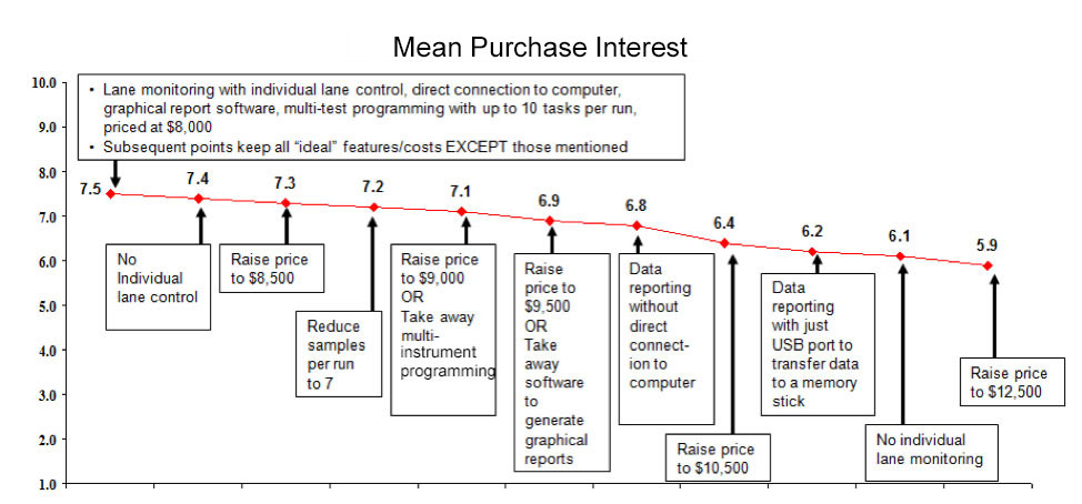
When shown this way, marketers can more effectively use the conjoint results to make better decisions about whether the incremental increases in purchase interest are worth offering the product at a lower price point or whether they should include a particular feature in their offering.
Added value
The above represent just a few ways of showing statistical results in ways that make it clearer for clients, marketing people and other non-statisticians to better understand what the data are saying and to more easily apply those insights to their business goals. Many of the statisticians and data scientists that I have worked with over the years are very smart people. Some do a great job of explaining what they are talking about, others not so much. Being able to translate what these folks are talking about and showing it in ways that clients can easily understand helps me bring added value to my account relationships.