
SPONSORED CONTENT
The collaborative process of data design
 Jack Weber
Head of U.S. Custom Research, YouGov
Kevin Sturmer
Creative Director, YouGov
One of the most comprehensive forms of data visualization is the infographic. Infographics have a beginning, middle and end, providing the viewer with a full interpretation of the topic or idea. While other forms of visual storytelling may rely heavily on accompanying text, commentary or voice-overs in the case of video, infographics allow the data alone to drive the viewer through the narrative.
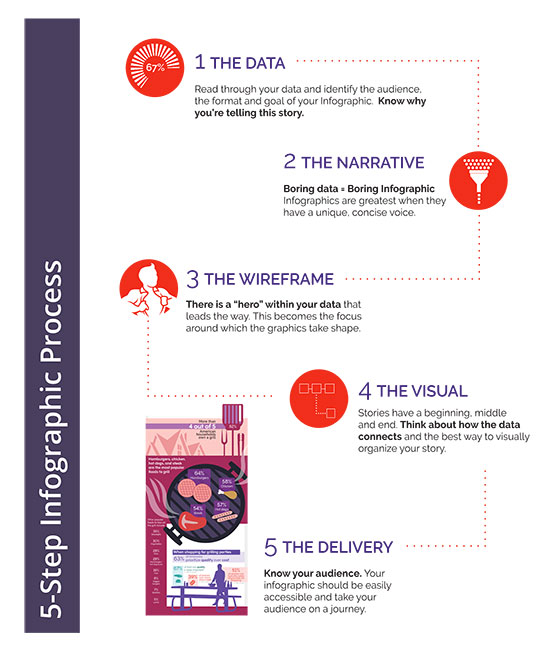
Because infographics rely so heavily on design to effectively express their purpose, tactful collaboration between the researchers or writers who source and structure the data and the designers who bring it to life is essential. When developing an infographic, five critical elements can help define and ease this process: refining the data, developing a narrative, structuring the wireframe, assembling the visuals and delivering the final product to its audience.
1. The data
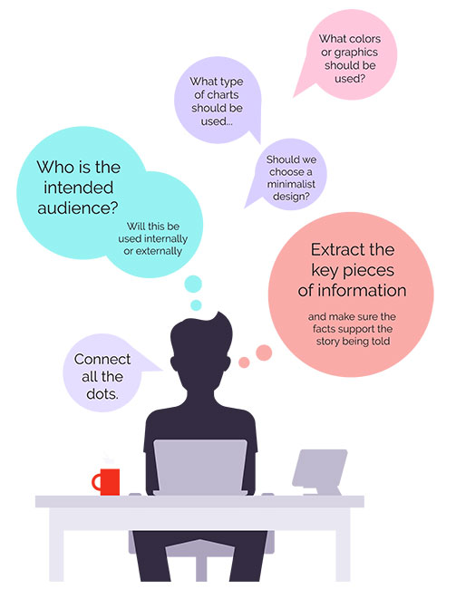
If you’re developing an infographic, chances are you have a topic in mind and either already have or are working on accessing the necessary supporting data. Once you’ve collected your data, there are three key elements to evaluate before you can begin structuring your story. First and foremost, you have to know your audience. Consider why they’d want to view your infographic and what they most want to learn from it. Is the information groundbreaking? Informative? Highly relevant? Would they share it with their boss or peers? Use this analysis to inform the next step in molding your content: selecting the strongest data and discarding the remainder. Keep your story concise and impactful.
At this point, you’ll be ready to define the output of your production. Will it be a traditional infographic embedded in an online article, 600 pixels to 700 pixels wide and very tall? Will it be a printed as a poster for display or make its way into a magazine? Knowing what your audience expects and how they will interact with the piece sets the stage for telling your story and gives both researchers and designers concrete parameters in which to work.
2. The narrative
Both content and visuals inform the narrative of an infographic. In arranging the data that you’ve selected, it’s important to think through the story you want to tell and the one that will resonate with your audience. Make sure that your elements flow cohesively and support a thesis, whether you expressly state it or not.
Once you have the structure of your story, it’s important to maintain a consistent visual voice. If your topic is hard and edgy, it’s probably best to avoid rounded corners, soft graphics and pastel colors. Understanding your audience’s style expectations allows you to lead them through the story, evoking the emotions you want to convey seamlessly.
3. The wireframe
It’s time to pick a hero for your story – a strong visual element that encapsulates the core of your message and serves as a focal point for your supporting data. As the viewer navigates through your infographic, this hero will serve as a constant reminder of the overall message.
As you lay out the various elements of the infographic, pay attention to how your eye tracks through the design. Like the pages of a book, there should be a visual order to your story. This visual order should help the story build toward a rewarding conclusion for your audience.
4. The visual
After defining the aesthetic flow, it’s time to connect the dots with graphics and design. These elements will be inspired by the decisions made in the first three steps. Detailed iconography that ties in with your hero image pairs with background patterns that support the overall mood of the piece and design elements that connect the data. This visual execution of your detailed groundwork will draw the viewer’s attention and encourage them to engage with and consume the data.
5. The delivery
When the drafts and designs are done, it’s time to share your story with the world – or at least with your target audience – through whichever delivery method you’d chosen when first parsing the data. Feedback to and engagement with your infographic once it has been published can give you and your team a deeper understanding of your audience’s desires and needs. This feedback loop will support the creation of even more effective infographics, data visuals and stories over time.
Design your data story
There are a variety of storytelling techniques that can be effective when paired with the right content. Many of these include visuals to support the inclusion of data and encourage engagement from individuals who may overlook data-filled, text-only reports. Understanding the different frameworks available, while using a methodology similar to the steps above, may prove helpful the next time you design your data story and may alleviate tensions or confusion between research and design.
![]()
today.yougov.com
jack.weber@yougov.com
kevin.sturmer@yougov.com