Editor's note: Michael Lieberman is founder and president of Multivariate Solutions, a New York research firm. He can be reached at 646-257-3794 or at michael@mvsolution.com.
The marketing research industry is moving more and more toward visual outputs. Visuals are intuitive, easy to insert into report templates and a breeze to explain to the end client.
Today powerful, free open-source software packages like the R Project for Statistical Computing have put marketing research companies on par with expensive data-mining labs to mine large client databases. Corporate CPG, food service, advertising or political clients now have access to pivotal database insights without being charged five-figure outlays for statistical modeling packages.
Visuals come in all shapes and sizes, from flow charts to multivariate regressions diagrams, structural equation models and CHAID trees, to big data visuals such as social network analysis. This article will highlight one particularly functional and long-standing visual: multidimensional scaling.
Basics of multidimensional scaling
Multidimensional scaling is the visual of choice for two goals: one, to obtain comparative evaluations of objects when the specific bases of comparison are unknown or undefined – in other words, classification – and two, to identify unrecognized dimensions affecting behavior – causation of events. Multidimensional scaling is in essence a visual type of segmentation. Let's take a look at what this means.
Most researchers are familiar with perceptual maps, commonly displaying brands or segment groups with attributes surrounding them like moons around planets. These are terrific for determining brand snapshots and equity or how consumers view brands in relation to one another.
Multidimensional scaling is a subset of perceptual maps. A multidimensional scaling map can help pinpoint:
• products and services that customers tend to purchase together;
• brands that tend to get lumped into the same space; and
• when attributes’ importance or performance tend to be connected.
Multidimensional scaling places data into a matrix and runs the scaling software. The software calculates distances or patterns for each of the attributes and then projects them onto a two dimensional space.
Mapping personalities with multidimensional scaling
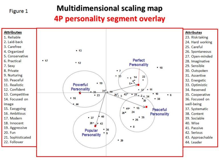
Self-help author Florence Littauer’s Personality Plus personality systems are overlaid onto a multidimensional scaling map of self-descriptions in Figure 1. In this case, respondents were asked to self-assess on a scale of one-to-five. This is a common data-collection technique. The four personality types as defined by Littauer are:
• cholerics – powerful personality type
• melancholics – perfect personality type
• sanguines – popular personalities
• phlegmatics – peaceful personalities
In Figure 1 we ran a multidimensional scaling map and then overlaid each of the four different personality types to see where they would be displayed on the map. Please recall that we have a basic understanding of each type of personality. We want to test if our multidimensional scaling map and overlay confirm our hypothesis of the makeup of these four personality types.

The results are intriguing. Powerful personalities tend to be ambitious and to take leadership roles, as shown in the map. Popular personalities are fun-loving people-persons, who make great, say, receptionists or cruise directors. Perfect personalities are organized and conservative. For example, one would want a detail-oriented perfect as her brain surgeon, rather than a fun-loving popular. Perfects are reliable. They are generally the people that powerfuls rely on for completing their vision. Peaceful personalities are laid-back, cooperative and tend toward passivity. Interestingly, peacefuls tend to rise in large organizations because they do not step on other people’s toes and are thus consensus-builders who are likely to be chosen for leadership. In other words, they duck the dueling powerfuls, don’t bore the populars and finesse the perfectionistic perfects. A great example of a peaceful personality is Ban Ki-moon, the secretary-general of the United Nations, a position whose primary qualification is that you don’t antagonize the leaders of the 193 United Nations Member States.
Arranging the chocolate
A well-known retail sales practice is to place related items next to each other on store shelves. This improves shopping efficiency, which leads to higher sales. For example, in any large supermarket, all the coffee will be in one aisle, next to the sugar, fake creamer and Sweet’N Low. Toilet paper would probably be down a different aisle.
Research continues, however, into more complex placement of products within categories. Thus, companies continue to research micro-categories for more accurate product placement.
In our example, there are 31 chocolate-bar SKUs that the retailer would like to place in an optimum configuration according to customer perceptions of “chocolate class.”
Data collection
For this study, data is collected in a different way, at a specific location (a test kitchen or mall, for example) rather than through the usual panel or CATI approach. Respondents are given 31 cards with the name of a popular candy bar. They are asked to group the 31 SKUs in groups, as many or as few as they like.
Once the data is collected, we create a matrix for each candy bar as it relates to all the others. If a SKU is in the same group as another candy bar, it is noted in the matrix. Given that there are a fairly large number of SKUs, there are 465 ways to create groups of two. This may seem like a large task, but a "do-repeat" loop within an SPSS syntax window can create the matrix on an individual level very quickly.
Once the matrix is complete, the software computes distances between the individual chocolate bars and then projects them onto a two-dimensional space. The results are shown in Figure 2.
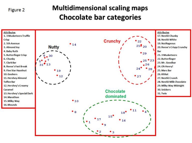
Examining the map, we see that three segments emerge. The labels given the groups are subjective.
What the client should heed, though, is the results of the segments. If he does so, he will display the chocolate SKUs around the created segments. This will make the choice task of shopper easier, result in quicker decisions and most likely lead to more successful transactions.
Multidimensional scaling maps and climate causation
As a final point, we are going to have a look at the weather. Specifically, we shall see the perspective of one study on European attitudes toward the causes and effects of climate change in the U.K. and on the Continent.
Data collection
During the course of a telephone interview, respondents were asked to indicate which causes and affects Europeans believe are related to global warming. They were told to check off the conditions they believe currently exist. The multidimensional scaling map revealed the proximity of causes and effects that Europeans believe are behind the weather changes on the Continent. Figure 3 shows our output.
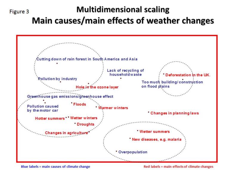
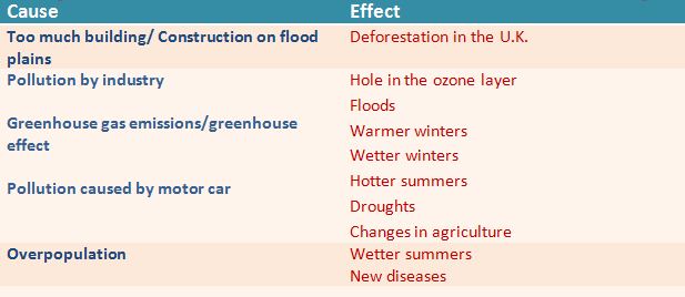
Below is a summary of climate perceptions shown by the multidimensional scaling map. We have colored the segments of causes and effects to distinguish between the groups.
To summarize:
• too much pollution is causing deforestation in the U.K.;
• pollution is causing Europe to be warmer and wetter (and in some cases, drought-prone); and
• overpopulation is causing new diseases.
In short, the multidimensional scaling map gave us a great deal of useful information on our subject, at very little cost.
The value in a graphic
A picture is worth a thousand words. A graphic is worth more.
Each one of these maps yields multiple conclusions that would fill pages. The graphs condense thousands of spreadsheet data points and highly complex analysis techniques into intuitive visual results.
Understanding the relationships between brands and the cause and effects of perceived attributes is the bedrock of successful market research. Visuals are leading the way.