We can do better
Editor's note: Based in Boston, Ken Faro is vice president, research, decision science, and Elie Ohana is researcher, decision science, at advertising agency Hill Holliday
In part one of this article last month, our argument against the general use of top-box scoring was mainly conceptual. After all, we believe this emphasis to be important since research is a conceptual endeavor. The bulk of research is based on rigorous conceptualization of the problem being studied and the method used to best assess the problem. The rigorous conceptualization required in research also includes the statistics chosen to best test the problem being studied. For example, it is important that the measures used in research align with the conceptualization of the problem in the study. Failure to align constructs and measurements could easily invalidate one’s study. For a more detailed treatment on the importance of designing conceptually rigorous and valid measures, see our article: https://bit.ly/2s9w0WR. In the context of the current article, there are a number of reasons as to why, statistically speaking, using averages is better aligned with what we’re testing than using top-box scoring. This is the case for two core reasons and five secondary reasons:
- Different performances on statistical testing
- Loss of information (loss of power; loss of effect size; loss of variance explained; loss of non-linearity; loss of visual information)
The authors assessed each of the reasons by performing 1) a simulated data set created to approximately match the distributions in part one’s Sample 1 example (see Table 1, 2 and 3 in part one); and 2) a real data set from a survey fielded approximately one year ago. We will show how both the simulated and the real data provide striking results that support our position.
Different performances
The first statistical reason to question top-box scoring versus using averages is the fact that they perform differently. Let’s again use the Sample 1 data in Table 1, 2 and 3 from part one. When testing for differences in the proportion of top-box scores, the z-test for two independent sample proportions yields a z-score of -4.45, which has a p-value of <.001. It’s significant! However, when using the full Likert scale, the independent samples t-test yields a p-value of .11 – not significant. So now what do you do? How do you interpret two tests which are often used as proxies of one another, knowing that one might flag significance while the other one might not?
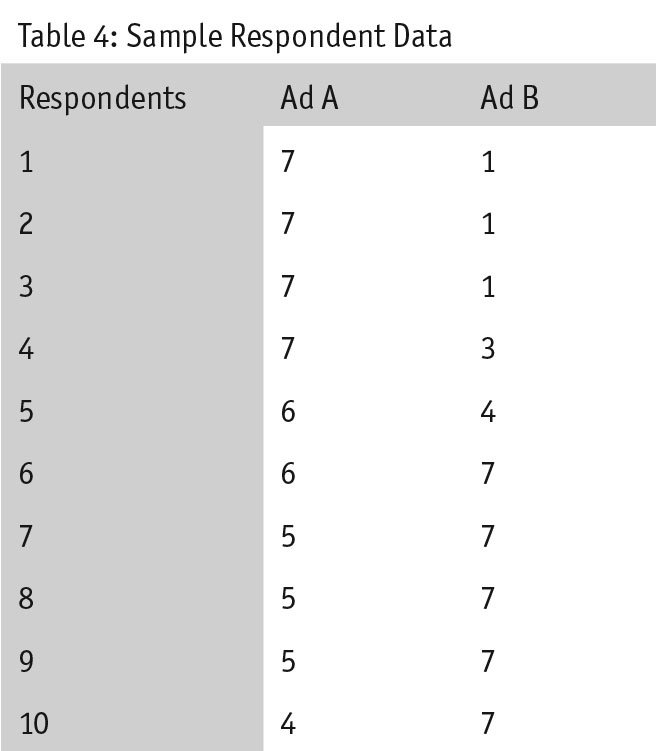
The reverse of Sample 1 can also happen. Imagine we conducted a survey with 100 respondents per ad and the data set that comes back has the distribution shown in Table 4.
 When testing the top-box score, the difference between two independent proportions yields a z-score of -1.4, which has a p-value of .16 – not significant. However, when testing the full scale, the independent samples t-test comes back as significant – a p-value less than .001. Again, what do we as researchers do in this case?
Simulated studies: To some, the above two examples might seem too artificial – contrived examples to make the authors’ points. To illustrate that this is not the case, we put our claims to the test in a simulation study. In this study, we simulated data for respondents who, for the purposes of this article, were presumably answering the extent to which they liked the ad they saw. To do this, we created two normal random variables, one to represent respondents’ ratings of Ad 1 and one to represent respondents’ ratings of Ad 2. To simulate our examples, each variable was distributed around the Sample 1 means highlighted in Table 3. However, to make our simulation closer to real data, we injected noise into the distribution. We accomplished this by setting the mean and standard deviation for each simulation to a random number within +/-.5 units of our Sample 1 data (e.g., for Ad 1, mean = 4.5-5.5 and SD = 1.06-2.06). Additionally, to capture the behavior of the test as a function of sample size, we varied the sample size (i.e., 100, 200, 300, 500 and 1,000). With all of these considerations, we were able to estimate the percent of times that top-box scoring and Likert-scale scoring showed the same results.
When it comes to smaller sample sizes, such as when N = 100, top-box scoring and Likert-scale scoring yield completely different results. For example, out of 1,000 simulations, a t-test finds 538 of the studies to have a significant difference. Conversely, when using top-box scoring, only 125 out of the 1,000 studies were found to have significant differences. In total, only 14 studies (1.4 percent of total simulated studies) found overlap between the two tests. If only 1.4 percent of 1,000 studies have overlap between the two tests, it seems fair to assume that the tests perform very differently.
Even when we increase the sample size to 1,000 respondents, we find a similar – albeit less extreme – pattern. Again, simulating 1,000 different studies, 845 were found to be statistically significant when testing for top-box scores. All 1,000 studies were found to be significant when testing for a difference in the averages. This means that out of 100 percent of the studies deemed statistically significant by the top-box score, the t-test was also significant. However, the reverse is not true: 16 percent of the studies that were significant when using a t-test were NOT significant via the top-box scoring.
Real data: But simulated data is just that – simulated. And those who are familiar with the many pitfalls of real-world data sets know all too well that some data sets can create havoc among otherwise neatly known statistical principles. To examine the ecological validity of these findings, we sought to replicate them with a real-world creative testing data set.
Additionally, the authors believed that a stronger argument could be made if we were to test the performance of averages and top-box scoring on more than one item. Testing on multiple items would demonstrate that the pattern we observed was not just a function of an idiosyncratic fluke in one item but rather an established pattern across multiple items.
The data set used for this analysis was collected in Q4 2017 and was used when testing creative for a pitch. There were two pieces of creative used for this analysis. After exposure, respondents had to answer questions in two main sections: ad assessment (e.g., Overall, how did you like the ad? Was it memorable?) and consumption outcomes (e.g., After seeing the ad, how likely are you to visit the Web site? The store?). We numbered all of the items in these sections and used a random-number generator to select the outcomes for this article. The items selected are:
• How much do you agree or disagree with the following statement about what you just saw?
-- It grabbed my attention.
-- I think it was unique.
• After what you just saw, to what extent would you consider working for each of the following companies?
• After what you just saw, to what extent would you recommend to a friend or colleague that they should work for each of the following companies?
We then conducted statistical tests to explore differences between responses for the two creatives across the questions. To make the analysis comparable to the simulation, we bootstrapped the results by resampling 1,000 times. Bootstrapping involves conducting an analysis multiple times in order to obtain more precise estimates. The results of our analysis can be found in Tables 8-11.
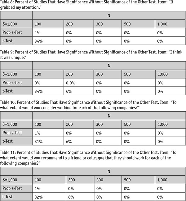
We observe a very similar trend. At lower sample sizes, a smaller proportion of cases (0-1 percent) found top-box scores to be significantly different when the t-test was NOT significant. However, 31-34 percent of the tests that the t-test found significant were not found to be significant by the top-box scoring statistic. Again, this suggests that each statistic performs very differently. It is only when sample size increases dramatically that this trend disappears as all comparisons for both tests are flagged as significant.
The bottom line: When sample size is small, each test performs differently. Generally speaking, a t-test identifies more differences than the z-test used for top-box scoring.
Loss of information
The second major statistical reason for not using top-box scoring is that market researchers who use that statistic are intentionally throwing away information. They are taking a scale, which in the above example has seven potential pieces of information (seven points on the Likert scale) and reducing it to two points – top-box and not-top-box. That means they are intentionally throwing away five pieces of information. Throwing away information leads to several different effects. Most important are the effects on five key areas: power, effect size, variance explained, non-linearity and visual information. Below, we provide a detailed analysis of each effect.
Loss of power: Every statistical test is like a market researcher’s microscope. You need a more powerful microscope to see smaller things and a less powerful one when looking for bigger things. This analogy holds in statistics – you need more power to detect small differences and less power if you’re looking at bigger differences. Power is a way of expressing the probability that the researcher will find a significant difference that is real (as opposed to a false negative or not finding a statistical difference when there really is one). Because ensuring that we have sufficient power is central to achieving a good study design, we recorded power in each of our simulated studies discussed above (see Table 12).
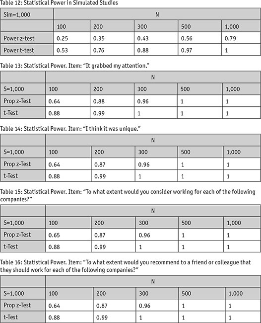
Notice that in both cases of low sample size and high sample size, the power is always higher for the t-test, not for the test used on top-box scoring. In fact, at the lower sample sizes, the power of a test for top-box is approximately half of the size of its t-test counterpart.
We similarly replicated the effects of using top-box scoring on statistical power within our real-world data set. This data set did not reveal the difference of the same magnitude as the simulated data set. However, the pattern still holds – in all cases, a t-test has equal or more power than the z-test used for top-box scoring.
To help frame this differently, let us specifically look at the results of power when N=100 in Tables 13-16. Across the board, the test for top-box scoring has a power of 0.64 - 0.65 relative to the t-test, which has a power of 0.88. To put these results in perspective, using top-box scoring (where N = 100) leads to a similar loss of power as running a t-test on a sample of 57.
The difference in power between the t-test and the z-test may be explained by looking at what affects power. This includes:
- sample size – the more sample, the more power you have;
- alpha – the smaller significance criterion, the more power you need;
- effect size – the smaller the effect size, the more power you need.
In our simulations and real data sets, sample size remained consistent (matching conditions when N = 100-1,000) as did the alpha (at .05). However, for a given sample size, the effect size was reportedly smaller in the tests using top-box scoring, something we will demonstrate next.
Loss of effect size: One of the reasons both tests yield different outcomes (i.e., presence or absence of a significant result) is because the effect we’re testing differs. Effect size is a statistical measure that assesses the practical significance (not statistical significance) of a test – namely, how big of an effect does one thing have on another. To see how effect size differed between top-box scoring and averages, we recorded the effect sizes from our simulation studies (see Table 17).
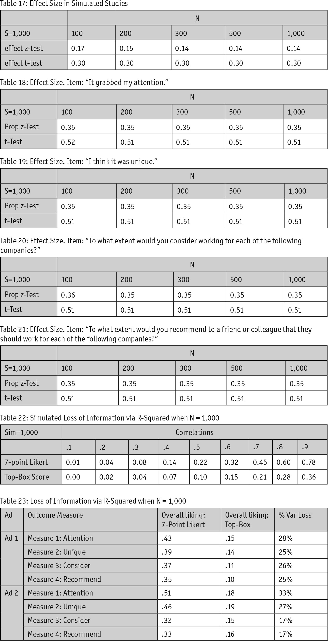
Notice that once again, we observe a similar pattern. In all cases, the effect size measured by the t-test is higher and twice the size as the effect size of the z-test used for top-box scoring. This means we are “dampening” the measurement of the effect of seeing an ad on key performance indicator. It’s not advantageous for us to use a statistic that dampens the effects because then once again, we have an artificial read on how are ads are doing.
To confirm that this pattern is generalizable, we also examined the differences in effect size between measurement methods using our real-world data set (see Tables 18, 19, 20 and 21).
Again, the effect sizes for t-tests are almost twice as big as the effect sizes for top-box scoring. For advertisers, this means that by choosing top-box scoring, we are artificially DEFLATING the measure of the effect our ads have on consumers. Ultimately, what is the point of testing our ads if we are not going to properly test the effect they have on key performance indicators and behavioral activations?
Loss of variance explained: Very similar to the way in which we’re dampening the measurement of how our ads affect consumers, by using top-box scoring we also are losing considerable information when using variables like how much a respondent likes an ad to explain behavioral activations, such as visiting the store’s Web site. Oftentimes, we use r-squared as a measure of how much variance the x variable explains in the y variable. The authors set out to simulate what one might find when using r-squared with a predictor variable coded as either continuous or top-box. To do this, the authors took the original variable (see Tables 1, 2 and 3) and created a second variable which was correlated to the first. We then varied the strength of the correlation. Notice how in the simulations below, as the correlation gets stronger, the r-squared values grow further apart. The pattern suggests that by using top-box scoring, we are explaining half as much variance than using the original continuous variable.
We replicated a similar finding within the real data set as well. While we did not manipulate the real data to vary the correlations between the predictor and outcome variables, overall, we observe the same trend – top-box scoring only explains about half as much variance in comparison to when the overall Likert scale is used.
Loss of visual inspection: If you are less inclined to accept the case we’ve made for our position with statistics and simulations, let the graphs speak for themselves. We can understand this loss of information intuitively through scatterplots. Plot 1 illustrates a scatterplot of the simulated data from the last section. Specifically, this first graph plots both the x-axis and y-axis in their original form – as Likert scales.
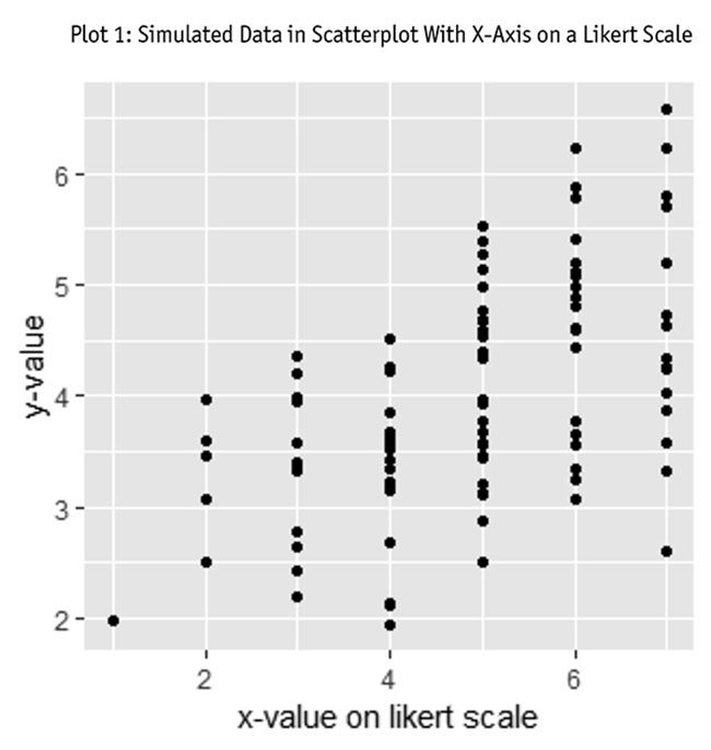
Even to the untrained eye, this graph shows a clear relationship – higher values on the x-axis are associated with higher values on the y-axis. This intuitive understanding of the data is lost if we were to use top-box scoring. For example, take a look at Plot 2. This plot has the same exact data but with the x-axis recoded using top-box scoring.
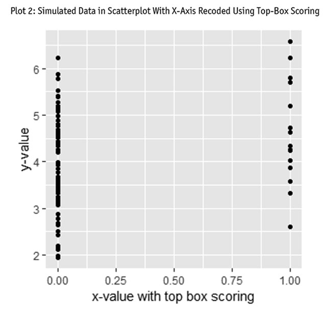
It is not impossible to see a trend here but it’s certainly much harder – and less intuitive. Top-box scoring takes the data along with all its variability and collapses it on top of itself. So visually, we often go from clear trends that are observed as variability across a range of values to vertical lines.
This doesn’t just make the graph harder to understand, it also dampens trend line. Consider Plots 3 and 4. Plot 3 shows the simulated data shown above (in Plot 1) but this time with the trend line overlaid. Similarly, Plot 4 shows the same exact data as Plot 2 along with a trend line.
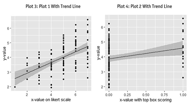
The first thing you might notice: the line in Plot 3 shows a more distinct trend than Plot 4. In fact, the pattern in Plot 4 seems to have moved closer to a horizontal line, which would indicate no trend.
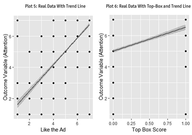
When we turned to the real data set to replicate this finding, we saw a similar effect. Plot 5 shows a clear strong positive relationship when all the scale information is used. However, in Plot 6, that relationship is weakened as the trend line once again becomes more horizontal.
Whether we choose to look at the effects found in the simulation or the effect in the real data set, once again, we see that the measures perform differently.
Loss of non-linearity: Looking at statistical relationships in scatterplots is valuable. For example, the data doesn’t always show neat linear relationships. Nonetheless, we often simply assume a linear relationship and carry on with our analysis. While many market researchers execute their statistics under the assumption of linearly related variables, it is possible that non-linear relationships exist.
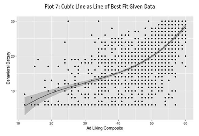
For example, Plot 7 shows a cubic relationship between how much consumers liked an ad and their willingness to engage in specific behaviors (such as visiting the brand’s Web site). What we see is that both for low and high ad-liking score, an increase in one point of ad-liking sharply increases how willing someone is to engage in our target consumption behaviors. However, in the “middle” of the ad-liking score, an increase in one point of ad-liking is associated with a small incremental increase in how willing someone is to engage in our consumption behaviors.
Using top-box would not pick up on this trend. Instead, it would assume no trend at all. Again, this visual example illustrates the details we throw away when we settle for top-box scoring.
Other work should be done
It should be clear by this point that there are a number of different reasons as to why market researchers might not want to use top-box scoring. For both conceptual (see part one) and statistical reasons, it should not be used as a general practice, except for specific cases when counting people who are high on a measure is of direct relevance to the goals of the research. However, both authors would like to emphasize that this article bases its conclusions on only one simulation study and one real data set. Therefore, our conclusions should not be accepted as true in all cases. Other work should be done to examine if the observations made in this article replicate on other data sets. Only through replication can we as a discipline feel confident in the claims made in this article.
Hence why the objective of this article is not to say top-box scoring is always bad and should never be done. Instead, the goal of this article is merely to suggest a healthy sense of skepticism of a measure that is widely used within the applied field. Furthermore, because of the drawbacks of using top-box scores outlined in this article, we hope to encourage researchers to think carefully about the variables in their study and how they are choosing to measure them. How we choose to measure variables has a profound effect throughout our research. Choosing measures poorly leads to obtaining results with questionable validity. No client wants to make a business decision based on results that were poorly conceptualized and measured. So the next time you go to use top-box scores, ask yourself if you have the right study for that measure.