
Editor’s note: Christian Super is VP, U.S. technology solutions at ENGINE Insights.
 With the rise of multi-channel feedback including behavioral data, operational data and survey data, reporting for your customer experience (CX) program is more challenging and important than ever before. Many brands are feeling challenged to report CX information in ways that reduce confusion and data overload – and result in action that ultimately impacts business outcomes. Following are six best practices to ensure that your CX reporting is successful in today’s multi-channel world.
Focus reports and dashboards on actionable information
Focus users on key actionable measures using good design and layout. Don’t clutter reports with non-actionable data. Note that design is an academic subject, so don’t rely solely on people who like to make pretty PowerPoint slides. Seek experienced experts in dashboard and report design. If you adhere to sound design principles, your reports will be easier to read and your team will be able to focus on the information that matters most.
To understand what metrics to focus your reports on, first determine what is actionable and how your metrics correspond to your organization’s desired business outcomes. For example, link a business outcome of increasing revenue to customer’s impression of ease of ordering or overall satisfaction with your product or service. This could include actionable metrics related to cost reduction or could include items like number of calls to a support line or the percentage of orders fulfilled in one shipment versus multiple shipments.
Use techniques such as text analytics, driver analysis or segmentation analysis to determine which metrics truly drive your organization’s desired business outcomes. Work to identify how those metrics and measurements can drive action across all the roles in your organization.
Create a single source of the truth
Combine data from financial, operational and feedback systems into one reporting platform. Avoid wasting time comparing data from disparate systems and arguing over who has the “right” data.
We’ve helped clients enrich their CX data by combining survey data with internal financial and products data, digital clickstreams and phone center statistics to help them gain greater insights into their organization’s strengths and weakness. This work creates one source of CX information that provide the full context needed to analyze the data.
Don’t overdesign reports and dashboards
You don’t need gauges and fancy infographics to effectively communicate. Dashboards communicate information at a glance. Don’t overload your corporate dashboards with unnecessary metrics and visualizations that impede communication of what’s important to the user.
“Good usability is essentially a mission-critical element of customer experience (CX).” – Goran Paunovic, Forbes.com, February 28, 2019
The dashboard metaphor, for example, is not well-suited to clear communication. This metaphor has led vendors and therefore users to create dashboards that mimic automobile dashboards with gauges, meters and even traffic lights (which are not even part of current-day car dashboards). But these visualization elements are often poor choices to focus users of actionable information because they don’t match the scale type (e.g., nominal, ordinal, interval), they take up too much space compared to the information communicated – thus taking up space for other useful information – and they don’t allow for easy comparison between segments, targets or benchmarks.
Another example of the weaknesses of poor designs is also illustrated by car dashboards. Car dashboards do not give context to make information actionable. For example, knowing that you are going 45 miles per hour is not helpful by itself. You need the context of whether you are in a school zone or what the speed limit is. A simple display of a single number +/- mph versus speed limit is more useful and actionable than a speedometer graphic.
Good design involves an educated layout using simple elements. Use sparklines, tables, bar charts, column charts, scatterplots and text to focus users on what is important. Avoid overloading screens with visualizations when simple tables and text can communicate information more clearly.
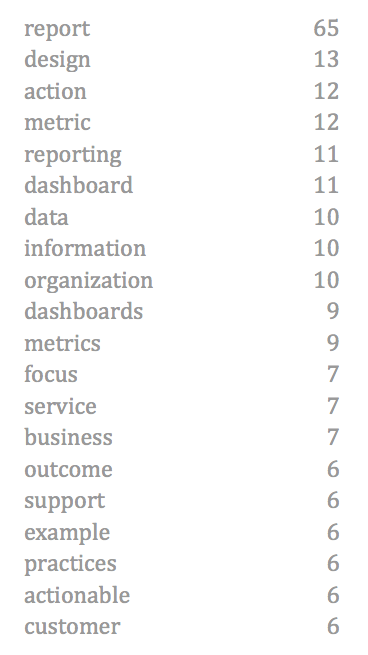
Which item below makes it easier to see the frequency and relative ranking of words?
Design reports by role
Design and target reports relative to your organization’s roles that support decision-making and action. What works well for an operations manager has little value to the CEO and vice versa.
Match report design and delivery mechanism to roles. Provide trended reports with benchmark comparisons to managers, give operations staff real-time information and push PPT summaries to executives like in the telecommunications example shown below.
ENGINE works with a large telecommunications company who requires reporting for their brand managers and advertising group, as well as senior executives including the CEO. Our team discovered that our insights client was manually creating a one-page PPT scorecard for the CEO. We were able to assist the client by redesigning, then automating the report to the CEO so it looks cleaner, reduces work for our client and provides the CEO with the key metrics he requires.
Beyond real-time reporting, organizations with mature CX practices go farther to get the maximum value of their feedback channels via reporting. Consider providing standard static reporting on monthly, quarterly and annual basis. Some roles require less frequent reporting than others. For example, a CEO does not need a daily update on NPS.
Monthly reporting, for example, could consist of the year-to-date NPS metric with some comments from customers categorized as “detractors”. Pushing these reports to all employees based on their role provides a regular check-in on progress and evidence of those facts.
Quarterly reporting could include not only the year-to-date NPS metric but also the trend line for the metric and a comparison to a target or benchmark. This type of report is appropriate for all employees as a shared vision of corporate progress. It would communicate best practices, celebrate success stories and inspire everyone to provide better service. As a reminder, this report isn’t designed for action – real-time dashboards, reports and anomaly reports take care of those items.
An annual report on CX could mimic a corporate annual report – or could even be part of a corporate annual report – with lots of text summaries, pictures and infographics to highlight successes and point out areas of improvement for the upcoming year. This report would be distributed to all employees and to customers as well. By providing customers with a CX report, an organization demonstrates its commitment to service improvement and will result in high levels of customer response to future requests for feedback.
Alignment of reporting frequency to frequency of action and decision-making is key. Front-line workers should try to improve customer experiences every day. Therefore, these workers need real-time data that they can act on to improve customer experiences. Managers of front-line workers should be making sure that their team’s metrics are improving over time. Monitoring improvement at daily intervals would result in micromanagement but use of weekly or monthly intervals are more likely to illuminate trends in service quality. Corporate CX owners and management also need to monitor macro trends in CX performance. To ensure that the organization isn’t just chasing anomalies, management should look at monthly or quarterly reports and focus on differences that are statistically significant.
Sharing these reports across the organization supports a common vocabulary and common CX metrics and also creates a great way to highlight best practices. And it can stir up some healthy competition within the organization to provide better customer experiences.
Provide self-service interactive and static reporting
Self-service interactive reports and static reports are both contributors to the overall success of your CX effort. Self-service reports and dashboards support analysis (“digging in the data”) to find answers to immediate business challenges. Static reports – whether delivered on a portal or through paper/PDF reports like the monthly, quarterly, annual reports mentioned above – help to create a shared view of the organization, communicate common metrics and support a common vocabulary.
Support analysis and exploration via filters
For interactive reports, provide filters to all granular views by region, brand, product, question, employee or whatever parameters you hope to more clearly understand.
Creating a suite of CX reports that provide information at-a-glance, support action, are tied to business outcomes and that are easy to use is a challenging task. With the rise of self-service enterprise feedback management (EFM) tools, end-users in brand management or marketing are often tasked with developing the reports. Design and delivery of a broad set of reports across your entire enterprise is better suited for CX specialists who have training and experience to apply these best practices to maximize the ROI of your CX program.