
Editor's note: Greg Ryan is owner of Ryan Consulting. He can be reached at ryan.greg@comcast.net.
Picture for a moment (if you will) the time, effort and money spent to build a survey draft, field it, tabulate and analyze data – only to find that the final overall metrics or scores the researcher used were faulty or misleading.
Not only has the researcher wasted their effort and their client’s money but perhaps more importantly, they have squandered respondents’ valuable time, to say nothing of the cost of incentives, etc.
Why is choosing the right customer metric so important to researchers? (In this discussion, when we say “customer metric” we are referring to overall customer satisfaction or customer loyalty metrics.) Many companies place great emphasis on KPIs like overall satisfaction or loyalty scores and include them in their corporate goals and compensation and/or bonuses. But what if the system of gathering and measuring these corporate goals and the resulting employee compensation was flawed? Not a good predicament to be in.
There are two metrics, which incorporate a five-point scale, that have been used for many decades without problems or flaws (provided the research is done correctly): the “gold standard” American Customer Satisfaction Index (ACSI) customer satisfaction question – “How satisfied are you with the following product/service?” – and also a standard loyalty metric question – “How likely are you to purchase X products or services in the future?”
I was employed as a research consultant for nearly four years at Kaiser Permanente, where I was responsible for research, metrics and executive interface for its largest lines of business (national accounts, strategic accounts, labor and trust, etc.). When I first joined Kaiser, executives were complaining that Kaiser’s Net Promoter Score (NPS) appeared to be very unpredictable. I informed them that NPS was a volatile metric and that we should adopt a different one. The problem was, employee and executive compensation and scorecards were tied to NPS, so naturally the executives were hesitant to change. I suggested that we do a real-world customer metric comparison by having two loyalty metrics in the surveys versus just the NPS.
For a couple years, we used both the standard ACSI five-point loyalty metric question, “How likely are you to purchase X products or services in the future?” simultaneously with the NPS metric question “On a scale of 0 to 10, how likely are you to recommend Kaiser Permanente to a friend or colleague?”
At the end, we closely examined the differences between the two metrics (especially since employee and executive compensation were based on them). The results were conclusive: We found the NPS score to be of no value to Kaiser and further that it actually provided negative value because of its volatility. (While the NPS score fluctuated wildly, all the other question scores in the survey remained almost identical over the same period.)
Let’s discuss the numerous significant flaws of the NPS scoring system and why NPS system failed:
• Begin with the NPS question and wording itself. The NPS question is based around measuring the respondent’s likelihood to recommend. First of all, many respondents would never naturally or formally recommend in the first place, so this is not a good question to ask. Therefore, a score of 9 or 10 doesn’t mean respondents will actually recommend. Rather, likelihood to purchase (vs. recommend) is a better indicator in most cases. For an article published in 2008 in the MIT Sloan Management Review (“Linking customer loyalty to growth”) a study found no evidence that NPS was the best predictor across customers’ future loyalty intentions. The authors also attempted to find a link between NPS and growth, a part of the NPS measure that has been attractive to companies. They examined data from more than 15,000 consumers and 21 companies over multiple years. They then added in the growth rates for those companies. None of the range of metrics they examined, including NPS, was found to be a good predictor of growth. As the authors note, “Even when ignoring statistical significance (the likelihood that the correlations occurred by chance), Net Promoter was the best predictor in only two out of 19 cases.” They conclude that, “based on our research it is difficult to imagine a scenario in which Net Promoter could be called the superior metric.”
Also another example of problems with “likely to recommend” comes from a study titled, “Measuring customer satisfaction and loyalty: improving the ‘Net-Promoter’ Score,” by Schneider, Berent, Thomas and Krosnick (2008), who found satisfaction is a stronger predictor than the likelihood of recommending.
• Measuring NPS is simply a case of asking the following question: How likely is it that you would recommend X to a friend or colleague? It uses an 11-point scale of 0 (not at all likely) to 10 (extremely likely) and, based on their responses, customers fall into one of three categories: Promoters respond with a score of 9 or 10; Passives respond with a score of 7 or 8; Detractors respond with a score of 0 to 6. Net Promoter Score is calculated by subtracting the percentage of Detractors from the percentage of Promoters. (The percentage of Passives is not used in the formula.) For example, if 10% of respondents are Detractors, 20% are Passives and 70% are Promoters, your NPS score would be 60 (70-10). Here’s one example in which the NPS calculation provides flawed computational results: a combination of 20% Promoters, 80% Passives and 0% Detractors gives the same score as 60% Promoters, 0% Passive and 40% Detractors!
• Another NPS score computational issue is that NPS is not symmetrical (top-two boxes minus the bottom six).
• The NPS 11-point scale lacks labels on the scale to guide respondents (including no neutral label).
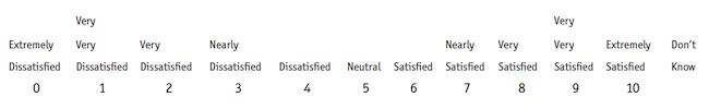
• Well-known researchers (such as Jon Krosnick, see below) have completed extensive studies mentioning that respondents have problems differentiating beyond a seven-point scale. In fact, this author cannot differentiate using an 11-point scale so I don’t expect my respondents too either. To illustrate why an 11-point scale is so difficult to differentiate, the example above shows how ridiculous an NPS scale would look like if you put labels on the scale. Do you realistically expect your respondents to be accurate with this NPS scale, labeled or unlabeled?
• A score of 0 on the scale throws off respondents who are used to seeing a 1.
• In addition, reducing an 11-point scale to three points increases the statistical variability.
• NPS scores vary by industry.
• Sample sizes need to be increased for NPS.
• In a July 2007 Journal of Marketing article (“A longitudinal examination of Net Promoter and firm revenue growth”) the authors offered empirical evidence using data from 21 firms and 15,500 respondents: “We find that when making an ‘apples and apples’ comparison, Net Promoter does not perform better than the American Customer Satisfaction Index (ACSI) for the data under investigation. [NPS creator Fred] Reichheld acknowledges the ‘imperfections’ in the analytics that were used to support Net Promoter. Unfortunately, the statistics matter.”
The best empirical evidence about scale lengths is research provided by Stanford professor Jon Krosnick, who is viewed by many as one of the leading authorities on research and, specifically, scales. In systematic reviews, Krosnick and colleagues (Krosnick and Fabrigar, 1997; Krosnick and Presser, 2010) came to the conclusion that an optimal measurement – in terms of reliability, validity and degree of differentiation – could be achieved with five to seven categories. Respondents also preferred scales of this length.
In addition, an article by Peter Stuchbery (“Tracking KPIs with confidence”) gave evidence that the NPS system requires larger sample sizes and must be increased by two to four times (in excess of 1,200 respondents for 95% confidence intervals): “In practice, based on analysis of actual NPS data across industries we have found that to reduce the error associated with NPS to be similar to that of a top-two box score, sample size needs to be increased in the order of two to four times, on average. For most tracking studies this is either not practical from a budgetary perspective or just not possible in terms of the numbers of respondents required.”
All of the issues above contribute to the volatility of NPS and many others have experienced the same volatility with NPS – in my view rendering it not usable.
If you review the NPS flaws in detail – and there are many, from the NPS question itself to the scoring system and score calculations, etc. – and you’re still not convinced of the NPS issues, I recommend you do like we did at Kaiser and run the NPS question and ACSI question wording (using a five-point scale) simultaneously in your surveys and see the results between the two metrics for yourself.