Editor's note: Tony Babinec is a market manager at SPSS Inc., a Chicago-based company that writes and markets software for market research and analysis.
For most of us, the analyses we do produce results in tabular form. It is useful to be able to look at these tables in a number of ways. In this article, we present several useful ways of doing so.
Example 1
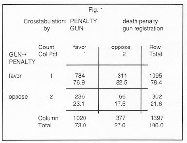
Our first example looks at the contingency table relating attitude towards the death penalty to attitude towards gun registration. The table is shown in Figure 1.
 |
The table is based upon the 1982 General Social Survey, and can be found in Agresti's "Categorical Data Analysis" (published by John Wiley and Sons, 1990). In our analysis, we wish to treat attitude towards the death penalty as the dependent variable, and attitude towards gun registration as the explanatory variable. The categories "favor the death penalty" and "oppose the death penalty" define the rows of the table. For this reason, we present not only the cell counts but also the column percents, which sum to 100 in each column. That is, we percentage down and compare across.
Such a comparison reveals a small negative association between the two variables. That is, in the first row, the upper right-hand cell has a larger percentage than the upper left-hand cell, while in the second row, the lower left-hand cell has a larger percentage than the lower right-hand cell. Focusing on the second row of the table, the PERCENTAGE DIFFERENCE is
17.5 - 23.1
which equals -5.6%. This leads to a straightforward description of the effect of the explanatory variable (attitude toward gun registration) on the dependent variable (attitude toward the death penalty): those who favor gun registration are an additional 5.6% more likely to oppose the death penalty than those who oppose gun registration. Note that in a two-by-two table, if we express the percentage difference as a proportion (-0.056), we have a special case of the measure of association known as SOMERS' Dyx. If the row and column variables are not associated, the column percents in all columns would be identical, giving rise to a percentage difference of 0.
Another way of expressing the association in Figure 1 is by means of ODDS. Looking at column I of the table, if the respondent favors gun registration, the odds of favoring to opposing the death penalty are 784 to 236 or 3.322 to 1, while if the respondent opposes gun registration, the odds of favoring to opposing the death penalty are 311 to 66 or 4.712 to 1. Meanwhile, the odds on the margin of the table are 1095 to 302 or 3.626 to 1. If the row and column variables were not associated, the odds in each column would equal the odds on the margin. As it is, there is evidence of association between attitude toward gun registration and attitude toward capital punishment, for the odds appear to vary across columns.
Comparing the odds gives rise to an ODDS RATIO. That is comparing 784/236 to 311/66 gives rise to a ratio of 0.705. Those who favor gun registration are 0.7 times as likely as those who oppose gun registration to favor the death penalty.
Figure 2
Parental SES
|
|
a |
b |
c |
d |
e |
f |
Total |
|
mental health |
|
|
|
|
|
|
|
|
well |
64 |
57 |
57 |
72 |
36 |
21 |
307 |
|
column |
24.4% |
23.3% |
19.9% |
18.8% |
13.6% |
9.7% |
18.5% |
|
|
|
|
|
|
|
|
|
|
mild |
94 |
94 |
105 |
141 |
97 |
71 |
602 |
|
column |
22.1% |
22.0% |
22.6% |
20.1% |
20.4% |
24.9% |
21.8% |
|
|
|
|
|
|
|
|
|
|
moderate |
58 |
54 |
65 |
77 |
54 |
54 |
362 |
|
column |
22.1% |
22.0% |
22.6% |
20.1% |
20.4% |
24.9% |
21.8% |
|
|
|
|
|
|
|
|
|
|
impaired |
46 |
40 |
60 |
94 |
78 |
71 |
389 |
|
column |
17.6% |
16.3% |
20.9% |
24.5% |
29.4% |
32.7% |
23.4% |
In table larger than two-by-two, it is useful to look not only at odds ratios but also at LOG-ODDS RATIOS. The reason for working in logarithmic units is this: In the odds-ratio metric, an odds ratio of 1 indicates absence of an effect in the row and column categories being compared. An odds of 1 to 3 (0.333) and an odds of 3 to 1 (3) are effects of equal magnitude but opposite direction. However, 0.333 is not as far from 1 as 3 is from 1. On the other hand, expressing everything in logarithmic units produces a nicer metric. The logarithm of 1 is 0, the (natural) logarithm of 3 is 1.099, while the logarithm of 0.333 is -1.099. That is, in the logarithmic metric, odds of 1 to 3 and 3 to 1 appear equally far from the zero point. The use of these ratios is illustrated in the next example.
Example 2
Our second example looks at the four-by-six table relating the mental health status to the socioeconomic status of 1660 respondents.
The table is originally attributed to a 1962 study by Srole, and is often found in the categorical data analysis literature. In our analysis, we will treat mental health status as the dependent variable and socioeconomic status as the explanatory variable. As in the previous table, we present column percentages; again, percentage down and compare across.
The table shows an interesting pattern. In the first row, the percentages decline from 24.4% to 9.7%, for a difference of 14.7% in magnitude. In the second row, the percentages fluctuate by small amounts around the marginal value of 36.3%. In the third row, the percentages fluctuate by small amounts around the marginal value of 21.8%. In the fourth row, except for a slight reversal in the first two columns, the percentages increase from 16.3% to 32.7%, for a difference of 16.4% in magnitude. It appears that whatever "action" there is in the table resides in the first and last rows, and the difference between either of these rows and the two middle rows. On the other hand, there is little difference across rows two and three. The general trend in the percentages in the table is for larger ones in the upper left and the lower right, suggesting a positive association between mental health status and socioeconomic status.
Now, consider that the four-by-six table we've been examining consists of a bunch of adjacent two-by-two subtables. For example, "well" and "mild" by "a" and "b" is the following table:
|
64 |
57 |
|
94 |
94 |
While "well" and "mild" by "b" and "c" is
|
57 |
57 |
|
94 |
105 |
And so on. There are a total of 15 of these subtables. The association in the four-by-six table can be summarized in the following l 5 odds ratios and their averages:
|
|
|
|
|
|
avgs. |
|
1.123 |
1.117 |
1.063 |
1.376 |
1.255 |
1.187 |
|
0.931 |
1.078 |
0.882 |
1.019 |
1.366 |
1.055 |
|
0.934 |
1.246 |
1.323 |
1.183 |
0.910 |
1.119 |
The 15 odds ratios fluctuate somewhat, but note that in rows one and three they are on average somewhat above 1, while in row two (the comparison of rows two and three of the original four-by-six table) the odds ratios are on average nearer to one.
Examining the log-odds ratios reveals the same pattern, this time centered around 0:
|
|
|
|
|
|
avgs. |
|
0.116 |
0.111 |
0.061 |
0.319 |
0.227 |
0.167 |
|
-0.071 |
0.075 |
-0.125 |
0.019 |
0.312 |
0.042 |
|
-0.068 |
0.220 |
0.280 |
0.168 |
-0.094 |
0.101 |
While we do not detail how to do it here, one can use available software such as SPSS LOGLINEAR or Clifford Clogg's ANOAS program to fit models to the original four-by-six table which take into account the pattern of the odds ratios. For example, one could fit a simple model which assumes that the association in all of the two-by-two subtables is uniform; or that the association between rows one and two across adjacent columns is of a certain degree, while being different from the association between rows two and three across different column s, which is different yet again from the association between row three and row four across columns.
Conclusion
Using two example tables, we have shown how the use of percentages, the percentage difference, odds, odds ratios, and the log-odds ratios can lead to understanding and illumination of the pattern of association in two-way tables. In truth, one should be able to move with ease among these different interpretations for the same table. Doing so will lead to better understanding and presentations to clients.