
Healthy strides
Editor's note: Shelley Krasnick is vice president, marketing effectiveness at GfK. Josh Billig is market research manager at Microsoft.
In some ways, inclusion – from a statistical vantage point – has been on the minds of insights professionals for decades. Representation has been a mark of quality in research of all kinds, assuring that all voices are counted in proportion.
But inclusion has now evolved into a much broader concern, one that has grown well beyond sample sizes and population counts. Brands need to recognize and meet the needs of all types of consumers – ethnically diverse, differently abled and with a strong preference for certain modes and devices for communicating. Researchers need to take on this newly expansive definition as both a mission and a mandate; if getting representation right was complex before, it has grown even more challenging – and more important.
A journey, not a destination
First and foremost, we would not claim that we have solved, once and for all, any of the myriad challenges around inclusivity in research. This is a journey, not a single destination, and we share our experience to date in that spirit. Everyone has something to contribute and companies throughout the insights industry will continue to learn from and improve on each other’s work. Inclusivity is not something any one company – or even pair of companies – can conquer alone but we are making strides.
Three of the areas where Microsoft and GfK have collaborated over the last several years are all top-of-mind for insights professionals today:
- making research truly mobile-first – prioritizing the devices that most people use to complete surveys these days, thereby representing the online population;
- assuring that Hispanic populations are represented proportionally in surveys; and
- making research participation accessible to everyone regardless of ability.
Important place to begin
Our journey to be mobile-first actually started back in 2018. It doesn’t fit into the traditional definition of diversity, equity and inclusion (DEI) but when we were putting this story together, we recognized that device usage is an important place to begin talking about inclusivity. GfK Consumer Life data shows that 75% of Americans age 15+ used a smartphone in the past 30 days. Moreover, if they had to give up all but one of their possessions, most people in the U.S. would choose to hang onto their phones. This incredible symbiosis and dependence, developed over just the past 20 years or so, has had a profound impact on research participation – but not always on study and survey design.
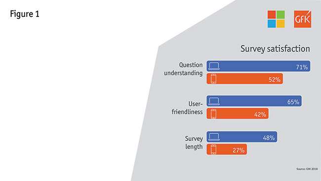
When we began this process, like many others in the industry, we were still overly oriented to PC-based survey-taking. As we looked deeper into the experience, we could see clear evidence that our survey experience served in this manner was not optimal for those on a mobile device. In fact, while smartphones accounted for 30% of survey starts, they only accounted for 5% of our survey completes. And survey satisfaction metrics were markedly lower among those taking a survey on a smartphone. Seven in 10 PC respondents felt they fully understood the survey’s questions, compared to just half for smartphones (Figure 1). And we saw similar differences when it came to user-friendliness and survey length.
So what does this mean and why does it belong in a conversation about inclusivity? When we started to look at the audiences who were taking our surveys on a smartphone, we quickly realized that our current experience, which was leading to so many dropouts, was also excluding key audiences. For example:
- 18-to-24-year-olds are three times more likely than the total population to use a smartphone for surveys;
- Spanish/Hispanic and African American respondents are much more likely to appear in smartphone samples; and
- smartphone respondents are more likely to earn less than $50,000 annually and less likely to have a four-year college degree.
By not providing an environment where respondents are able to take the survey in their way, we were clearly missing out on some key points of view. As a result, we committed to taking a mobile-first approach for all surveys, to make sure we were capturing all potential voices.
It is worth pausing here to note that when we say mobile-first we are making an important distinction versus simply mobile-friendly. The changes we made to be mobile-first were across all devices – so the experience is intended to impact the experience for all respondents on any device.
What actions did we take to be mobile-first? One big step was keeping ourselves honest on survey length. To serve a mobile audience, we needed to make 15 minutes our maximum survey time – which meant making some tough decisions about the information we really needed to drive key business decisions. We took a hard look at question and statement length, as well as a variety of other factors.
We also explored a number of design changes intended to smooth the mobile experience. We moved to a banked design, for example, which allowed us to get the same functionality we were getting from grids, but with better usability. The buttons are also bigger and easier to select, making smartphone responses a breeze. In another scenario we utilized accordions instead of grids.
As a result of all these changes, we saw a 24% decrease in dropouts across all devices, not just mobile. So inherently the experience improved for all users. Going mobile-first also improved our representation from a number of perspectives – certainly across device type but also across ethnicity, education and household income.
Further to go
It may seem like the industry has been talking about representing Hispanic consumers for years – and some progress certainly has been made. About a year ago, however, Microsoft developed a cross-disciplinary Team of Teams to audit diversity and inclusion in research. One consistent issue we found was underrepresentation of Hispanic consumers. This just revealed how much further we still need to go.
As we dove into solutions, we identified some key issues right at the start. Specifically, we discovered that the incidence of self-identified Hispanics was much lower in our research than census data indicates. Further investigation discovered that the Hispanic population included in our sample tended to be older, more educated and have higher incomes. We chose to leverage Pew’s National Survey of Latinos1 to understand how to accurately represent the U.S. Hispanic population.
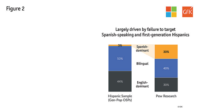
While a representative population is split 30/40/30 according to language dominance, our sample was dramatically skewed to bilinguals and included almost no Spanish-dominant respondents (Figure 2). This was largely driven by a lack of Spanish-speaking and first-generation Hispanics.
One proposed solution was to give all respondents the option to complete the survey in Spanish or English. However, conversations with our mainstream online sample providers drove us to the realization that this would not resolve our underrepresentation issue – U.S. gen-pop panels do not adequately represent Hispanic consumers. In fact, we found a disproportionately low incidence of Spanish speakers.
Our solution: GfK and Microsoft devised a method which involved:
- including Hispanic panels to broaden our sample;
- asking acculturation questions to ensure a representative sample of self-identified Hispanics; and
- weighting this augmented sample back into our gen-pop sample.
In the end, we found that adjusting our representative population of Hispanics did not move our total numbers significantly; scores on key metrics – such as ease of use, innovation, love, relevance and quality – only jumped by one point each when we included the Hispanic augment. But, diving deeper, we found that we have succeeded in incorporating a crucial point of view in our studies, with differences between Hispanic and non-Hispanic sample rising four to nine points on these same metrics.
Our solution worked but it is expensive and laborious in a large, multifaceted brand-tracking study. Ultimately, this is a problem that needs to be addressed at an industry level, so that a representative sample will be considered the norm.
Accessible to all
The third component we took on is accessibility – namely, making our research accessible to all respondents.
First let’s talk about the definition of a disability. Research accessibility is a huge and important challenge – possibly the hardest topic of the three covered here to get your hands and head around. A wide variety of populations can have difficulties getting to or taking conventional surveys. For the purposes of this work, we opted to focus on four disabilities that we could identify through census data for benchmarks: visual, auditory, cognitive and mobility.
Furthermore, we opted to think about disabilities as situational, temporary or permanent – with the belief that if we solve for someone with a permanent disability, we also solve for those who are in temporary or situational scenarios (so if we solve for one, we solve for many). For instance, someone could be experiencing a visual difficulty in a few ways. If they have a permanent disability, they could be blind. Someone could alternatively be experiencing cataracts or be blinded by the sun in their eyes – situational or temporary scenarios causing visual difficulties. If we create a solution for someone who is blind, that can similarly relieve an issue for others in these alternative scenarios.
To take on accessibility in our research, we came at the problem from two angles:
- Are people with disabilities represented in our survey population?
- Are we creating an environment that enables people with disabilities to take our surveys?
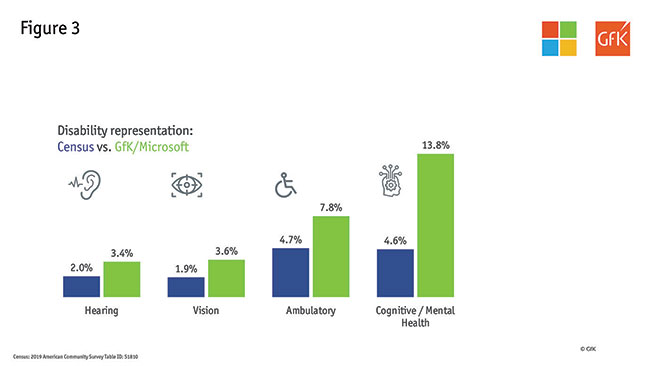
In response to the first question, we had hypothesized that our representation would be low since we know our survey environment has not been fully optimized. So we were surprised to learn that, in fact, we overindexed versus the census in terms of representing people with disabilities (Figure 3). One of our main hypotheses for this difference is that some respondents may be more comfortable classifying themselves in a survey environment as compared to the census.
This does not mean that we are getting a representative response from all our survey takers, however. In fact, we are sure we are still letting some of our respondents down and making their survey experience too difficult.
So how are we making our surveys more accessible to all? Here are a few examples of what we are doing to ensure we get it right. Some are harder than others!
- High-contrast screens – allowing those with vision challenges to see our content clearly.
- Correctable answers – respondents should be able to correct, change or edit answers after their initial selection of a response.
- Keyboard navigation – all functionality of the content is operable through a keyboard interface without requiring timing for individual keystrokes. Keyboard navigability is necessary to operate assistive technology (for example, screen readers).
This is only a small selection of the steps we are taking to be fully accessible. As we work through this part of the journey, there are two important things we have noted. First, there is a natural push between mobile-first and accessibility in terms of functionality. For instance, when moving our surveys to mobile-first, we set up some questions to auto-advance, so respondents had fewer clicks. We needed to think about that here, as respondents with cognitive issues may need more time to consider a response. And respondents with mobility/dexterity issues may mistakenly hit a wrong answer. We need to be willing to have these hard discussions as we optimize the overall experience. Second, we need to partner with people who are experiencing these disabilities to help us better understand the problem and the solution.
Take together
As we said earlier, this is a journey we need to take together as an industry. What we have learned, more than anything, is that we have to slow down and ask questions. There is no DEI checklist to be followed. Researchers need to think about diversity and inclusion in all of their research; unless you are being intentionally inclusive, you are likely being unintentionally exclusive.
We need to be willing to collaborate and experiment to drive toward better solutions. Some things we can solve as individual researchers but others involve us coming together as an industry to find a fix. While we have shown some tangible steps here, we look forward to hearing about the steps you all are taking as we try to move the industry in this direction.
References
1 2018 National Survey of Latinos (Pew Research Center).