
Removing the subjectivity
Editor's note: Adam Cook is the chief research nerd at CraniumTap in Norfolk, Va.
 I was participating in a Webinar with a leading secondary research provider and had one of those “there’s got to be a better way” moments when they shared example geographic opportunity reports. Included in the reports was one geographic listing with the amount of opportunity available (the population or mass) and the other was a listing of the same areas with a likelihood to purchase a specific product (the concentration, propensity or index). Without any hesitation the presenter continued to share how a business could combine these two sets of data to help identify the strongest and weakest geographic opportunities within a market. This is a challenge many businesses face; basically, picking and choosing which areas are at the top of each respective set of data. In this instance, it was choosing from a list of potential consumer population counts and a list of desired attribute concentration percentages. To have data in front of you and feel that you have to subjectively decide just didn’t seem right to me. With that, I opened a spreadsheet, got to work and calculated a better way, because that’s what research nerds like us do.
Using a basic example of zip codes within any given market with a secondary research resource, we can extract population or household counts and multiple demographic, expenditure or other consumer behavior attribute counts. This enables us to identify two distinct percentages: vertical and horizontal. The directional descriptions are used to understand the base of analysis in a basic crosstab report like the one presented in Table 1.
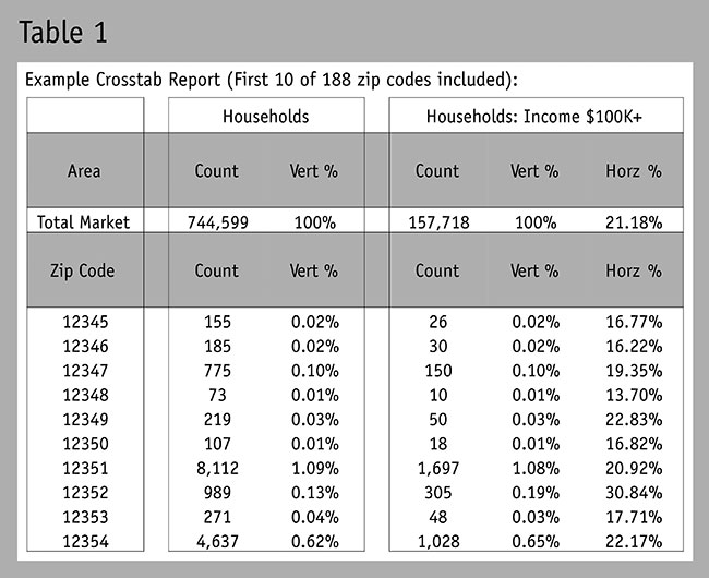
In this instance, the vertical percentage is simply the percentage of the entire market that falls within the zip code under analysis. As seen in Table 1: 0.02 percent of all households within the market with an income of $100,000 or more lives in zip code 12345 (26 of 157,718 households).
Conversely, the horizontal percentage is the percentage of that zip code that resembles the attribute under analysis. As seen in Table 1: 16.77 percent of zip code 12345 has a household income of 100,000 or more (26 of 155 households).
A geography could have a high population count of an attribute (or vertical percent) yet have a lower-than-average concentration of that attribute (or horizontal percent), whereas another geography could conversely have a smaller population count but a high concentration of that attribute. Both present different geographic opportunities.
As a result, decision-makers feel bound to either subjectively favor the value of one percentage over the other, or literally guesstimate which geographies appear to be strong in both. Not very scientific to say the least – but there is a mathematical solution.
Step 1: Convert percentages to an equal field of analysis
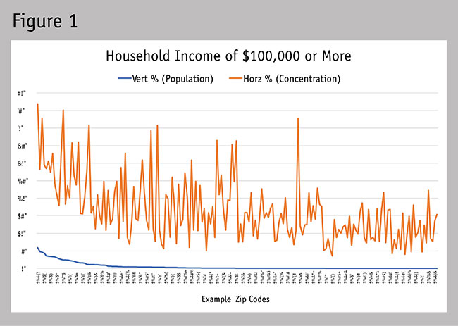
Most people would be inclined to simply combine or average the two percentages available but this is problematic. The sum of vertical percentages for a set of geographies is bound to the maximum of 100 percent, whereas horizontal percentages can be much higher depending on the number of different geographies and the type of attribute included in the analysis. (The total sum of the 188 horizontal percentages used in the example equals 3,134.40 percent.) In this example, simply combining or averaging the two would unintentionally give greater weight to the horizontal percentages. See the example in Figure 1 to see how the distribution of vertical and horizontal percentages can vary for a geography including 188 different zip codes. You can see how it’s a bit like comparing apples and oranges. There is a way to convert the horizontal percentages onto the same mathematical playing field as the vertical percentages (meaning, they add up to 100 percent) and maintain the integrity of the data’s distribution within the set.
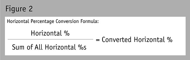
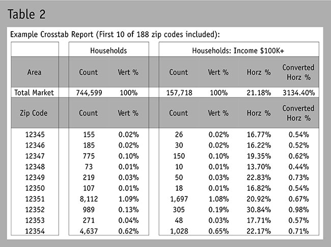
See Figure 2 for this conversion formula. See Table 2 for the updated converted horizontal percentages.
Note: We innately believe that two different numbers or variables cannot be combined into one number (e.g.,population count, percentages, rating, ratios, etc.). The reality is that most differing variables can be converted into a common form of vertical percentage.
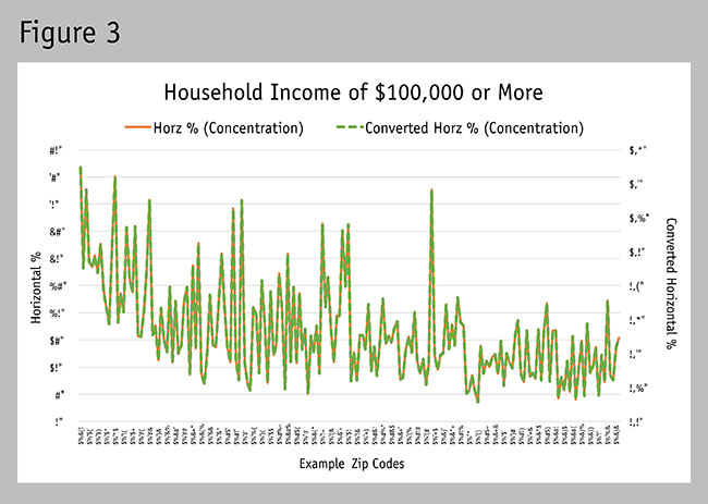

To see that the integrity of the data distribution has remained intact, see Figure 3. When displaying the two different data sets on a chart with a primary and secondary axis, we can see that the distribution of the data sets is identical. Now see the updated chart in Figure 4 using the same axis of percentage for the vertical and converted horizontal percentages. Our problem of being able to make one objective decision isn’t solved yet but this is a crucial first step.
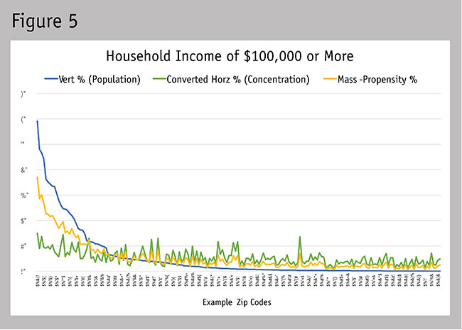
Step 2: Calculate the mass-propensity percentage
To calculate this, we simply average the vertical and converted horizontal percentages. This applies an equal weight for each percentage used. If a decision-maker had a specific weight they desired to apply to one percentage over the other, that can be applied to the equation (e.g., a desired 75 percent weight for the vertical percentage would be [(vertical percent x 75 percent) + (converted horizontal percent x 25 percent)] ÷ 2). Figure 5 demonstrates where our mass-propensity percentage would fall in relation to the vertical and converted horizontal percentages.
Step 3: Calculate and report using a mass-propensity index
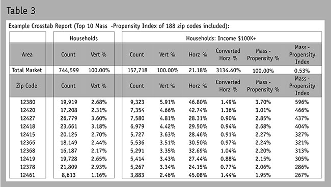
Since people will likely struggle with defining what the mass-propensity percentage variables represent, I suggest adding one additional conversion. Most business people can relate to an index (percent higher or lower), so here is the final step for calculating the mass-propensity index. First, calculate the average mass-propensity percentage for the entire region under analysis (0.53 percent,as seen in Table 3) and then calculate the percentage difference between each geography listed and this average. This shows us that the top mass-propensity percentage zip code was 596 percent higher than the average (3.70 percent vs.the average of 0.53 percent). Table 3 now gives you a mass-propensity index listing, which enables you to objectively rank the geographies by the count and the concentration of households. Figure 6 demonstrates how this final conversion from mass-propensity percentage to the mass-propensity index does not impact the integrity of the data’s distribution. This form of indexing can be applied across all geographic levels (e.g., globally with countries; across the U.S. by regions, states, metros, cities, zips, census tracts, block groups,postal routes; or locally by smaller geographic definitions).
Endless list of variables
While the mass-propensity index was devised for balancing population and propensity measures, these same steps for conversion can also be applied with other measures. For example, you can combine dollar volume and market share or dollar volume and growth or sales and customer satisfaction ratings to analyze geographies. You’re also not limited to combining two measures. As a result, there’s an endless list of variables and numbers of variables that can be combined. A little bit of math can go a long way in helping to reduce subjective business decision-making.