Editor’s note: Mark Travers is an insight specialist at marketing research firm Burke, Cincinnati. He can be reached at mark.travers@burke.com.
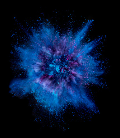
Blue. It’s been called the “lustre of the soul.” It is a color associated with feelings of tranquility, reliability, productivity and sometimes melancholy. It also just so happens to be the most popular color in the world, especially among men.
 It’s also the flagship color of some of the popular brands in the world – think Facebook, IBM, GE, Walmart, Ford, BMW, Visa and Twitter, just to name a few – and has long been a topic of marketing intrigue. For example, it was reported that Google pilot tested over 40 shades of blue to see which resulted in the highest click-through rates.
But new research appearing in a recent issue of Psychology and Marketing adds even more mystique.
Professor Gianluigi Guido, of the University of Salento, and his colleagues examined how blue light influences shopping preferences in mobile shopping environments. And what they found is fascinating: A specific wavelength of blue light, referred to as actinic blue, increased the likelihood that shoppers would make impulse purchases.
Here’s how they arrived at this striking conclusion.
Researchers asked 220 students at a university in Italy to make a series of purchase decisions on a mobile device. Half of these students, randomly selected, were exposed to blue ambient light; the other half were exposed to white light. The students were then asked to indicate their likelihood of purchasing 10 products, five of which were hedonic products (Intimissimi lingerie, Nutella chocolate cream, Ray-Ban sunglasses, Swatch watches and Zara clothing). The other five were utilitarian products (Dash detergent, Johnson’s baby shampoo, Mentadent toothpaste, Scottex toilet paper and Sharp calculators).
Researchers found that when students made their decisions in the presence of blue ambient light, purchase intentions were higher for the hedonic (impulse) products than for the utilitarian products. However, when decisions were made in the context of white ambient light, the purchase intentions did not differ between the product groups.
Furthermore, this finding held true even when the light source wasn’t external but came from the digital device itself. Manipulating whether the mobile display was set to actinic blue vs. warm white, the researchers showed a similar preference toward the hedonic products in the presence of blue mobile light.
What does this all mean for brands and retailers? Well, the success of a product or brand often depends on the strength of the emotional connection it can create with its consumers. One way to activate this connection is through color. From this perspective, colors should complement the mood a brand or product is trying to strike with its customers. A caffeinated beverage, for instance, might invoke the color red for its energizing and activating properties (think Folgers coffee packaging) while a calming product, such as Vicks VapoRub, should favor a cool blue for its soothing connotation. When colors and concepts fall out of sync, consumer appeal suffers.
Compared to other colors, however, there seems to be something particularly evocative about blue – which might encourage marketers to deploy a “when in doubt, pick blue” strategy when selecting color schemes for new products and brands. For instance, consumer research has found that blue lighting increases browsing times in retail shops, influences the perceived quality of wines in restaurants and can contribute to the illusion of faster download times in virtual settings.
Guido’s work shows that blue is top dog when it comes to high-end, luxury shopping.
“The use of blue light in ambient and mobile displays could increase consumers’ level of arousal when watching Web promotions, using an app or sending viral messages – at least when hedonic products or services are involved,” says Guido. “Managers could also implement blue light as part of Web site customization, allowing users to alter the online atmosphere with a click.”
As always, there is no substitute for rigorous concept testing when trying to find the right match between concept and color, but the academic research provides a useful starting point that can help whittle down the search.
References
Bellizzi, J. A., and Hite, R. E. (1992). Environmental color, consumer feelings, and purchase likelihood. Psychology & Marketing, 9, 347–363.
Gorn, G. J., Chattopadhyay, A., Sengupta, J., & Tripathi, S. (2004). Waiting for the web: How screen color affects time perception. Journal of Marketing Research, 41, 215–225.
Guido, G., Piper, L., Prete, M. I., Mileti, A., & Trisolini, C. M. (2017). Effects of Blue Lighting in Ambient and Mobile Settings on the Intention to Buy Hedonic and Utilitarian Products. Psychology & Marketing, 34(2), 215-226.
Junemann, M., and Weitmann, F. (1994). Drawing and Painting in Rudolf Steiner Schools.
Oberfeld, D., Hecht, H., Allendorf, U. and Wickelmaier F. (2009). Ambient lighting modifies the flavor of wine. Journal of Sensory Studies, 24, 797–832.