SPONSORED CONTENT
We live in an increasingly mobile world.
According to the International Telecommunication Union, mobile cellular penetration has nearly reached market saturation, and Pew Research Center estimates that more than 70 percent of U.S. adults now own a smartphone1. As such, market researchers must adopt mobile-friendly surveys for this population of users … and quickly.
Research also shows that mobile users are accessing online surveys whether the survey is designed with them in mind or not. For online studies that do not specifically target mobile users, we’ve found that around 35 percent or more of survey start attempts can come from a mobile device2. This is the case for studies employing a client-supplied sample of the general consumer market.
Research further demonstrates that smartphone users are less likely than PC users to complete a survey once they start. Data quality can differ as well through this medium. However, these differences can be mitigated, or even eliminated, if smartphone friendly survey designs are employed3,4,5. How can you ensure mobile-friendly surveys? Here are five simple steps:
Step 1 – Make it big
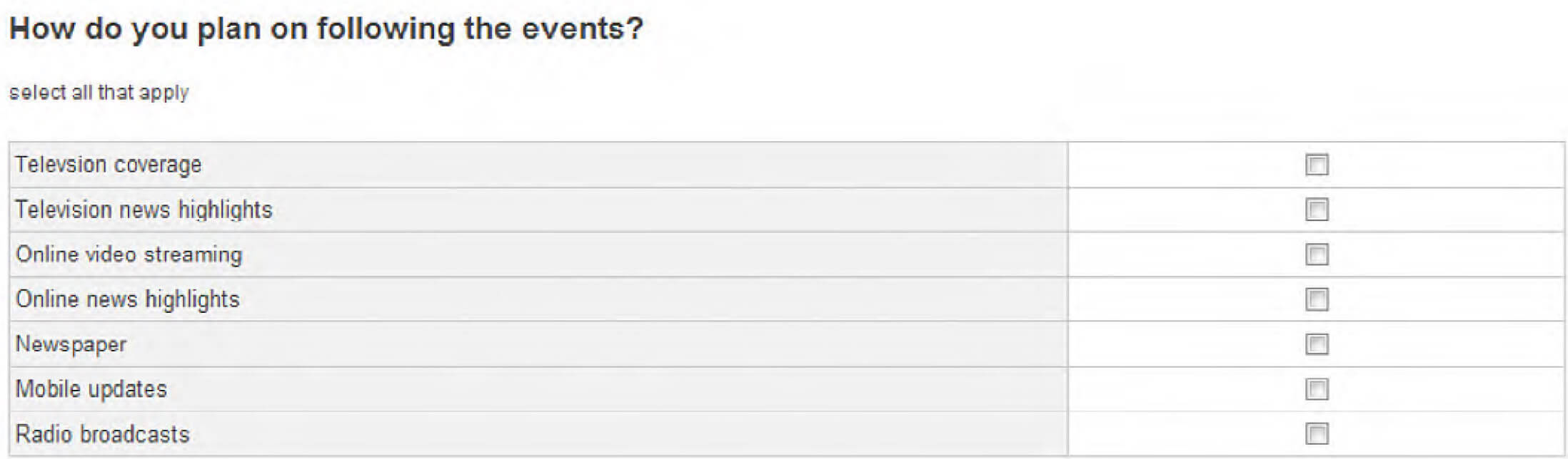
Touch input — The use of touch input and smaller screens are among the most defining aspects that contrast PCs and smartphones; two critical data points to consider when designing surveys for smartphones. For smartphones, the selection area of a survey must be enlarged to accommodate the needs of touch input. Figure 1 illustrates a multi-select question designed for PC. While this is fine when using a mouse and pointer to make a selection, touch input selection areas should be enlarged for accurate execution.

To do so, simply transform the checkboxes into large buttons or adjust the spacing and layout for the checkboxes (Figure 2). Changes like these will reduce survey dropouts among smartphone users. Also, recent research has shown that such modifications will have an immaterial impact on the data. That is because the fundamental nature and presentation of the question have not been altered; the wording and vertical arrangement are consistent, and it is still a point and click (or touch tap) task. In contrast, if a single select question is changed to a slider, there would be data collection differences between the two question types; one uses a point-and-click input mechanism, while the other uses a point-and-drag input mechanism.
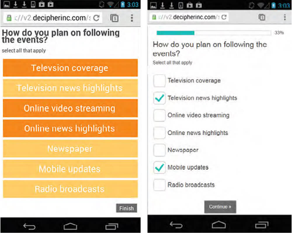
Figure 2: Mobile-Friendly Format
Font size — The size and legibility of text can also impact how well a mobile survey will perform. Many smartphones will rescale a Web page so that the width of the page fits the width of the mobile device. This can lead to smaller, harder to read text. For example, here is what a question looks like in 14-point Arial, scaled to actual size on a laptop:

Now, here is the same question on a smartphone, again scaled to actual size.

By increasing the font size to 24 point Arial bold, the question becomes much more readable on the mobile device.

Step 2 – Cut the clutter
Market researchers are used to designing online surveys with the appropriate amount of content for PC screens. However, the only way to fit the same amount of content onto a smartphone screen is to make everything smaller. This violates our first principle of making things larger.
Instead, simplify the content so that font size and selection areas can be enlarged for ease of mobile use. This is quite common outside of the research realm, for instance, mobile readers of the The New York Times don’t see the full Web site, but a simplified and enlarged version (Figure 3).
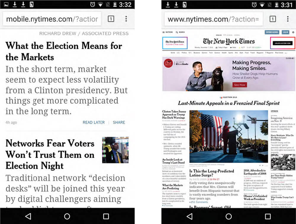
Figure 3: New York Times Web Site – PS Design (Left); Mobile Design (Right)
When simplifying content for mobile surveys, be sure to keep text, rows and column lengths to a minimum. Strip out any unnecessary graphics so you can enlarge pertinent content for better reading and increased survey engagement. Below is an extreme case of too much content on a mobile screen (Figure 4). This 11 column grid question came from an actual survey. When smartphone users encountered it, high dropout rates ensued. The small font-size was difficult to read, and the tiny input selection areas were all but impossible to use. As a result, few smartphone respondents bothered to complete this question. These issues could have been avoided by increasing readability with larger touch areas, and, most importantly, by shrinking the number of rating scale points to reduce input requirements. An additional enhancement is the use of card sort questions, where statements are shown one at a time, rather than appearing all at once (Figure 5).
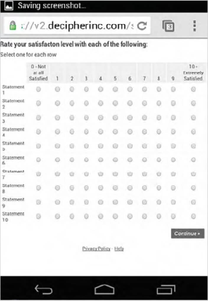
Figure 4: Smart Phone View: Grid Question With Too Many Columns
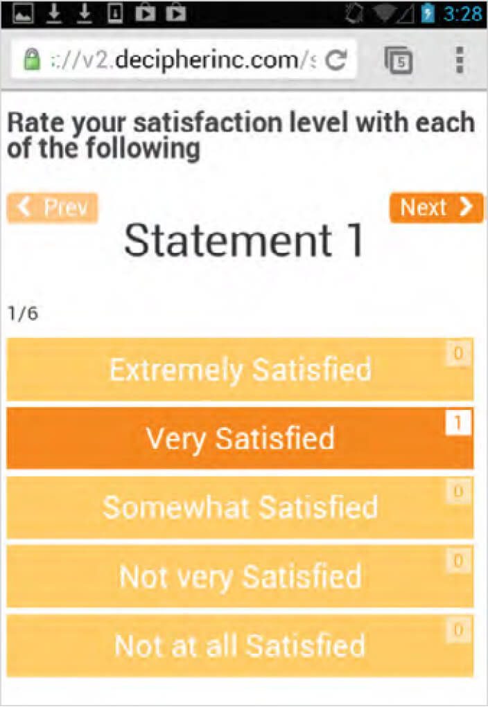
Figure 5: Mobile View: Card Sort
When considering how much content to cut, strive for these two goals:
- Minimize the amount of scrolling required. Vertical scrolling is acceptable, horizontal scrolling is not.
- Eliminate the need to zoom. Input areas and font sizes should be large enough so that the user doesn’t have to zoom in to properly view and take the survey.
Step 3 – Swipe and touch tap
Point and click, dragging objects and typing — these are all input methods indigenous to PC use. Conversely, touch tapping and swiping are primary input methods for smartphones. As such, try to limit input requirements to these two methods when designing surveys for smartphone use. Requiring other types of input is burdensome, and encourages respondents to abandon surveys.
For example, while typing is possible on a smartphone, it is much more cumbersome than on a PC keyboard. Therefore, it is important to minimize or even eliminate the use of open ends in mobile surveys. In fact, FocusVision studies have shown that smartphone users are almost twice as likely as PC users to abandon a survey when encountering an open end question1.
Step 4 – Consider interview length
Smartphone users will take longer to fill out surveys than PC users. This is largely due to the longer download times typical of mobile devices, and traditionally mobile-unfriendly survey designs. Most smartphone users also connect to the Web through a cellular network versus a faster wifi connection.
Survey respondents are known to abandon a survey while waiting for online content to download. Therefore, videos that require long download times should not be used in mobile surveys. Unnecessary images or graphics should also be stripped out. Not only do these types of stimuli cause longer download times, they also take up precious mobile screen real estate.
Smartphone users are also more susceptible to outside distractions compared to someone sitting in front of the PC. As such, quick downloads that keep smartphone users engaged and minimize any inconveniences related to taking a survey are a must.
Step 5 – Test and re-test
The only way to completely ensure that mobile respondents will have effective survey experiences is through direct and repeated testing. Every researcher should get into the habit of testing and taking their own surveys. This helps researchers intuitively pinpoint what may encourage respondents to complete or drop out of a survey. Experimental evidence is not needed to identify where the text is too small, or where input areas may be difficult to manage. If a mobile survey experience is not good for the researcher, it won’t be good for respondents either. So, take a little time and make your surveys infinitely more successful by testing them yourself.
References
- Pew Research Center: “Technology Device Ownership: 2015” http://www.pewinternet.org/2015/10/29/technology-device-ownership-2015/
- Jue, A. (2016) “FocusVision Mobile Trend Report.” White paper: www.focusvision.com
- Baker – Prewitt, J. and Miller, J. (2013). “Mobile Research Risk: What Happens to Data Quality When Respondents Use a Mobile Device for a Survey Designed for a PC” Paper presented at 2013 CASRO Online Research Conference.
- Peterson, G. (2013). “Solving the Unintentional Mobile Challenge.” Paper presented at CASRO research Webinar.
- Lattery, K. (2013). “Optimizing Surveys for Smartphones.” Paper presented at CASRO research Webinar.