
Editor's note: George Terhanian is founder of research firm Electric Insights. The author wishes to thank Ryan Heaton for his analytical work and sharp suggestions for improving earlier versions of this article.
In May this year I flew to Las Vegas after Nevada lifted its COVID-19 restrictions. For 10 days, I played blackjack at Aria, Bellagio, Red Rock and Circa, hoping the endless hours I spent honing my skills during lockdown would bear fruit. I don’t mind losing when I play perfectly. But I prefer to win – it’s a great buzz. I know I’m not the only market researcher of that opinion.
I once asked the owner of a phenomenally successful company if he felt better about the multimillion-dollar profit his company netted that month or the $300 he made that day at Treasure Island’s blackjack tables. It was no contest: the $300 sparked more joy.
I lost more hands than I won but still came out ahead. Did I play perfectly? No – but I came close. My betting (e.g., $25, $50, $100) and playing (e.g., hit, stand, double) decisions maximized my probability of winning as much money as possible with only a tiny “risk of ruin.” (That’s the term blackjack players use to describe the mathematical chance of losing their entire bankroll.)
A perfect blackjack game demands a deep understanding of likely effects, or the change in the hand win probability associated with any playing decision. Let’s say the card count is zero, which means the same number of high (10 through ace) and low (two through six) cards are in the shoe. I’m dealt an eight and four while the dealer shows a two. If I stand (i.e., draw no cards), my win probability is .35; I can expect to win 35% of the time under identical conditions. But if I hit (i.e., draw a card), my win probability, excluding ties, rises to .37 for a two-point “likely effect” or two more wins in 100 hands.
I follow the math, hit and draw a nine for 21. (Foolishly, I thought the right play was to stand before I upped my game during lockdown.) The dealer turns over her down card – a king – so she has 12 and must take another card. It’s a jack; she exceeds 21 and busts. I’m fortunate considering the .37 win probability but I’ll take the victory because I know I’ll lose many hands when the probabilities suggest I’ll win.
Core functions
A win probability (number of wins/number of hands under identical conditions) is a score – a proportion like a top two-box percentage in a concept test, copy test, customer experience survey or brand tracker. In political polling, it is analogous to an approval rating or a candidate’s expected vote share in an upcoming election. Producing scores is one of market research’s core functions. Whether that’s a good thing depends on who you ask. It’s been that way forever.
In a 1976 People magazine interview, pollster and consultant Lou Harris derided peers, whom he dubbed “political eunuchs,” for believing their job was done once they tallied scores, such as presidential approval ratings (Friedman, 1976). He directed his criticism at George Gallup, who had argued that pollsters should be “fact-finders and scorekeepers, nothing else” (Spartacus Educational, no date). Like Gallup, Harris took great care to gauge opinions, attitudes and experiences. In contrast to Gallup, who coined the term “scientific polling” decades earlier, Harris believed that all social scientists and all pollsters had a fundamental duty to uncover cause-and-effect relationships. Scorekeeping was a step in that process (Harris, 2007).
Throughout his career, Harris advised clients, including John F. Kennedy, on how to raise scores on crucial measures. For JFK, Harris had to estimate the vote-share bump – the “likely effect” (as in blackjack) – JFK would earn if he emphasized specific issues in the run-up to the 1960 presidential election. To be effective, Harris had to transform typical scorekeeping surveys into platforms for prediction. It was a massive, mathematically intensive challenge and a reason he worked “until 3 or 4 a.m.” (Friedman, 1976).
Harris’s approach did not scale easily – he began his career when the computing equivalent of a modern laptop weighed more than 25 tons. That made it difficult to carry out logistic regression analysis, though it was, and is, “the standard way” (Gelman and Hill, 2009, p. 79) to predict binary outcomes like vote choice (e.g., JFK or Nixon). Nor did Harris receive helpful advice from academic researchers – they lacked enthusiasm for reporting likely effects in the form JFK (or a blackjack player) expected: probabilities or percentage points (Harris, 2007). Why? According to sociologist Richard Williams, academic researchers were and still are more interested in the sign and statistical significance of logistic regression coefficients (i.e., logits) than in “the substantive and practical significance of the findings” (Williams 2012, p. 308). Put more bluntly, reporting likely effects in plain language has never been a priority.
For reasons too numerous to describe here, market researchers have followed suit – rarely are likely effects reported in probabilities or percentage points (Terhanian, 2019). Instead, they are in logits, odds and odds ratios. This is what a market researcher might say to a hotel client after using logistic regression to analyze its customer data: “If all 5 million of your guests check in remotely, their logit of recommending the hotel will increase by 0.51.” Or perhaps that researcher would say: “Guests who check in remotely have 33% higher odds of recommending the hotel than those who check in traditionally.” Both statements would leave most people scratching their heads. That is probably why DeMaris (1993) observed “…there is still considerable confusion about the interpretation of logistic regression results” (p. 1057). And why Gelman and Hill (2009) asserted “…the concept of odds can be somewhat difficult to understand and odds ratios are even more obscure” (p. 83).
Had the researcher reported likely effects in plain language, it would have gone something like this: “If all 5 million of your guests check in remotely, the percentage who recommend the hotel will rise from 20 to 24, for a four-point likely effect. That translates to an increase of 200,000 guests (from 1 to 1.2 million).” The researcher also could have predicted remote check-in’s effect on critical segments (e.g., business travelers) and individual guests. Most people want and need clear information like that to make excellent decisions.
Reporting likely effects in probabilities or percentage points is not difficult. It is standard in blackjack, so it should be possible in market research. But examples are hard to find (Terhanian, 2019). To complicate matters further, most statistical software packages (e.g., SPSS, SAS) do not include the capability in prepackaged procedures. The good news is that the nine steps involved are not proprietary, though they take some effort to understand and absorb. This guide should make things easier.
Step 1. Apply logistic regression to your data to build a model that predicts the binary outcome of interest. Binary outcomes (which are ubiquitous in market research and the sole focus here) can be events, like wins or losses; groups, such as customers or non-customers; or nearly anything with a yes-or-no interpretation.
Logistic regression produces a weight – a logit coefficient – for each level of each predictor variable. In an optimal model, those weights maximize the predicted probability gap between the respondent groups that selected the mutually exclusive outcomes (e.g., “recommended the hotel [Group 1] or “did not recommend the hotel” [Group 2]).
Logistic regression also generates a constant representing the predicted probability of respondents who selected the lowest-coded value of each predictor variable. For a variable with two response options (e.g., “agree” and “disagree”), the lowest-coded value would be the first: “agree.”
Step 2. To calculate a single respondent’s probability, sum the weights corresponding to that person’s responses, add the constant, then apply this formula to the result: exp (sum of logit coefficients + constant)/(exp (sum of logit coefficients + constant) +1).
Step 3. Do the same for all remaining respondents (or units, when not dealing with people), then take the average. With a nationally representative survey, the result is the binary outcome’s population probability – think of it as the starting probability for subsequent simulation (i.e., if-then analysis). You might find it illuminating to convert it into a population size estimate. For instance, if 70% of respondents support legalizing marijuana (i.e., a .70 probability for a random adult), it translates to about 175 million adults.
Now for the tricky part.
Step 4. Develop an algorithm, using JavaScript if you want your simulator to work online or through a mobile app, to let users see how changes in the values of the predictor variables affect the starting probability.
Step 5. Design a user interface.
Step 6. Keep things simple at first – permit users to change only one value of one predictor variable. If it has two response choices like “agree” and “disagree,” let the user change every “agree” response to “disagree” or vice versa. Think of this as the all-or-nothing option.
Step 7. Behind the scenes, change the corresponding weights for all respondents to align with the selection, recalculate each respondent’s predicted probability, sum those probabilities, take the average, then report the new probability and population size. The difference between the new and starting probability (and the new and starting population size) is the likely effect associated with the user’s selection. It is just like the two-point likely effect of hitting on 12 when the dealer showed a two.
Step 8. Follow the same process to let users change the values of several variables simultaneously – the process will work because the predictor variables are independent.
Step 9. Now go a step further and allow users to change any response percentage of any variable by any amount – think of this as the fine-tuning option. You will need to create rules in your algorithm for aligning users’ changes with the changes you make (after that) to the original percentages.
How it works: driverless vehicles case study
In its study, Automation in Everyday Life (2017), Pew reported that 40% of U.S. adults (100 million of 250 million) were enthusiastic about the development of self-driving vehicles. Thus, a randomly selected adult’s probability was .40. Pew noted Americans strongly favor policies including “requiring driverless vehicles to travel in dedicated lanes” and “restricting them from traveling near certain areas, such as schools” (p. 36).
But Pew did not model how responses to its survey questions predict enthusiasm. Unanswered were questions like this: If all 250 million adults, rather than 27.5 million (11%), felt “very safe” on the road with driverless vehicles, how would that affect the percentage (40%) and number (100 million) of driverless vehicle enthusiasts?
A skilled blackjack player would require a precise answer. So would a company like Tesla.
In line with the nine-step guide, I downloaded the Pew data, built a logistic regression model to predict enthusiasm, then packaged it in a fully functioning simulator to help users determine how to move those numbers.
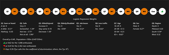
Figure 1 shows the weights (W1-9) corresponding to each value of the nine (of a possible 250 or so) predictor variables (labeled Q1-9); the green thumbs-up icon represents enthusiasm for driverless vehicles (per Pew). Figure 1 also provides select diagnostic information.
As mentioned earlier, logistic regression produces a predicted probability for each respondent. Figure 2 illustrates this for a single respondent, with advice on her appeal as a marketing target given, as well.
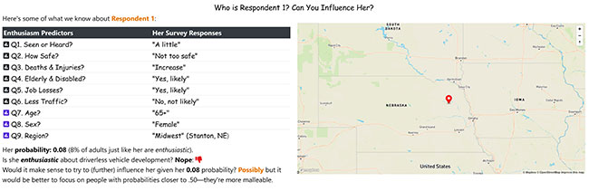
To complete the picture, Table 1 reports the weights corresponding to Respondent 1’s survey responses (see ID=1) and, for illustrative purposes, the effect of a single change (see ID=1a) on her probability (see the column “Prob”) of being enthusiastic. Had she responded to Q2 that she would feel “very safe” rather than “not too safe” on the road with a driverless vehicle, her logit (see the columns Q2 and Sum) would have increased by 2.75 and her probability by 51 points from .08 to .59.
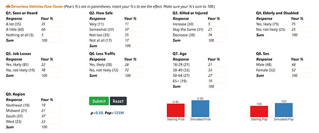
Figure 3 depicts an all-or-nothing simulator. The first column contains the predictor variables and Pew survey response options. The probability and population size resulting from the user’s simulator choices and a “Highlight” are at the column’s base. Column 2 shows the Pew survey frequencies for each question, while the third column reports the changes (in blue) the user made to those frequencies. The last column provides space for “Comments.” Here are two tips on how to use the simulator:
Tip 1: If users select “hold constant” for a single question, they keep every Pew survey-taker’s response choice for that question. If they choose “hold constant” for every question, the simulated probability of being enthusiastic will still be .40 (because they made no changes).
Tip 2: If users select different values, the simulator assumes every Pew survey-taker chose those same ones. It is the all-or-nothing option.
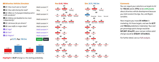 Notice in Figure 3 that the user changed the value of one predictor variable (Q2: “How safe would you feel on the road with a driverless vehicle?”) from “hold constant” to “very safe.” The likely effect is a 37-point rise in the probability and percentage of respondents (and U.S. adults) enthusiastic about driverless vehicles. That translates to an increase of 92.5 million people.
Finally, Figure 4 shows a fine-tuning simulator, where a user can change any value of any predictor variable by any amount and see the effect. Here, the user changed the Pew responses (in parentheses) for Q3 (“As driverless vehicles become widespread, how will it affect the number of people killed or injured in traffic accidents?”) and Q5 (“Will there be job losses for people who drive for a living?”). The likely effect is a 10-point rise in the probability and percentage of respondents (and U.S. adults) enthusiastic about driverless vehicles. That translates to a 25 million-adult increase.
Crucial to their success
Elite blackjack players know that mastering likely effects is crucial to their success. Anything less would be like flinging thousand-dollar casino chips into the famous fountains of the Bellagio. Blackjack, of course, is not the same as market research. In blackjack, the player’s decision (e.g., hit or stand) is the action. In market research, the values a simulation user chooses are often more comparable to targets than actions. But that may be a trivial point. What almost certainly matters more is this: if a company like Tesla relied on Pew data, predictive modeling and simulation, it would know that a key to boosting enthusiasm for driverless vehicles would lie in reducing or eliminating safety concerns. Tesla also would understand that it can’t snap its fingers or wiggle its nose to make that happen instantly – it would take time, work and investment. But as in blackjack, the likely effect of Tesla’s efforts, if successful, would be clear: a 37-point increase in enthusiasm and 92.5 million more enthusiastic people (as Figure 3 showed).
Market researchers and other insights professionals should seriously consider reporting likely effects in probabilities or percentage points. Any investment they make to develop the necessary skills should pay off immediately considering the size and scope of the opportunity. Within the Pew dataset, several questions identify “growable groups” important to companies like Tesla and it is just one dataset covering one topic. As the illustrative list below suggests, group-growing opportunities abound in market research.
- Market size and share tracking: buyers (rather than non-buyers)
- Customer experience monitoring: promoters
- Brand tracking: brand lovers
- Concept testing: definite/probable buyers
- Ad testing: ad lovers
- Political polling: approvers
Tap its potential
Although the ideas and suggestions given here may seem new or novel, the concept of reporting likely effects in probabilities or percentage points (in market research) is not. Lou Harris, an elite player in his own domain, took steps to tap its potential decades ago though he had almost no access to high-powered computers and received little guidance from academic researchers.
It was not easy but Harris served JFK and many others well. The challenges facing contemporary market researchers and insights professionals, particularly those committed to growing key groups, pale in comparison. Times have changed, technology has evolved and so will they if they learn to report likely effects in probabilities or percentage points. As a bonus, they will leave behind their less-proactive counterparts, the so-called “mere order-takers” (Poynter, 2021) who probably would stand on 12 when the dealer showed a two – assuming they were brave enough to take a seat at the table in the first place.
References
Friedman, D.H. (1976, February). “Pollster Lou Harris feels the ‘adrenaline’ flowing as the campaign tests his predictions again.” People. Retrieved August 15, 2021, from https://people.com/archive/pollster-lou-harris-feels-the-adrenaline-flowing-as-the-campaign-tests-his-predictions-again-vol-5-no-4/
DeMaris, A. (1993). “Odds versus probabilities in logit equations: a reply to Roncek.” Social Forces, 4, 1, pp. 1057-1065.
Gelman, A., and Hill, J. (2009). Data Analysis Using Regression And Multilevel/Hierarchical Models. Cambridge, U.K.: Cambridge University Press.
Harris, L. (2007). Personal communication to George Terhanian.
Pew Research Center (2017). Automation in Everyday Life. Pew Research Center. Retrieved August 18, 2018, from http://assets.pewresearch.org/wp-content/uploads/sites/14/2017/10/03151500/PI_2017.10.04_Automation_FINAL.pdf
Poynter, R. (2021). “Market research: A state of the nation review.” International Journal of Market Research, 63(4), 403-407.
Spartacus Educational (no date). George Gallup. Retrieved August 15, 2021, from https://spartacus-educational.com/SPYgallup.htm
Terhanian, G. (2019). “The possible benefits of reporting percentage point effects.” International Journal of Market Research, 61(6), 635-650.
Williams, R. (2012). “Using the margins command to estimate and interpret adjusted predictions and marginal effects.” The Stata Journal, 12 (2), 308-331. College Station, Texas: Stata Press.