Challenge your assumptions
Editor's note: Patrick Elms is vice president, research and analytics, at Culturati Research and Consulting Inc., San Diego.
 Mobile phones are quickly becoming the primary link to the Internet for many of us today. A recent Pew Research Center survey found that 77 percent of Americans own a smartphone, up from just 35 percent in 2011.¹ Other research reveals that 73 percent of all e-mails are opened on a mobile device² and that 65 percent of our digital time is now spent on mobile devices, including tablets, and only 35 percent on a PC.³ For one recent nationally representative survey conducted by our firm, 39 percent took the survey on a mobile device. And for ethnic groups mobile is even more prevalent: in the same survey 49 percent of Hispanics and 48 percent of African-Americans used a mobile device for the survey.⁴ Smartphone usage also skews younger and more affluent,1 groups that are often of interest to marketers. In fact, 35 percent of Hispanics and 28 percent of those age 18-29 say they do not have broadband and exclusively rely on their smartphone for Internet access.¹
As Americans become even more attached to their smartphones, we would expect the usage of mobile devices to take surveys to continue to increase. Researchers need to understand the implications of this when designing their surveys. It’s critical to create surveys that can be easily taken across multiple device types and equally important that the results are independent of the device used – questions where mobile users tend to answer differently from PC users will create problems for analysis, especially when results will be analyzed by age or ethnicity.
A quick Internet search reveals many sites ready to provide general guidelines for creating smartphone-friendly online surveys. These are typically grounded in the reduced screen size compared to a PC or tablet, the increased difficulty of typing written responses and the perceived reduced attention spans mobile users are likely to have. The most common design tips for mobile surveys include: keep the survey short; use simple, short question types and avoid long grid questions; avoid images whenever possible, especially large ones; and limit the use of open-end questions.
These guidelines are usually stated as fact, without empirical evidence that they are actually essential to a best-in-class mobile-friendly survey. The purpose of this article is to test those assumptions to determine the impact of various design choices on survey responses and the user experience. The key questions we will answer for smartphone survey design are as follows:
- When can you use grid questions?
- Can you evaluate large images like concepts or packaging?
- Are open-end questions answered differently?
- How does the device used impact the survey experience, attentiveness and interview length?
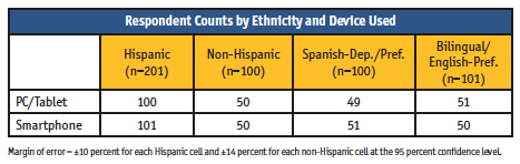
To answer these questions, we conducted an online survey with n=301 respondents (n=100 non-Hispanic and n=200 Hispanic, broken down by ~n=100 per language dominance), with approximately half the responses in each segment using a smartphone to take the survey and half using a PC or tablet (see table). The survey was conducted in May 2018.
When can you use grid questions for mobile surveys?
Grid or matrix questions are commonly used in online surveys when there are a number of items (e.g., categories, brands or attributes) that are answered using the same scale or set of answer choices. When administered on a PC, grid questions allow for fewer separate questions and can typically be answered more quickly than asking each question separately. When using a smartphone, however, a large grid format would require a lot of scrolling and make these types of questions quite difficult to answer.
The good news is that most online survey platforms today are able to detect the device being used and adjust the grid to a simpler, single-question format for smartphone users. This is true for Culturati’s Confirmit platform used for this test. But if PC respondents are seeing a grid format and smartphone users are seeing individual questions, we need to be certain that the question format does not result in significantly different response patterns across the two devices.
To address this issue, we tested two types of grid questions. The first type was a series of six typical CPG categories and we asked purchase frequency using a six-point scale, with each category requiring a response on the scale. The second type was a series of eight brand attributes, with respondents asked to select which of six brands, if any, they associated with each attribute. As opposed to the single response scale in the first type, this was a multiple-response scale where respondents could select any or all the brands or none. Each question type was programmed both as a grid and as separate question, with the grid questions reformatted as separate questions for smartphones, so that smartphone users always saw both formats as single questions. The analysis compared the responses of PC/tablet and smartphone users for significant differences at the 95 percent level to determine if the question format impacted the results.
The results showed marked differences between the two types of grid questions. For the single-response scale using the grid format, the number of significantly different responses across all the categories was only 1.4 percent, which is less than random chance given the 95 percent confidence level. This was the same number of significant differences as when the categories were asked separately, indicating that programming as a grid has no impact on the responses for single-response scales.
The same cannot be said for the multiple-response scale, however. When the brand attribute association question was programmed as a grid, there were significant differences for 7.3 percent of the responses, compared to only 1.0 percent when it was programmed as a separate question. The pattern of differences for the grid format revealed that smartphone users selected more brands across the attributes compared to PC/tablet users, resulting in an understatement of the brand associations among PC users. This is likely because the smartphone users were evaluating each attribute separately, while PC users were evaluating all the attributes at once.
The differences among Hispanic respondents were even more glaring, with the multiple-response scale resulting in 16.7 percent significant differences when programmed as a grid versus 6.3 percent differences when programmed as separate attributes. For the single-response scale, programming as a grid resulted in the same small number of differences as overall, at 1.4 percent.
Based on this data we can conclude that for questions with a single-response scale for multiple items, you can program the questions as a grid without concern that smartphone and PC respondents will answer the questions differently. However, when the scale is “select all that apply,” you should avoid programming as a grid and ask each item separately to be sure the responses are valid.
Can you evaluate large images like concepts or packaging in a mobile survey?
The idea behind avoiding images for mobile surveys is based first on the time it takes to download the images to the phone and secondly on the difficulty of viewing large images on a small screen. However, given the advances in mobile bandwidth and faster mobile processors, the former is becoming less of a concern. For viewing images, most survey platforms offer a zoom feature where smartphone respondents can touch an image to view it more closely, along with any text that might otherwise be too small to read. However, even with this tool there is a concern whether mobile users would view all parts of a larger image compared to PC users who can see the full image on their screen and if they would spend the same amount of time looking at the image.
For this mobile-device test, we created a brand concept image that included large primary text, smaller “fine print” and a product image. Respondents were allowed to examine the image for as long as they wanted and then rate the concept on a series of attributes, including one that focused on the smaller text information. We then compared the responses by smartphone users and PC/tablet users, as well as the time spent examining the image. The concept was shown in Spanish for those taking the survey in Spanish.
The results showed that there was little difference between responses or image viewing time between device types. The number of significant differences between smartphone users and PC/tablet users was 5.0 percent, which is exactly what would be expected at random given the 95 percent confidence level. Among Hispanic respondents the difference was even lower, at 3.3 percent. Plus, none of the differences were for the attribute related to the smaller print. The time spent viewing the image was nearly identical across devices, with 21 seconds for smartphone users and 20 seconds for PC/tablet users. Hispanics took more time to view the images overall but they were also nearly the same across devices, with 34 seconds for smartphone users and 35 seconds for PC/tablet users.
These results demonstrate that researchers should feel free to incorporate images in their surveys without fear that smartphone respondents will examine the images less closely or evaluate them differently compared to PC users, as long as the survey platform provides a tool for smartphone users to zoom in on the image.
Are open-end questions answered differently by mobile respondents?
Most “experts” advise against using open-end questions for smartphone surveys, assuming that the typing will be more difficult for smartphone users and thus they may be more likely to drop out of the survey. There is also concern that they would give shorter answers with less detail compared to PC users.
To test these assumptions, we asked a broad open-end question regarding the reasons for a specific rating, asking for a detailed explanation. We measured the time it took to type the response as well as the number of characters typed.
While it is true that smartphone users spent more time answering the open-end overall, the difference was not significant and the additional time is because smartphone users actually typed more characters than those using a PC or tablet, which runs counter to the assumption that they would be typing less. Smartphone users spent 25 seconds answering the open-end and typed an average of 39 characters, compared to PC users, who took 20 seconds to answer using 28 characters. Hispanic respondents took longer and typed more, with an average of 38 seconds and 51 characters for smartphone users, and 28 seconds with 40 characters for PC/tablet users. While these differences were significant, the increased time was again due to the length of the response and not to greater difficulty typing.
Based on these results, we can conclude that using open-ends will not reduce the response quality for mobile users. In fact, smartphone users typed more characters and spent more time answering the question compared to PC/tablet users. However, as with any survey, the number of open-end questions should be kept to a minimum needed, as excessive typing will cause greater respondent fatigue regardless of device used.
How does the device used impact the survey experience, attentiveness and interview length?
Other questions regarding mobile surveys revolve around whether the respondent experience would be less positive for smartphone respondents than for those using a PC, whether they might pay less attention to the questions and how the device used impacts the interview length.
To understand the user experience, we asked respondents to rate the ease of taking the survey on a 1-10 scale, with 10 being the highest. The ratings were very similar, with a mean rating of 8.8 for smartphone users and 8.6 for PC/tablet users. Hispanic respondents also gave equally high ratings of 9.2 for smartphone users and 9.3 for PC/tablet users. Based on this we can conclude that mobile users will have a similar survey experience compared to PC users.
To measure attentiveness, we included a quality-control attribute in the brand-association question to ensure respondents were reading all the text. Smartphone users and PC users had very similar attention levels, with 86 percent of smartphone users selecting the correct response compared to 84 percent for PC/tablet users. Therefore, there is little concern with smartphone users being less attentive to the questions.
Regarding interview length, it took smartphone users 50 percent to 75 percent longer per question to answer separate questions compared to PC users formatted as a single response grid and also about 25 percent longer per question to answer open-ends. However, when questions were formatted as separate questions for both PC and smartphone users, those on smartphones answered the questions in 10 percent less time. Overall, we can expect the average survey length to be about 10 percent to 15 percent longer for smartphone users. This difference should not be a great concern for surveys 20 minutes or less, where the overall time difference would be less than three minutes. However, the overall time difference will increase as the survey gets longer, so we recommend against conducting surveys much longer than 20 minutes.
Understand the impact
Given the continuing increase in smartphone usage today, it is critical that market researchers understand the impact of their survey design choices on the results for mobile users so that the responses are not dependent on the device type and that the survey experience is as similar as possible for both smartphone and PC users. The overall conclusion from this test is that by keeping in mind a few key considerations, we can achieve that outcome.
- When asking a series of items with a single response scale, program as a grid for PC respondents and as separate questions for smartphone respondents.
- For a series of items with a “select all that apply” response list, program as separate questions for all devices to avoid different response patterns for smartphone users versus PC users.
- Large images can be evaluated without response or viewing differences by device type.
- Both smartphone users and PC users answer open-end questions similarly despite the type of platform used.
- The survey experience and attentiveness levels are similar across device types.
- Smartphone respondents tend to take 10 to 15 percent longer to complete the typical survey but the difference is not a big concern if the overall survey length is 20 minutes or less.
References
¹ Pew Research Center, Mobile Fact Sheet, February 5, 2018.
² MovableInk, The Retail Consumer Device Preference Report: Q3 2016, 2016.
³ ComScore, 2016 U.S. Cross Platform Future in Focus, March 2016.
4 Culturati Research and Consulting Inc., Cultural Mosaic Survey, November 2017.