Editor’s note: Terry Vavra and Doug Pruden are senior partners at research firm Customer Experience Partners. Vavra is based in Allendale, N.J. Pruden is based in Darien, Conn.
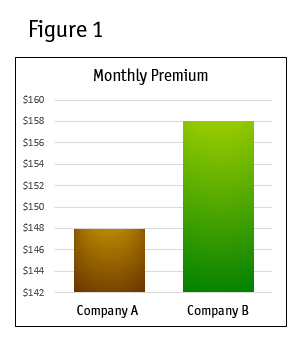
The proper and ethical use of graphics has always been a topic of interest to us, so it wasn’t surprising when an experience with an advertisement last month set off our “alarm systems.” We received a mailing touting the benefits of an insurance product and the sponsoring carrier. Economy was the obvious strategy. The headline read, “Compare our rates to (the major competitor).” While there were labels on the vertical axis, all the casual observer – someone without analytical training – would likely see was the height difference between the two companies, which looked something like this:

Lies and manipulated graphs
The price difference in the graph appeared compelling. Who’d do business with Company B when Company A is so much cheaper? The mailing’s sponsor (Company A) likely got plenty of calls from prospective clients and even some, no doubt, from present customers of Company B.
But for those viewing the graph with a more critical eye, taking the time to study the chart long enough to determine the units on the vertical axis, the surprising answer was that the big savings was a relatively small difference of only $10 per month on a $158 bill (or 6 percent). Still a savings but not of the magnitude graphically telegraphed by the chart.
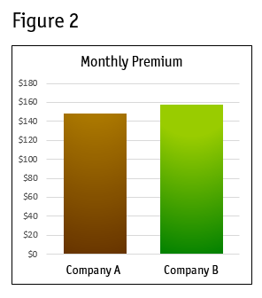
Figure 2 shows the chart redrawn using a $0 starting point (origin). The true savings are put in a much more realistic perspective. It’s not that the marketer who developed the mailing was outright lying but by truncating the vertical axis they were either:
- trying to make the graph legible and conforming to the space available on the page (which might have been difficult if the vertical axis had started at $0); or
- putting a spin on the numbers and trying to attract prospective customers into believing amazing savings were available at Company A.
Such graphs, referred to as "truncated" or "torn" graphs are, unfortunately, in popular and frequent use. But these graphics do a disservice to the presenter as well as the audience.
Using torn graphs is a challenge or temptation we all face. And, regrettably, it’s a trade-off. Those of us in marketing and marketing research are often tasked with the objective of presenting data in a fashion that either overplays or downplays the reality of the data. But, when that objective verges on deception, we must reign in our marketing spirit in favor of fulfilling our ethical obligation of producing accurate and honest presentations.
Consider the following five rules for honest graphing:
- Always attempt to use a true 0,0 valued origin. After this is in place, clearly label both your vertical and horizontal axes, using the same font type, size and boldness to promote a clear understanding.
- In the case of a presentation, overcome the urge to vary the scale of the vertical axis to fit graphs into each slide. Attempt to keep the scale consistent throughout your deck to be faithful to your data and your audience.
- Don't use headlines that mislead or misdirect the viewer's interpretation. The chart in the example above depicts the difference in the monthly premiums but the accompanying headline touted annual savings of $120.
- Understand the optimal graph-type to communicate your point. Pie charts and stacked bars are ideal to show the composition of a market, product or investment program. Line, scattergrams and possibly bar charts are ideal for displaying results longitudinally. Don’t force your data into a pre-selected graph type.
- Colors in graphs should be respected as tools for conveying information, not decoration. Assign a universal meaning to colors used from slide to slide so that you train your audience to expect similar meaning when viewing the same color throughout the presentation.
As with pictures, graphs often say more than several accompanying paragraphs. Because this is such a powerful form of communication, it's critical that we avoid misrepresenting information when we create graphs as it is possible to create distrust and suspicion among our audiences. Otherwise, those who don’t like the story our facts purportedly show may retort, “Statistics never lie, but liars use statistics!”