Editor's note: Michael Lieberman is founder and president of Multivariate Solutions, a New York research firm. He can be reached at 646-257-3794 or at michael@mvsolution.com.This article appeared in the November 12, 2012, edition of Quirk's e-newsletter.
In market research, obtaining data is often the easy part. Where the work gets tough is interpreting and explaining those results to the client. Surveys can generate thousands of data points with dozens of complex correlations between a brand and outside factors. Explaining these conclusions in writing could take five, 10 or 15 pages - which is four, nine or 14 pages more than a busy executive would like to read.
However, with a combination of statistical analysis and visual mapping, complex results can be summarized in a powerful graphic. Correspondence analysis, preference mappings and biplots are all descriptive statistical methods that generate visual graphics. Market researchers commonly use these methods to investigate relationships between products and customers. They can also be used to explain preferences and emotional ties to a particular brand.
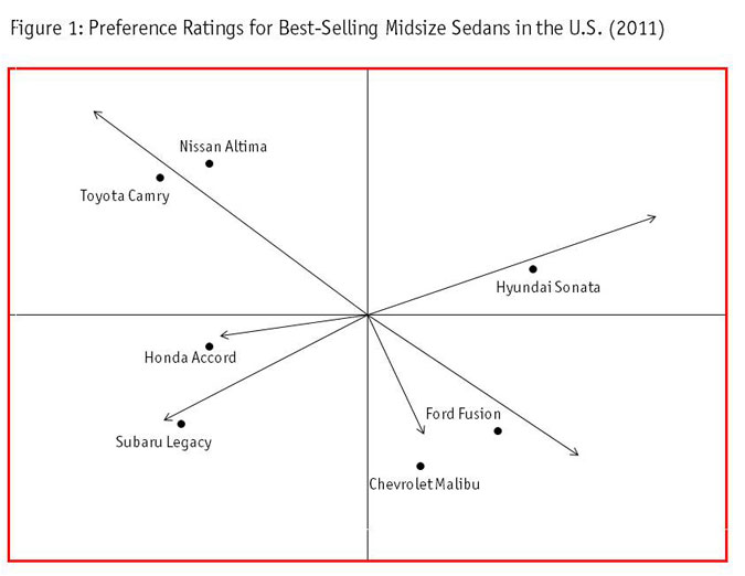
Biplot map
Market researchers use biplot visuals to illustrate relationships between products and individual preferences. I often describe my biplots as a visual factor analysis, showing variability and correlations of consumer responses.
A biplot can answer any of the following questions: Who are my customers? Who could be my customers? Who are my competitors' customers? Where does my product stand in relation to other brands? Who should I target for upcoming products?
In practical terms, a biplot visual is ideal for rating a brand position vis-à-vis the competition. For example, Figure 1 contains a display in which a survey of 1,000 consumers rated their preference for the seven top-selling midsize sedans in the U.S. in 2011. With one glance, we can see the alignment of competitors.

Each vector represents a certain type of respondent. The automobile that projects farthest along a vector has the highest predicted preference of those respondents. So who are your customers? The people described by the factors that move this vector. Who is your main competitor? The company closest to your vector. Since the goal is to assess the car brands, not predictive power, the length of the vector is really not important. The key takeaway is the direction of the vector and the proximity of the brands to the vector.
Examining Figure 1, the people at the top left most prefer the Japanese models Nissan and Toyota. Scanning down to the lower left, we see that two other Japanese models, the Honda Accord and Subaru Legacy, share close preference points. It would be fair to conclude that a shopper looking at a Toyota Camry might also shop for a Nissan Altima. The Toyota shopper, however, would be less likely to shop for a Subaru and even less likely still to shop for a Ford.
Those who would shop for a Ford are most likely to also consider the Chevrolet Malibu, as these two brands form an American area in the lower-right corner.
Finally, the best-selling Korean model, the Hyundai Sonata, sits in the upper-right corner by itself, indicating that the respondents who prefer this brand tend to prefer it exclusively. The biplot does not tell us what factors these preferences are based on but by showing where brand allegiances lie, Honda, for example, can easily see its closest competitor is Subaru. Honda could also conclude that there is something in the Hyundai that attracts a specific type of user - one that is far from preferring its own brand.
Preference map
Our goal with preference maps is to project external information onto a set of coordinates, such as the above biplot. The new information can help us interpret why a set of consumers prefers a certain model of automobile.
With a preference map, we can answer the questions: Was my model positioned well relative to my competitor? Why is my brand positioned here? How can I reposition my model?
In Figure 2, we have overlaid five automobile attributes (ride, safety, gas mileage, fun and reliability) onto our biplot.
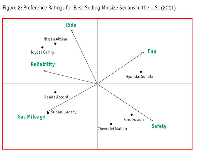
Notice how the positions of the brand "dots" did not change. Rather, the vectors changed. Here we see how the brands lie in terms of specific attributes. Preference maps help us explain the configuration of the preference clusters on the biplot.
Though our example is a mock-up, the results can be interpreted for illustrative purposes. From our map, we see Nissan and Toyota are viewed as having a superior ride and as being more reliable. The Honda and Subaru can travel farther on a gallon of gas and the American models have terrific safety records. The Hyundai Sonata is perceived as more fun than the others.
The position relative to other vectors can also be indicative. The Toyota Camry is quite far from the safety vector and the Subaru Legacy is not seen as very fun. For brands looking to expand, there seems to be an empty spot for a car with a good ride that is also fun.
Perceptual map
Perceptual mapping is a graphical marketing technique that visually displays the perceptions of brands. The position of a product, brand or company is displayed relative to its competition. Perceptual maps are created by running a correspondence analysis of each brand's ratings. The analysis yields data matrices, from which distances are calculated and then projected onto the map.
Unlike other visuals, a perceptual map does not rely on an x-y axis for interpretation. I like to use the following analogy to explain: Brands are like planets; attributes are like moons. Nearby planets have similar atmospheres. The close proximity of a moon indicates a strong association. In other words, a perceptual map is a snapshot of how consumers view all brands in relation to each other - or brand position.
Perceptual map surveys require respondents to rate each brand on each attribute. This can be done using a discrete scale (e.g., 1 to 5) or simply by having respondents check off whether a particular model has each attribute.
In our example, we gathered this data among only those respondents who own a midsize sedan, regardless of whether they purchased a new one in 2011. Figure 3 shows our perceptual maps.
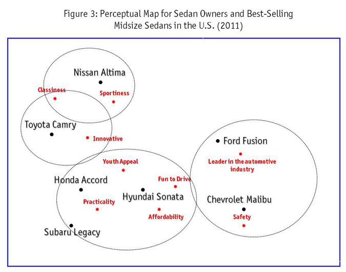
The interpretation of the correspondence map, not surprisingly, does not differ much from the biplot and preference maps shown above. However, it gives a bit more nuanced snapshot of the current market dynamic. If one were going to draw conclusions on, say, the Honda and Hyundai, one could surmise that respondents see them as young, fun, practical and affordable. The other Japanese models are sportier and more upscale. The Chevrolet Malibu is seen as the safest car and it shares virtually no attributes with the Nissan Altima.
Worth more
A picture is worth a thousand words. A graphic is worth more. The myriad conclusions that can be drawn from each one of these maps would take pages to write up. These graphs condense thousands of spreadsheet data points and complex analysis techniques into intuitive visual results.
Understanding the relationships between brands and the causes and effects of perceived attributes is vital to successful market research. Often the most effective method for conveying these results is with visuals.