What works and what doesn’t
Editor's note: Jerry Cole is managing director at the StarPoint Consulting Group, a Chicago research and consulting firm.
Most intelligent devices, software programs and Web sites rely on multilevel menus of functions, content and settings as a central element of the user interface. The perceived simplicity of the menu structure, and the ease of interpretation of the menu’s choices, directly affects both usability and ratings of user experience.
Designing an effective menu is a challenge. A shrewdly designed menu will capture the full range of functions, content and options with a minimum number of intuitively-grasped words or short phrases. The design team faces a demanding trade-off between economy and clarity.
At the top level of the navigation scheme, the designers need a small set of words or short phrases that, as a group, span the universe of functions or content the user will encounter. Each of the main headings should succinctly describe both the variety and the boundaries of the functions and content the user is likely to discover at the next, lower, level. Extending the process, the subtopic headings should nest comfortably within the array of functions or subject matter implied by their main heading while maintaining a readily perceived thematic relationship with each other.
A set of self-explanatory, topically-comprehensive and mutually-exclusive headings and subheadings will substantially improve both navigation and the user’s experience with the device, the program or the Web site. But getting there may require some experimentation.
Four essential qualities
The technique of contingent concept analysis was developed to visually demonstrate four essential qualities of a proposed function or content classification system:
-
Whether the top-level headings are perceived as distinctive and mutually-exclusive.
-
Whether the list of proposed top-level headings is sufficient to capture and categorize the full array of proposed subtopic headings.
-
How well each top-level heading in the content hierarchy effectively communicates the array of subtopics it is intended to define and subsume.
-
The relative ease with which users of the system can accurately anticipate where in the content hierarchy specific subtopics are most likely to be found.
As a method for evaluating function and content descriptors, the research technique was designed as a method for the analysis of two sets of nominally-scaled variables. In the example presented below, the nominal variables in question are the main headings and associated subtopic headings used in the early versions of a technically-focused Web site. (Other applications are possible and are discussed at the end of this article.)
The research process employs a sorting task for data collection, complemented by a data-mapping technique that visually summarizes the implicit relationships between elements in the navigation (or content classification) scheme.
Card-sort process
Contingent concept analysis employs a card-sort process to reveal the user’s perception of conceptual relationships between function or content descriptors in a two-level hierarchy – in this instance, the main headings and the subtopic headings used for a Web site navigation scheme. Individual subjects – or two-person teams – are given two decks of cards.
The first deck contains the list of proposed top-level function or content descriptors (navigation headings), one heading or topic area per card. The second, much larger, deck is comprised of the full list of proposed second-level topic descriptors (navigation subheadings), one subtopic, or content descriptor, per card.
After arranging the top-level content descriptors (main headings) across the work space, participants are asked to place each of the subtopic cards under the main heading they feel is “closest to” or is “most likely to capture” the full meaning of that specific subtopic.
Once the sorting process is finished, each respondent’s (or each team’s) sort pattern is checked for accuracy and then reviewed with the interviewer. Once the respondents are satisfied with their sort results, the placement of each subheading is recorded. Ties – the conclusion that a subheading reasonably could be placed under two or more headings – are permitted. Similarly, if respondents conclude that a subheading doesn’t fit anywhere within the main classification scheme, they are permitted to designate an “other” category.
Depending on the project configuration, the sort process can be executed as part of an individual (or couple’s) interview or as a specific task embedded within the discussion guide of a focus group. As with any qualitative exercise, the process should be repeated until consistent results are being observed. (We have found that approximately 15 to 20 repetitions per homogeneous subgroup are generally sufficient to determine a stable solution.)
The sorting task is easily explained, engaging for participants and quite revealing.
Arrayed as a matrix
The results of the sort process can be arrayed as a matrix indicating the number of times each subheading is placed underneath a specific main heading. These raw counts, in turn, can be recast as a matrix of contingent probabilities, indicating the likelihood that any subtopic will be assigned to a specific main heading by the members of the target group – given the list of main headings available and the number of subheadings in play.
Finally, the likelihood matrix can be analyzed with a mapping technique, such as correspondence analysis†, to depict the target group’s mental configuration of main headings and their contingent subtopics. Essentially, the analysis generates a graphic representation of “what goes with what” – a mental map of how members of the target group perceive and configure the concept space under study.
Case study: navigation aids for a technical Web site
During the late 1990s a leading software firm had moved all of its technical support documentation online for easier access. After doing so, however, the site’s development team discovered that the members of its principal audience – IT professionals – were having difficulty finding the articles they were seeking. In other words, a Web site developed by tech-savvy professionals for use by other tech-savvy professionals was encountering significant usability issues. The site’s navigation scheme was identified as one of the principal factors contributing to poor ratings of usability and overall user experience.
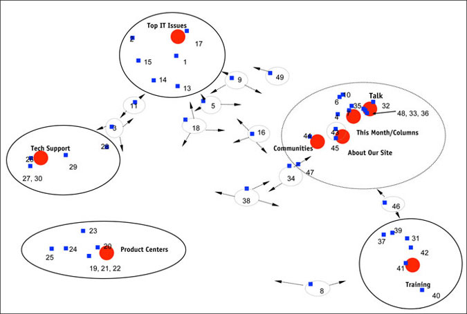
We were invited by the site’s development team to help review and refine both the home page layout and the principal navigation schemes used within the site. We interviewed IT professionals in several locations as part of a multistage program to revamp the site. During the interview process we employed contingent content analysis to help the site development team assess the effectiveness of their navigation tools. The results of the card sort and mapping analysis are presented in Figure 1.
Figure 1: Contingent Content Analysis of Main Headings and Subtopics
At this early stage in the site’s development process, the navigation scheme employed eight top-level content headings (top IT issues, tech support, product centers, etc., represented by red circles in Figure 1) and 49 subheadings intended to identify more tightly-focused topic areas (represented by the numbered blue squares).
The correspondence analysis plot indicates that for four of the eight main headings – top IT issues, tech support, product centers and training – were seen as well-defined by the site’s intended users: each of these four main headings occupies a unique space in the content map and maintains a reasonably tight clustering of specific subtopics. In other words, the research participants readily grasped the intended content category represented by these four main headings, found them to be distinctive and were able to consistently sort specific groups of subtopics (the numbered blue squares) under each one of them.
This happy outcome contrasts sharply with results for the other four main headings: talk, communities, about our site and this month/columns. Instead of occupying unique spaces in the site users’ map of the content space, these main headings are clustered together, indicating that the research participants found them to be conceptually vague or difficult to distinguish. In addition, the subtopics (numbered blue squares) found within this broad grouping are arrayed as an elongated cloud spanning all four main headings – indicating that there was very little discrimination in the way they were assigned. In summary, these four main headings were neither distinctive in terms of their intended meaning nor clear in terms of the content they are supposed to introduce. As navigation headings they offered little guidance to a site visitor attempting to refine a search.
Lastly, in the center of the plot, one finds a scattering of subtopics that appear orphaned – not clearly or consistently assigned to any of the main topic headings that were used in this exercise. Research participants sorted these subheadings with almost equal probability into three of the main topic headings (indicated by the arrows) – or dropped them in the “other” category – with the result that they are left floating in a middle zone of the map that lacks clear conceptual definition.
This undifferentiated cloud of subtopics calls for two – possibly three – revisions to the content classification hierarchy. First, the list of main headings used in this exercise needs to be expanded and clarified to better capture the full range of conceptually distinct subtopics. Secondly, some of the orphaned subtopic headings may require revision: the words or phrases used to designate their intended content may be unclear or ambiguous in their interpretation, hampering any attempt to place them confidently within a hierarchical classification scheme.
The third possibility would be to consider whether some of these subheadings may, in fact, fit conceptually under more than one main heading. A meta-goal for the design of a hierarchical classification scheme is to specify a minimal number of headings and subheadings that are mutually exclusive with reference to each other and exhaustive in their combined coverage of the content in question. However, if the site’s content or the program’s functions are more readily described by a cross-classification scheme involving multiple descriptors, then subtopic headings might naturally occur in multiple positions within the classification scheme. Examples might include clothing items, books, parts or help functions, to name a few. If the design objective is to facilitate discovery through cross-classification, the correspondence analysis map will indicate the set of main headings that best telegraph the content or functions described by any specific subheading.*
The Web site’s home page and navigation scheme were substantially revised after our initial project: this list of main headings was revised and expanded; the subheading classifications were substantially revised. A second round of research and a consequent revision followed approximately one year later. Feedback on usability and the overall user experience improved markedly after each revision.
Other applications
As noted in an earlier section of this discussion, contingent content analysis was designed as a technique for the analysis of two sets of nominally-scaled variables. The example presented above focuses on a set of hierarchically structured keywords and phrases used for navigation; other applications, however, are clearly possible.
Unlike a rating task for similarity or proximity, the sorting process employed here forces respondents to make concrete, either/or judgments about the relationships between complex concepts and potential concept descriptors: “Either this descriptor fits comfortably under this heading or it fits more comfortably under one of these other headings,” etc. Making judgments about “closeness” or “distance” between specific descriptors and a set of multifaceted concepts is a powerful form of projective technique that can be used for a broad array or research purposes.
Examples of top-level concepts that might be illuminated through this approach include brand names, political candidates and vacation destinations – to name but a few. Potential descriptors could be as varied as performance attributes, personality characteristics, policy preferences, emotions, desires or need states – depending on the category being explored. For example:
-
Which brands (multifaceted concepts) “own” specific performance attributes, benefit profiles or personality characteristics (specific descriptors)?
-
Which policy positions, personality characteristics or voter groups (specific descriptors) are most closely associated with which candidates (top-level options)?
-
As a purely projective technique, which feelings, desires, needs or visual images (specific descriptors) are most closely associated with: specific competitive brand logos; images or names of alternative vacation destinations; or well-known universities or area hospitals.
In each of these hypothetical examples, the well-structured sorting task, combined with an appropriate data mapping technique, such as correspondence analysis, will produce a visual summary of the structure and relationships embedded in the target group’s conceptual model of the market segment or the topic area in question.
Notes
† A brief overview of correspondence analysis can be found here: http://en.wikipedia.org/wiki/correspondence_analysis
*My thanks to Natalie Haynes of Gap Inc., for emphasizing the importance of this third option.