Socializing data vis
Editor's note: Based in New York, Bitsy Bentley is director of data visualization for GfK in North America.
Because data visualization has roots in graphic design, there is a temptation to view visualizers as artists – with all of the baggage that may imply. We think of the lonely painter in an unheated garret, turning out tortured masterpieces that may only be seen after his or her untimely death.
Sorry, but that is not a data visualizer.
Visualizers may find it convenient to cultivate the “solitary artist” mystique (“Leave me alone – I’m creating!”) but the truth is that data visualization is inherently social.
Just look at the words we use to talk about the visualization process: share, articulate, describe, explain. Every one implies an audience we need to connect with – someone who has to receive what we produce in order for it to be complete and successful.
In the end, visualization is as much about users as it is about data. While art is theoretically an unfiltered expression that the viewer can take or leave, data visualization has defined users with specific goals in mind. It may be extraordinarily beautiful but that is a happy accident, never its primary goal.
My approach to visualization revolves around four questions. You can quickly see that three focus on users, while only one is primarily about data: Who is my audience? What decisions need to be made with the data? How will my audience experience the data? Is my data set dynamic or fixed?
So, to visualize, we need to understand our audiences before anything else. We can have all the data in hand but without at least a basic view of our users, we cannot build even the first wireframe.
The first thing to understand about user groups is that they often are not the same as the departments and functional teams that they occupy in their companies. People with very similar goals, data needs and levels of visual comfort may reside in completely different parts of the company. A brand manager and product manager may need almost identical visual information, outlining the features and benefits of the products they develop and sell, though they use this information in different ways.
By the same token, people who work together every day and are theoretically on “the same team” can require totally different visualizations. Some researchers are very focused on detailed data delivery and are happy to get in the weeds. Others are looking for a more concise synopsis of findings so they can look at one study in the context of many others.
As a visualizer, then, it is best to throw out all assumptions and test your audiences on the things that need to shape your approach. You need to know their pain points when it comes to getting their work done; how comfortable they are using data to drive decisions; their level of visual sophistication; and what achievements will make them feel good – and get recognized by their peers.
For significant projects, we hold in-house brainstorming sessions with the users themselves, collecting information on simple Post-it notes and gradually developing specific personas that define the user groups. Essentially, this is a data visualization segmentation, drawing on an expertise that GfK uses on consumers but applying it instead to the marketers and market researchers themselves.
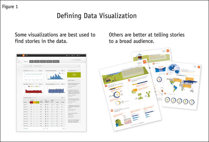
At the highest level, our user groups usually fall into two camps (Figure 1):

Analysis audiences: The researchers and other “data heads” who want and need to make deep dives into the data, play with it and ultimately develop stories.
Story audiences: CEOs, CMOs (some, not all) and others who only want the topline facts they need to do their jobs and have little interest in exploring the numbers.
Traditional market researchers – who often drive the data visualization project – are analytical people; approaches designed to meet their needs may leave “shortcut seekers” confused and even turned off. A tabular presentation is not going to make sense to them; instead, they need data graphics that draw out and annotate the important details, infographics that provide engaging snapshots and scorecards that use bullet charts to deliver contextual information in a compact way. Analytical users, by contrast, will thrive with box plots, network diagrams, perceptual maps and tabular data.
Insight can come from anywhere
We are seeing a sea change in how clients approach insights and analytics. Marketers and researchers are recognizing that insight can come from anywhere in their organizations and that other departments may even be pitching insight generation to business decision makers. With MR budgets shrinking, it becomes more important to bring insight back to the payors. Research departments are just one part of a web of services supporting a brand or product – and they need to adjust their approach to data accordingly.
Successful insights and analytics organizations we work with are being proactive and becoming more intimate with business decision-making, acting as partners with those who make choices and control budgets. Anybody can give you a set of tabs but formatting that information in a way that will drive meaningful change in your company requires empathy and intelligence. This is the analytical folks learning to speak to and accommodate the story seekers.
One crucial mistake that visualizers sometimes make in presenting data to story audiences is to separate headline findings from the data graphics that support them with evidence. For an audience that may be resistant to making data-driven decisions, obfuscating the numbers can make it harder for them to be convinced.
The best way to engage, convince and activate more passive data users is to make your findings crystal clear. If you do not, your audience may not recognize the value in the data; if you tell them that revenue is up 225 percent but do not show the line graph with that big leap, you may be creating a subtle but real believability issue.
The best data graphics feature three essential layers of information (Figure 2):
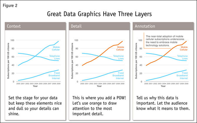
Context: Setting the stage for your data – the backdrop for your details
Detail: The POW! in your data – highlight it for clarity
Annotation: A simple description of why these data are important
The context/detail/annotation approach points audiences to the meaning and significance of a graphic without a voice-over or a smart person to explain it. If that significance is not clear, we are failing at a core function of visualization: separating the signal from the noise.
How do we format the data graphic so that it stands alone but also includes the right information to make a good decision or help the end client look good in front of his or her boss? As we approach revising data graphics, we employ a “reduce, refine, enhance” process – which is connected to our context/detail/annotation philosophy.
The first step is always reducing the data graphic to its essential elements. How much visual noise you can remove? Is the outline or gradient in that bar chart necessary to understand the deeper meaning of the graphic? What about the black outlines around that table – could they be softer in a light grey or can we get rid of them altogether? We like to employ a single-color or monochromatic color scheme that employs tints and shades of one color to create a neutral ground.
The refinement step is all about bringing the detail layer into the data graphic. Is the most important detail easy to see? Did we use a contrasting color or a different line weight to highlight the key element? Researchers will often rely on bright circles or squares but if your background information is subtle enough, it is much easier to bring out the detail without being too loud.
The final step is the icing on the cake: enhance the data graphic with meaning. Add in appropriate annotation of the key finding. By integrating the insight directly into the data graphic, you do not need to fret that your audience will not understand what they are looking at. Employing this technique over time has the added benefit of training your data audiences to have a more sophisticated view of data graphics in general. By pointing them to the detail that you, as the analyst, know to be salient, you empower them to make their own data discoveries.
Shaped by the intended users
So the lesson is simple: Data visualization needs to be shaped by the intended users, perhaps more so than the data. Knowing the key user groups who will be working with your creations is essential to making them successful. Trying to visualize without user profiles is like trying to ice skate with blinders on – success will be purely accidental. So take the time to identify and understand all of the key audiences for a data graphic. Treat them with respect and the result will seem like magic.