Editor’s note: Juliet Bakhmut is senior content strategist at market research firm CoolTool, San Francisco. This is an edited version of a post that originally appeared under the title, “The best rebrands: How did they do it?”
Proper rebranding requires a lot of time, effort and a bit of luck. Amazing rebranding gives a company an opportunity to improve the brand perception and attract new customers. Sometimes, companies invest a lot in an unsuccessful rebranding and instead of counting profits plunge into recession.
The success of rebranding depends on the quality of research, not on your designer's creative skills. If you know exactly what people want, you can give it to them. If you don't know (or if you just think you know) you make your designer work with no purpose. Rebranding without comprehensive research is another name for wasting the marketing budget.
The logo redesign is the most vivid incarnation of the conceptual changes which occur in the company during the major overhaul. In this blog I will illustrate successful rebranding with particular emphasis on companies' logos. I hope that these short stories will bring some inspiration and guidance to your rebranding efforts.
1. Apple

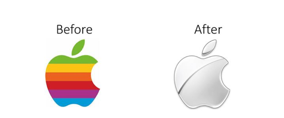
Let’s start with a classic. The rainbow Apple logo was introduced in 1976 just before the first color Apple II PC was introduced by the company. At that time this logo reflected the unique brand and its technological advantages. But by the mid-90s, no one was impressed by a color display or monitor casing and the logo became outdated and even looked childish. When Steve Jobs returned to the company in 1998 the new philosophy of design based on simple, light shapes as well as cold white and silver colors was introduced. Together with the change of the brand’s identity, the new logo was designed. It preserved the well-known shape and was repainted to better fit the new brand identity.
Lesson learned: Strive for consistency between messages your company conveys and its design features, as these help form the brand’s identity. apple.com
2. Airbnb
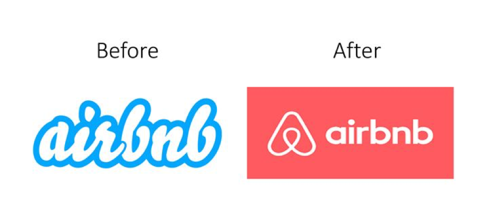
At one point, Airbnb faced several scandals, some of which resulted in lawsuits. When these scandals became public, the company decided to do a rebranding in order to improve its image. And I have to admit it was done pretty successfully. Just compare the old and the new logo. The difference is stunning. I am 90 percent sure that the majority of you didn’t know that once Airbnb had a logo with fat blue letters and stood without the round shaped triangle resembling an entrance to a small, cozy hut.
Lesson learned: Add a unique symbol to your logo and always work with fonts and colors. airbnb.com
3. Lego
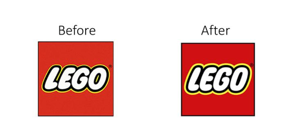
Don’t you find it amazing that in the digital era a company producing classical toys still receives billions in annual revenue? Things were not always going so well for Lego. At the beginning of the 1990s, the company faced a recession and was on the verge of bankruptcy. Making a tough call, the management decided not to give up and conducted rebranding of the company by encouraging its customers to share their Lego creations online. They even adapted their classical logo in order to make it better fit different digital platforms. As you can see, the changes were minor but quite impactful in terms of logo perception. Colors became more intensive while the font was more distinctive, which added presence and made the logo transmit confidence.
Lessons learned: Stay relevant by following trends. Even minor changes can make a difference. lego.com
4. Pizza Hut
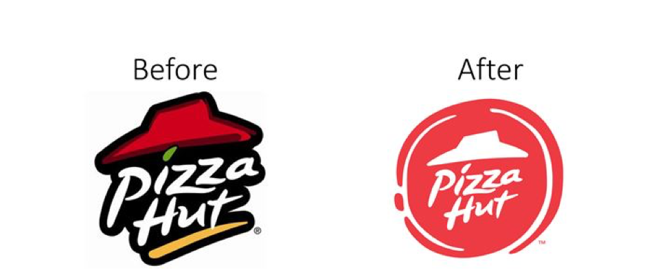
While trying to attract a younger audience – specifically Millennials and Generation Z – Pizza Hut introduced its new logo in 2014. According to the results of the conducted research, the company learned that younger people want a variety of flavors, particularly unusual ones, based on the cuisines of different cultures. New generations enjoy diversity and new experiences. So, the company expanded the variety of flavors, rebranded its restaurants by putting the emphasis on diversity and hit the target. Since the last rebranding, Pizza Hut revenue continues to grow.
Lesson learned: Successful rebranding should be research-based. pizzahut.com
5. DC Comics
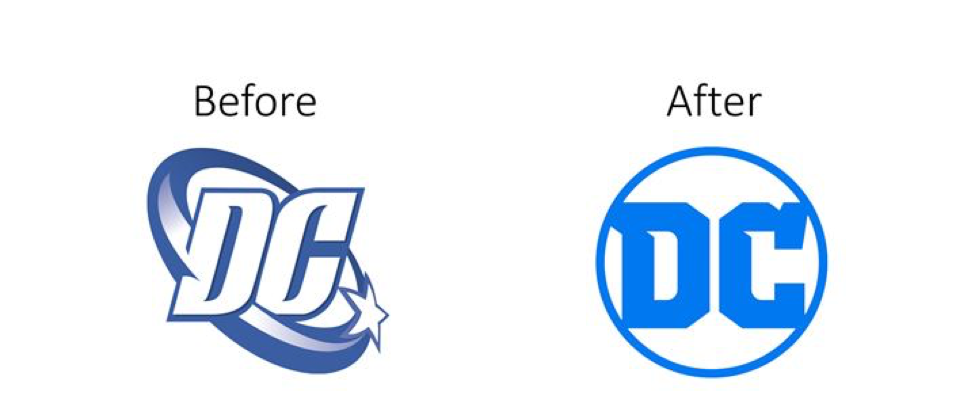
The DC Comics company is a unique business which, besides its commercial success, also has substantial culture value. Thus, its business model has always been about the balance between tradition and development aspirations. This concept is easily traceable in the evolution of the company’s logo. In 2016, DC introduced the new logo which was designed in the best traditions of the 1970s – sharp, plump letters and plain design. The new logo design was in line with the rebirth of some old comics and more traditional approaches to storytelling.
Lesson learned: Sometimes back-to-basics is the best rebranding solution. dccomics.com