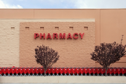
I fill prescriptions at my clinic’s pharmacy and until this morning I gave little thought to prescription bottle design. After a quick mention of the design change to Target’s prescription bottles in this morning’s office meeting – and a comment about disgruntled longtime Target pharmacy customers – I sat down at my desk to read the Associated Press’s recent article, “Unhappy Target customers send strong message on pill bottles.”
 According to the Associated Press, the switch came after CVS began operating Target’s drugstores earlier this year. CVS spokesperson Carolyn Castel said that “the company stopped using Minneapolis-based Target Corp.'s bottles because it's more efficient to fill prescriptions with the same bottle at all of its 9,600 pharmacies.”
Back in 2005, Target was labeled an innovator when it introduced the red pill container with the opening at the bottom. The bottle came with color-coded rings for the neck to help users easily tell the difference between medications – a safety and convenience feature. A quick search in Quirk’s article archive led me to our June 2005 “In Case You Missed It” article that made note of the new red containers and said, “there’s no doubting the genius of taking a mundane yet vitally important item like a prescription bottle and reworking it into a brand differentiator.”
Is CVS throwing away Target pharmacy’s solid brand differentiator? Or is the once genius idea no longer worth the cost? What about customer upset?
According to the Associated Press there was a slight slip in customer visits to Target’s in-store pharmacies in the second quarter, but CVS does not see a connection between that and the prescription bottle change. So is this a simple case of customers being resistant to change or a complete miss when it comes to the roll of market research? Time – and customer metrics – will tell.
