Editor's note: Michael Lieberman is founder and president of Multivariate Solutions, a New York research firm. He can be reached at 646-257-3794 or at michael@mvsolution.com. This article appeared in the September 9, 2013, edition of Quirk's e-newsletter.
As big data becomes more accessible, visualization services have grown exponentially. These have produced extremely agile, open-source graphics platforms that can graph consumer transaction data and huge clusters of preferences (e.g., which movies on Netflix a customer might like given his past choices) and provide visual representation of the social network activity.
This is all terrific news for the marketing research industry.
Today, powerful, free, open-source software packages like the R Project for Statistical Computing give marketing research companies the same capabilities to mine large client databases as expensive data-mining labs, which are primarily deployed in the financial, insurance and national security fields.
What that means, simply, is that we can now service our corporate CPG, food service, advertising or political clients with database insights without five-figure outlays for statistical modeling packages.
Advances in automated visualization have produced a boon for the visualization of small data (i.e., primary research). Marketing research output has never been easier to display. Below are two simple yet sophisticated examples. One involves a two-step cluster analysis and the second is a data-mining example that takes existing consumer purchase data and reports the items in which the client should specialize to connect to the greatest number of other products.
Latent class segmentation and media strategy
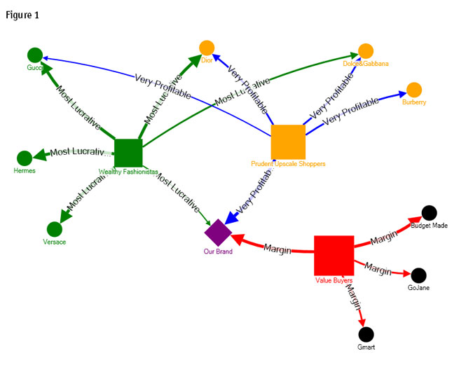
The segmentation visual shown in Figure 1 is the product of a multidimensional, two-step cluster analysis using latent class analysis and then K-means to cluster clothing style preferences, shopping behavior, money spent and self-image into three shopper segments. The size of the segment rectangle represents its relative size in the population. The thickness of the directed lines with labels such as "Most Lucrative" illustrate the profitability and strength of association for each brand to the shopper segments.

Our brand, which we'll call Purple Diamond, can now clearly see its market position vis-à-vis our segments. Purple Diamond's C-suite wants to be highly associated with Wealthy Fashionistas or Prudent Upscale Shoppers. Though these are smaller segments percentage-wise, they are more confident consumers, shop more frequently and, most importantly, spend more.
The graph also reveals that Purple Diamond competes most directly with Gmart and GoJane - bargain brands in the Value Shoppers segment space. The new advertising strategy, which resulted from this graphic, indicates that Purple Diamond wants to move closer to Prudent Upscale Shoppers and has only a tenuous foothold among the Wealthy Fashionistas. Purple Diamond should be vying for customers from Burberry or Dior to move up the high-end value-brand consumer chain.
Supermarket data mining
Data mining-specific project results are most effectively delivered visually. Figure 2 is an example of a data mining output for a major supermarket chain that we'll call Big Food. It wants to know which items it should put on special.
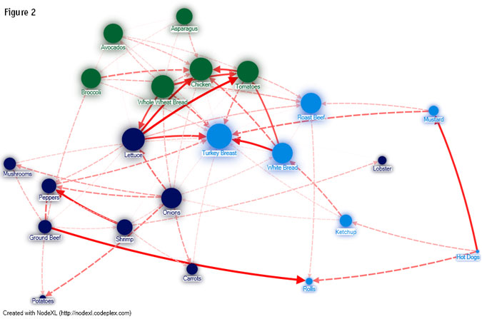
When examining Big Food's data mining visual, there are a few things to keep in mind:
- Items are clustered by transactions. Items with the same shade tend to be purchased together.
- The thickness of the red line indicates the number of transactions between its linked items. Heavy red lines indicate a big seller. A dotted connection indicates a weaker item.
- The size of the oval represents between-item connectivity - not the transaction rates. This, essentially, is what we are looking for: product influencers.
Open-source network graphing software (used to map Twitter, Facebook and hyperlinks) has been applied to this transaction-network graph. We received the data from Big Food's database and after some treatment, we placed it into our graphing software. The transactional spheres are part of the graphic calculation, which also includes clustering (we specified for the software to color the clusters differently) and eigenvalue centrality - a measure of the influence of a product in the visual, which is the statistic we are searching for.
Examining the graph, we see that there are four clusters. Peppers are purchased with shrimp; onions with carrots; broccoli with chicken; roast beef with mustard, etc.
The managers at Big Food though, would like to know which items they need to promote to increase sales overall. Best-selling items are not necessarily the correct answer. Hot dogs, for example, are a popular item but they are connected mainly to ketchup and mustard - not to other item clusters.
We want to report to Big Food the most influential items, which are:
- lettuce,
- turkey breast,
- whole-wheat bread,
- chicken, and
- tomatoes.
These items by themselves may not be the biggest sellers but they are the items in our graph that most stimulate the purchase of other items. Simply put, if you sell lettuce and turkey breast, chances are you will raise sales in other clusters, advancing Big Food sales overall.
New visual capabilities
Our Big Food example is quite small. New visual capabilities can graph literally thousands of items and find the most influential product-connector items among thousands sold by Big Food - or by Frito-Lay or Disney or Pfizer. Using emerging open-source technologies, marketing research firms can now take on the same projects as the predictive analytic leaders.