Editor's note: Michelle Pfister is senior product manager at research firm MaritzCX, South Jordan, Utah. This article is an edited excerpt from a chapter in Customer Experience is Your Business, an e-book published by MaritzCX.
Dashboards are strategic decision-making tools that help deliver, group and visualize information in a useful and impactful way. They are the hub where everything comes together; the nerve center of your customer experience program. You can see survey responses as they roll in, intuitively explore them in relation to other key metrics and share your results across the company. Dashboards can alert you to changes and help identify opportunities. They can answer questions like: How am I doing? How is my work affecting the organization? What can I do better? Where can I focus to make the most impact? How did the initiative we just completed affect our bottom line?

We all want our organizations to see earlier, sense faster and act personally.
- Dashboards can help you see earlier by compressing or eliminating the time between analysis, understanding and action – you simply drag and drop metrics onto the canvas and immediately see real-time results.
- You can sense faster by extending the ability to quickly comprehend and interactively explore performance information for everyone who needs it, tailored to each person’s roles and responsibilities.
- You can act personally by integrating data from any source to provide direct feedback and understanding of customer experience performance and trigger role-based actions.
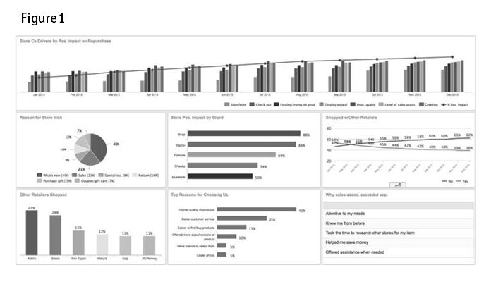
Well-designed dashboards give you access to attitudinal, operational and financial data, combined in a way that provides real insight and actionable results (see Figure 1). For example, you can create a dashboard that lists the top drivers of customer engagement trended over time. You can see the drivers relative to the actions you are taking as an organization to improve the drivers. By having an integrated measurement system that aligns to business objectives accompanied by a summary of recommended actions, you’ll be able to hardwire customer centricity at all levels of your company.
Dashboard guidelines
When a dashboard is working well, it focuses recipients on how they can specifically impact organizational key performance indicators (KPIs) such as retention, conversion and lifetime value, resulting in a real difference to the bottom line. However, none of this can happen without the effective, correct dissemination of information, so you’ll want to take the right steps to make your dashboards compelling, friendly and effective. Here are five guidelines to follow when mapping out dashboards:
1. Understand your company’s KPIs and how your program can impact them. This is probably the most important step you can take and many CX programs still have room to grow in this area. Much of the information displayed on a dashboard should be KPI-based. CX program goals should be aligned with strategic business objectives in order to inform short- and long-term planning. If properly constructed, the KPIs should immediately inform how things are trending and what action is needed.
2. Start at the top. Know how your executives want to view the data. Starting with executive involvement will be the fastest path to getting everyone in your organization on the same page. This helps you focus on those things that are most important to the organization. It also gives you vital feedback early in the dashboard-building process. Resist the temptation to design low-level dashboards first. Go up in the organization to create your initial dashboards and let the lower level dashboards follow.
- First, ask your executives what metrics they want to see and then build a sample they can review. Once they see the first version, they'll have additional thoughts and ideas. Prepare to go at least a couple of rounds before the dashboard is ready and approved.
- Each dashboard at the manager or individual team member level can provide more granular information that starts with the overview the executives are viewing. This ensures that all entities are focused on those issues that can make the most impact in your organization. It also helps them answer the right questions if an executive calls – and that helps make you the hero.
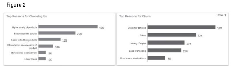
3. Keep it simple. Avoid the temptation to cover every small issue that could potentially come up. Instead, focus on the top five reasons for churn, as an example (Figure 2). And, sort information in charts from most to least important. This gives executives a quick punch list of issues to focus on. People can't meaningfully focus on more than five to seven concepts at the same time. Make use of this fact in all your chart designs.
4. Ask the right questions. You’ll create better dashboard designs if you ask and answer some basic but important questions:
- Who is this dashboard for? Once you know your target customer, many decisions will become easy.
- What is their need? Spend enough time to understand your dashboard users and their needs. This knowledge will help you cull the truly essential from the merely nice-to-know.
- Why do they need it? What surrounding situations make this dashboard important? Will it help them raise their department out of the red? Will it help them look good to the executives? Will they be able to finally see the relevant information they’ve been clamoring for?
- When do they need it? Do they need new information once a day? Several times a day? Once a month?
- Where do they need it? Do they consume information more easily in an e-mail or in a Web browser? Would they rather receive a printed report?
- How will they consume the information? Are your users apt to ask additional questions of the data or will they just focus on a few key numbers? Will you need to supply additional exploration tools, such as drill-down capabilities and supplementary reports?
5. Prepare your users for success. Don’t assume that your users will understand how to read the dashboards or immediately see the value in them. If you simply pass the dashboards over the wall, you’re likely to be disappointed. Take the time to explain dashboard access and talk through what the dashboard can tell the viewers. What nuggets can they gather? What actions should they take? How will this dashboard help them realize their wildest dreams?
Example dashboard charts
With these guidelines in mind, you’re ready to create some dashboards. Here are some examples of charts that work well.
NPS charts
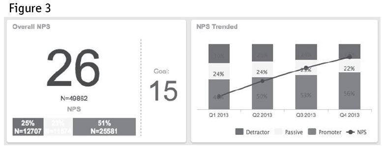
Figure 3 shows two charts presenting the Net Promoter Score (NPS) data. The first chart displays the NPS score and goal. The second chart displays NPS trended over quarters. These charts outline the distribution of the NPS score and allow users to track NPS progress over time.
Hierarchies and statistical significance
Figure 4 shows two charts that display information segmented by region. In the first chart, you can view multiple metrics for each region in the organization. Clicking on any region drills further into the region. The second chart displays scores trended over time, with statistical significance indicators for each time period.

Comments
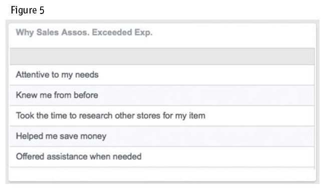
No matter what design you choose, adding specific comments to your dashboard will help users hear directly from the customer (Figure 5).
Putting it all together
An attractive dashboard is useless unless it delivers valuable information and all required information fits on the dashboard (Figure 6). Dashboards need to be actionable and relevant to the intended audience. Delivering KPIs is critical, so the user can immediately determine how things are trending.

Never forget: Companies purchase business intelligence tools for the outcomes they produce from data. A well-designed dashboard, first and foremost, provides an at-a-glance snapshot of how the displayed data translates to concrete business goals.