Editor's note: Mark Travers is an insight specialist at marketing research firm Burke, Cincinnati.
While most of us say we prefer quality over quantity when buying new products, marketers have long known this is not the case. In product categories where more really is better (think commodity products, such as bleached flour or baking soda), clever marketers are constantly searching for ways to create the illusion that packages contain more than they do.
This is why ice cream containers have false bottoms and thick lids and wine bottles are shaped the way they are. It’s also becoming more common to find packages inside of packages (think granola bars, Tide PODS or Starbucks instant coffee flavors). Making consumers believe they are buying more than they really are is a sure-fire way to increase sales.
 Though the art of optical illusion in consumer marketing is by no means a recent invention, new research is finding even better ways to trick the eye into thinking packages are bigger than they are.
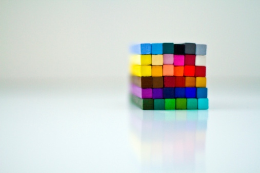
According to new research out of Boston College’s Carroll School of Management, packages with vivid colors are reliably perceived to be bigger in size than packages with less vivid colors. (The scientific term for color vividness is saturation – you may be familiar with this term if you’ve spent time using a photo editing software such as Photoshop.)
Here’s how researchers arrived at this conclusion. First, people were shown two identically sized cubes on a computer screen. The cubes differed only in terms of their color saturation: one cube was bright green, the other was muted green. They then asked people to choose which cube was bigger. Of the sample of respondents, more than 66 percent believed the bright green cube was bigger than the muted green cube.
Then, bringing this into a real-world buying environment, the researchers asked another group of people to look at one of two identically sized laptops (shown on a computer screen, as if shopping at an online retailer). Again, the only thing that differed between the two laptops was the color: one was bright red (high color saturation), the other was muted red (low color saturation). Next, the researchers asked respondents to estimate the screen size of the laptop and found that people judged the bright red laptop to have about a one-inch larger screen diameter compared to the muted red laptop.
Moreover, a follow-up study showed the effect of color saturation on product size influences buyers’ willingness to pay: people stated that they would pay more for products they perceived to be bigger, even when actual product sizes were identical.
Taken together, this research adds to a growing body of literature exploring the role of color in marketing and advertising. For instance, previous work has found that dark-colored products appear heavier than light-colored products, while light-colored products appear bigger.
Most importantly, this research has tactical implications for marketing research practitioners. For example, when concept testing packaging designs, it would be smart to test highly saturated colors when the goal is to make products look as big as possible. Incidentally, it also suggests the opposite hypothesis: when the marketing goal is to make things look smaller, reduce color saturation.
References:
Hagtvedt, H., and Brasel, S. A. (2017). Color Saturation Increases Perceived Product Size. Journal of Consumer Research, ucx039.
Walker, P., Francis, B. J., and Walker, L. (2010). The brightness-weight illusion. Experimental psychology.
Mahnke, F. H. (1996). Color, environment, and human response: An interdisciplinary understanding of color and its use as a beneficial element in the design of the architectural environment. John Wiley & Sons.