The hardest job of all
Editor’s note: Charles Young is CEO of Ameritest, an Albuquerque, N.M., research firm.
There’s an old saying among marketers that “The package is the last ad the consumer sees before she buys the product!” As a corollary, it should be added that the package is the most important ad the consumer sees before she buys the product. There are three reasons why this is true.
First of all, for many brands the package may be the only ad the consumer sees. This is certainly the case for many smaller brands, or for aging cash cows that no longer receive much ad support. But even for heavily advertised packaged goods there may be long periods of hiatus between the times when the consumer is exposed to regular advertising - times during which the package must provide the continuity of brand communication from one shopping trip to the next.
Secondly, the package is probably the most expensive advertising produced for the brand. Designing and producing the packaging for the millions of products that must sit on store shelves is typically a large part of the actual cost of the product itself - and in some cases, such as for perfumes or liquor, the package is an essential part of the brand identity. Changing out the packaging for all the product inventory is something done infrequently and at potentially great risk if the redesign isn’t at least as good as the one it replaces.
Finally, because the package is the last ad the consumer sees at the point of purchase it must do the hardest work of any advertising - it must actually close the sale!
Not radically different
For these three reasons packaging research is one of the most important kinds of consumer research that can be conducted on brand communications. That said, the way we should think about the communication elements that contribute to effective package design is not radically different from the way we approach the problem of how to measure other forms of creative executions.
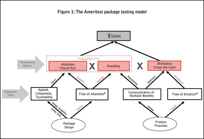
Like all types of communication between the brand and the consumer, a package must accomplish three things: it must first get the attention of the consumer; it must focus consumer attention on the brand; and it should motivate some kind of consumer action or behavior.
These primary functions of the package are, in turn, influenced by secondary creative variables. For example, the attention-getting power of the package is a function of both form and content. By form, we mean the design elements such as shape, color, graphics and size - which the consumer might perceive as more or less unique, appealing, or even “touchable” (an important, but poorly understood variable). By content, we mean the information on the package, both verbal and non-verbal, that the consumer must take in as she looks at the package - a perceptual sequence of mental processing that my firm calls the Flow of Attention.
How good a job the package does of branding the product inside is again a function of two variables: how quickly the package telegraphs the identity of the brand and how clearly it communicates the positioning of the product versus the competitive offerings on the shelf.
Finally, in order to motivate the consumer - and to close the sale - it is important that the package not only communicate the relevant selling ideas that need to be listed on the package but also engage the consumer’s emotions in a meaningful way.
To provide a roadmap to the information that we collect when we measure a package’s communication performance, and to identify the analytic tools that we can use to diagnose the reasons why a particular design is working well or poorly, we have developed the heuristic model shown in Figure 1. To understand how some of these variables interact, it is useful to discuss them in more detail.
Attention-getting power can be thought of in two ways, depending on the mindset of the consumer at different moments as she is shopping in the store. For some things, the consumer comes into the store planning to make a purchase. These are the items on her shopping list. In these cases the job of the package is to make itself as easy to find as possible, in order to minimize the consumer’s search time. For other things, such as new products, the consumer comes into the store not knowing she wants them. She is just browsing, trying to maximize the return on the time already invested in making a trip to the store. In this case, the job of the package is to call attention to itself so that the consumer will notice it as she scans the shelves for something new and interesting.
Given that the average supermarket these days has over 30,000 products sitting impatiently on the shelves wanting to be seen, this is not an easy problem for the brand in either case. From the brand’s point of view the problem of breaking through all that clutter is one of getting attention. But if we turn the problem around and look at it from the consumer’s perspective, it’s also a problem of giving attention. From their point of view, the problem is one of allocating attention as part of a search process.
Scarce resource
From our work testing communications of all kinds we’ve learned a few things about how the consumer allocates her attention. First of all, attention is a scarce resource - she tends to be frugal with how she spends it. Second, attention tends to be a process that operates largely below the level of the conscious mind. Unconscious emotions, for example, play an important role in driving the selective attention of the consumer’s search process.
Third, if you think about it, focusing the attention of the mind is a lot like focusing the lens of a camera, as you rapidly zoom in and out, depending on the kind of information you are trying to process. For example, you might use a wide-angle lens when you pan across a shelf, looking for a familiar brand name. And, if you see something interesting and out of the ordinary, you might zoom in on a particular brand and focus close-up on the elements on an individual package.
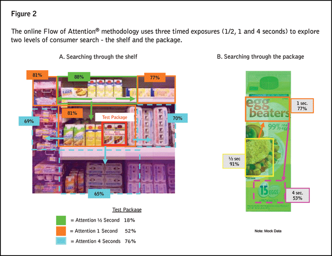
To measure the results of this visual search process, we use a kind of time-lapse photography of what the consumer sees, which we call a flash test. In an online test of a new package design, we expose the test stimulus - either the package shown in the context of a shelf or up close by itself - for controlled periods of time: ½ second, 1 second, 4 seconds. After each exposure, the image is replaced with a reporting grid and the respondent is asked to point to where she was looking and then to write a brief description of what she saw.
Depending on the goals of the research, the questions might vary. For the question of findability for a well-established brand, we might ask the respondent to look for a particular brand on the shelf during limited timed exposures and then ask her to indicate on a grid where she found it. As you will notice from the model, findability is actually a function of two variables: how well the package stands out on the shelf or calls attention to itself and how quickly it telegraphs the brand identity. Brand identity can, of course, be communicated in a variety of ways and not just by focusing attention on the brand name - recognizably distinctive shapes, such as those of the Method line of products, might help the consumer quickly find her brand on the shelf.
Results are reported in graphs like those shown in Figure 2, which look pretty much like eye-tracking data, with two important differences. First of all, this data is collected on the Internet, without special eye-tracking cameras. Second, the verbatim responses that go with each timed-exposure provides us with important insights about what the respondent was thinking as she was looking at the shelf or at different elements of the package (including potential confusion) - data which is missing from traditional eye tracking studies.
The Internet is a popular research medium for testing new package designs, primarily because of the economics, timing and flexibility in respondent sampling. Moreover, the construction of virtual store environments and the technology that allows respondents to pick up the virtual package from the shelf during an interview and turn it around to look at all the sides of the package have increased clients’ comfort level with online package testing.
A physical product
For those resistant to online testing, the issue is that unlike a television commercial or a Web ad or even the image of an ad printed on the glossy pages of a magazine, a package is undeniably a physical product. The importance of that physicality can be seen in numerous examples of packaging success. For example, the shape of the iconic Coca-Cola bottle - and how comfortably it fits your hand - is, even today, an important piece of retro brand communication. The squeezable bottle was an important milestone in the history of the Heinz Ketchup brand. How easily a package can be opened or resealed, how compactly it sits on a kitchen shelf, how conveniently the body wash bottle can be hung upside down in the shower for ease of use, how child-proof the easy-to-open bottle cap is - these are issues of functionality that cannot be studied online. These require package use tests. However, what the package communicates can be studied online quite effectively.
The researcher and author Paco Underhill has spent a lifetime as a consumer anthropologist videotaping and analyzing consumer shopping behavior in the store. One of the interesting things he has found is that the odds a consumer will buy a product increase significantly if the consumer actually touches the product and doesn’t just look at it on the shelf. Somehow the act of touching the product causes it to connect with the consumer in a different way, perhaps making it seem more real so that she can more easily imagine it being a part of her life.
Or think about one of the most outstanding examples of product design in recent years: Apple’s iPhone. In a very real sense the iPhone is a “package” of technology. To advertise this hugely successful product all Apple had to do was show fingers touching the screen of the phone. The essence of this design is its extreme touchability.
In an online test of packaging we can, and of course do, ask the consumer, “How likely would you be to pick this up and look at it more closely if it were on an actual store shelf?” This measure of consumer intent is an important diagnostic for how touchable a package is.
Touch the consumer
What is it that a package must communicate in order to make the consumer want to reach out and touch it, to pick it up from the shelf, to look at it more closely? To understand that, we need to examine the role that emotions play in the total communication of a package - because before the consumer will touch the package, the package must first touch the consumer.
But first, we should think about why the typical package is loaded with information. For many products, just about every relevant product feature and benefit that can legally be claimed can be found listed on the package, along with attention-getting graphics and visuals, as well descriptions of ingredients and consumer-protection copy.
Unlike traditional mass-market advertisements that, as ad agencies often counsel us, should be single-minded in the main message, a package must communicate with any prospect that is thinking about buying the product. In the final moments of the consumer’s decision, a typical package broadcasts multiple ideas like a fast-talking salesman trying to seal the deal!
In fact, an easy way for a marketer new to a category to quickly conduct a complete inventory of the selling ideas and marketing strategies currently operating in that category is to collect the set of competing products from their shelves in the store and write down all the product claims found on the packages. All of the selling propositions for the category will be there.
The reason for this is not that the manufacturer is indecisive and can’t make up its mind what ideas are important to put on the package. Rather, manufacturers understand that frequently the role of the information on a package is to rationalize human decision-making, which is driven by emotion.
Consider a simple case. Suppose I’m shopping for something to eat tonight and I have a sudden urge to eat ice cream as I walk past the freezer case. I know I’m not supposed to have it because it’s not on my diet, but I pick up a container with an appetizing photograph of a scoop of chocolate ice cream and notice that it’s “low-fat” and “contains one-third fewer calories.” In that case I might be able to overcome my well-meaning adult resistance to my inner child and buy the ice cream - by rationalizing the fat and calories that I didn’t buy!
Or consider a slightly more complicated case. Suppose I’m shopping for an over-the-counter cold medicine and I do a side-by-side comparison of two products on the shelf. One is a well-known brand I trust, with very appealing graphics and it costs a little more than the other, which is a store brand. I compare the list of symptoms each medicine will treat and find them to be the same, but like many consumers, I will buy the more expensive brand!
But what if the cheaper store brand has a longer list of benefits and the brand name has new, very clean-looking package that reminds the consumer only of the positioning idea the brand has been advertising lately. In that case I think I would be in a quandary - my emotions are blocked by the rational counterargument that I should not have to pay more to get fewer benefits.
Remove barriers
In all three of these cases, the role of the information on the package is not to motivate, it is to remove barriers to the purchase I want to make emotionally. Emotion is the driver of want and desire, of need and impulse; the role of the conscious, rational mind is to constrain and focus our emotional energy into positive behaviors. As a general rule, rational thought has a bias toward inaction.
(This is a common complaint among marketers about us overly-rational researchers - we want to study things too much, rather than “just do it.”)
A simple way to model the consumer decision process at the point of sale is to imagine the energy of my needs and desires constrained by my rational thoughts, inhibiting the action that I really want to take, perhaps at an unconscious level: to buy a particular product. You might visualize this as a polygon with many sides, with each side representing an argument in the category about why one brand might be better than another. In this case, the role of the rational information on the package is to systematically remove the barriers to action, one at a time, until enough barriers have been taken down that the emotional energy to buy has been released.
The role of the emotional information on the package is to generate that irrational, emotional desire in the first place. An example of emotional information would be the appetizing bowl of cereal on the cereal box. Or the image of the beautiful, flowing hair on the shampoo package. Or the image of happy kids and parents spending quality, family time together on the box containing of a board game. It would be visuals of the product in use, of happy outcomes and smiling, satisfied customers - all the kinds of imagery that can fire the imagination of the consumer so that she can see in her mind’s eye how the product inside the package will fit into her world and make her life and the lives of her family better.
In the right order
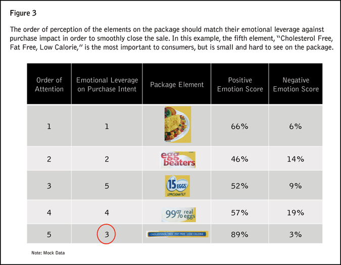
For a package to communicate effectively, therefore, it is important that the consumer actually sees all this information, both rational and emotional. And it is important that she sees it in the right order, before her attention wanders, so that she sees the most important information first and stays engaged until she decides to buy.
To measure the importance of the various kinds of information on a package we use Photoshop to decompose a package into its communication elements. In our online interview we then expose the consumer to each of these elements and have her rate how relevant each line of copy is and how she feels about each of the emotionally-charged graphic elements on the package. We can then correlate each of these ratings with the overall motivation score of the package to see how much leverage each element has in driving purchase intent.
By putting this data together with the Flow of Attention data we can then show how the consumer’s thoughts and emotions flow through the package. The example shown in Figure 3 (using mock data) provides a hypothetical illustration of how research might be used to identify an opportunity for improving the communication impact of a package, so that the consumer sees more quickly the information, both rational and emotional, that is really important to her.
Dynamic role
The important idea here is that the design of effective packaging must take into account the active, dynamic role that the consumer plays in co-creating the meaning of a brand’s packaging. The consumer is a search engine who wants to buy. But unlike the simple keyword search engines of the Internet, the consumer search process must be engaged emotionally, rationally and even physically. Designing a package that can really touch the consumer on all three levels is the key to closing the sale.
