
Going beyond the binary
Editor's note: Carl Jago is a senior researcher at User Research International. He can be reached at carlj@uriux.com.
Much of the confusion around Kano method studies can be traced to how the data are labeled, grouped and interpreted, often leading to misdirected prioritization efforts. Our version of the model, which we call User Research International (URI) Kano and will explore here, preserves the elegant two-question structure yet streamlines terminology, trims the response scale for clarity and centers analysis on simple, powerful proportions. This methodology, born from practical application in our quantitative research group and an understanding of Kano’s original principles, addresses the common pain points in traditional Kano studies.
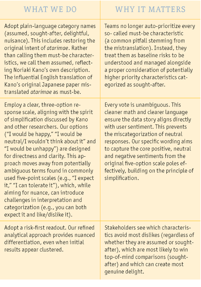
No new survey questions are invented; we simply interpret the classic present-vs.-absent pair through clearer language and cleaner math, with the goal of giving product teams a fast, defensible roadmap (see “What we do” sidebar). The URI Kano is designed to be useful when teams need to move beyond basic prioritization to uncover true delighters, manage baseline expectations and make informed decisions in competitive or evolving markets.
The original Kano model brilliantly showed that users do not react linearly to every product or service feature. However, decades of teaching examples that portray “sought-after” as a smooth, more-is-better dimension (when the standard Kano survey uses a two-question, present-vs.-absent design), an often-misleading five-choice answer set and one critically mistranslated category (atarimae as “must-be”) have seeded considerable confusion.
As shown in the accompanying box, product teams often find themselves forcing Kano results into familiar-but-incorrect schemas, such as automatically prioritizing all so-called must-be items first or misinterpreting so-called performance characteristics as dimensions where more is always better.
Misunderstanding | Risk to Roadmap |
Schema mismatch #1: Must-be = absolute table stake. The common translation of atarimae as must-be implies an absolute requirement. In reality, atarimae merely shows widespread annoyance if absent; it does not inherently prove the product is unusable without it. | Everything inaccurately labeled must-be jumps to the top of the backlog, potentially starving higher-impact product development work. |
Schema mismatch #2: The popular more-is-better teaching example. Teams often expect a smooth more-is-better curve for performance features based on this common example. The standard Kano survey, however, typically measures reaction to a single present vs. absent threshold. | Teams may treat a sought-after characteristic as a dimension where more is always better. True tuning requires a separate multi-threshold study. |
Curve mythology: Treating sketches as data. Organizations sometimes justify diminishing returns or all-or-nothing investment strategies based on the shapes of theoretical Kano curves that were never actually measured for their specific features. | Budgets are allocated based on folklore rather than evidence derived from the actual user data collected. |
Commonly used five-point response scales include overlapping options. | Respondents are unsure which option to select and researchers are unsure what respondents meant when they made their selections. |
A user-centric terminology reset
Our research and experience highlighted that much confusion originates from the terminology itself. The URI Kano was designed to adopt clearer, more intuitive labels that directly reflect user sentiment and expectation.
Classic Term | Must-be quality elements |
URI Kano Term | Assumed characteristics |
Essence | Taken for granted baseline. Presence avoids annoyance (users notice its absence with displeasure); users rarely think about it unless it’s missing. These are items whose absence represents a risk. |
Classic Term | One-dimensional quality elements |
URI Kano Term | Sought-after characteristics |
Essence | These are features customers are consciously considering and often compare across products. Presence pleases and absence hurts; the characteristic is top-of-mind during evaluation. |
Classic Term | Attractive quality elements |
URI Kano Term | Delightful characteristics |
Essence | A good surprise. These are not typically on customers' minds until experienced, offering significant positive differentiation potential. |
Classic Term | Indifferent quality elements |
URI Kano Term | Indifferent characteristics |
Essence | Little impact either way |
Classic Term | Reverse quality elements |
URI Kano Term | Nuisance characteristics |
Essence | Presence annoys or absence pleases |
The refined three-option Kano question
Q1: "If the product had this characteristic, how would you feel?"
Q2: "If the product did not have this characteristic, how would you feel?"
The URI Kano utilizes a clear, three-option response scale. The concept of simplifying the original five-option scale has been explored by researchers. Notably, Kano himself, in his 2001 paper, “Life cycle and creation of attractive quality,” presented at the fourth International Quality Management and Organisational Development conference, suggested a three-option approach (“satisfied,” “neutral,” “dissatisfied”). This was reportedly to address linguistic nuances when translating the original Japanese five-option scale for English-speaking audiences (Kano, 2001, as discussed by Witell and Löfgren, 2007, and subsequently Horton and Goers, 2019).
Response options (three only):
○ I would be happy
○ I would be neutral/I wouldn’t think about it
○ I would be unhappy
Why three options?
Ensures clarity: Our specific wording (“I would be happy,” “I would be neutral/I wouldn’t think about it,” “I would be unhappy”) is chosen to directly reflect the core positive, neutral and negative poles of the original five-option scale.
Yields unambiguous data: It eliminates confusing and often misinterpreted options like “I expect it” and “I can tolerate it.” Every vote clearly indicates positive sentiment, neutrality or negative sentiment, allowing the math and the resulting story to align cleanly.
Classifies correctly: It keeps both indifferent and unimpressed respondents safely in neutral, preventing their responses from being miscategorized.
Measured values: Proportion happy if present (share choosing “Happy” to Q1) and proportion unhappy if absent (share choosing “Unhappy” to Q2). No mystery coefficients; just straightforward proportions everyone understands.
Note: “Happy/neutral/unhappy” labels have been developed for native-English speakers in Western contexts. If this survey is translated or administered to respondents whose first language is not English, the wording must be reconsidered, just as we have done here in response to the translation from Japanese to English. Word choice itself shapes the measurement.
How to work with continuous attributes
For scalable traits (e.g., battery hours, speed, megapixels), which are often sources of confusion in Kano studies, the URI Kano employs discrete thresholds. Defining these thresholds requires careful consideration of user perception and market context.
Example: Instead of asking about “good battery life,” we would test a specific state like: “Laptop delivers 10 hours per charge.”
Each defined threshold is treated as its own distinct present/absent question pair. The URI Kano then tells you precisely how users react to that specific state. Fine-grain tuning across multiple levels of a continuous attribute naturally calls for testing additional thresholds or employing a different, complementary study design.
The URI Kano four-step workflow
Step 1: Anchor
Include at least two known-category “anchor” characteristics in your survey to sanity-check results and provide context.
Step 2: Phrase every characteristic binarily
Ensure each item clearly represents a “had/did not have” state. Focus on a product’s abilities, avoiding confounding these with specific implementation details where possible.
Step 3: Field and plot proportions
- Initial analysis involves excluding participants who provided questionable response pairs (i.e., “Happy if present” and “Happy if absent”) and then taking note of, but setting aside, nuisance response pairs (i.e., “Unhappy if present” and “Happy if absent”).
- X-axis = Proportion unhappy if absent
- Y-axis = Proportion happy if present
- Charting involves splitting the plot by the mean or median of each axis, creating four relative quadrants that indicate the relative qualitative classifications (i.e., assumed, sought-after, delightful or indifferent).
Step 4: Risk-first prioritization
- Prioritize avoiding dissatisfaction: The primary sorting criterion is the “proportion unhappy if absent.” This metric directly quantifies the potential for user dissatisfaction if a characteristic is missing. Crucially, this means prioritizing based on the degree of measured negative impact, regardless of whether that characteristic falls into the assumed or sought-after category. A high “proportion unhappy if absent” for a sought-after characteristic signifies a significant risk of not meeting user desires and it should be weighted accordingly.
- Consider upside potential: “Proportion happy if present” serves as a key secondary ranking factor or tiebreaker, bringing in the potential for positive differentiation.
- Leverage continuous data: This approach emphasizes prioritization based on the continuous nature of the collected data (the proportions) rather than relying solely on the categorical labels. While categories (assumed, sought-after, delightful) provide vital qualitative understanding of a feature’s relative nature, the proportion of the customer base who would be happy/unhappy drives the prioritization sequence.
- Integrate business factors: Overlay these user-centric, data-driven priorities with essential business considerations such as feasibility, cost, strategic alignment and market opportunities to form the final roadmap.
More than an importance score
Across our five most-recent Kano studies (~300 respondents each), “proportion unhappy if absent” shows a strong correlation (r = 0.87-0.93) with traditional point-point importance ratings.
“Proportion unhappy if absent” therefore effectively captures the same core priority signal as an importance score. The URI Kano then adds differentiating insights.
Equal “importance” scores can mask huge differences in user expectation and happiness upside. The URI Kano distinguishes features that are merely expected (assumed) from those actively desired and compared (sought-after).
Low “importance” (often meaning users don’t spontaneously ask for it) yet a high “happy if present” proportion
reveals true differentiation opportunities (the delighters) that are often invisible to simple ratings scales.
Potential benefits
Balanced investment and risk mitigation: Risk-first sequencing (addressing potential for high dissatisfaction first) avoids wasting development resources and ensures basic expectations are met.
Evidence-based funding: No curve mythology; fund features based on clear evidence of user reaction to their presence or absence, not on schemas or theoretical sketches.
User delight unlocked: Systematically identifying and targeting delightful characteristics builds brand loyalty and creates positive differentiation.
Shared language, clearer decisions: Customers, researchers and stakeholders finally speak the same language, leading to more-aligned and confident product strategy.
Roadmap for what to build next
The URI Kano trims jargon, fixes the response scale for unambiguous data and focuses analysis on the clear proportions of users happy with the presence of a characteristic versus the proportion unhappy with its absence. This disciplined interpretation of two straightforward endpoints per characteristic is designed to deliver a risk-aware, evidence-based roadmap for what to build next (and what to skip), empowering teams to innovate thoughtfully and meet user needs more effectively.