
Editor's note: Carl Jago is mixed-methods research lead at User Research International, with over 10 years of experience in advanced quantitative methodology and AI product research. He holds a Ph.D. in experimental psychology from the University of California San Diego and a B.S. in neuroscience from Columbia University. Find Carl on LinkedIn.
MaxDiff (maximum difference scaling/best-worst scaling) has a stellar reputation. However, it has become a tool we too often reach for by reflex rather than being one option among several, chosen deliberately. You’ve probably seen this scenario: someone says, “We need to prioritize 8-30 items,” and MaxDiff gets treated like the gold standard. We can feel obligated to deploy it if we want to be taken seriously. It is seen as more scientific, more precise and more defensible than simpler options. This isn’t the position of one overzealous article or blog post. Rather, it’s industry-wide orthodoxy, repeated across major platforms, vendor documentation and practitioner guides.
But that belief is expensive. Here’s why:
- It costs money (licenses).
- It costs time (more setup, greater complexity).
- It costs survey respondent goodwill (more survey screens, more drop-offs, fewer follow-ups).
- And it can cost clarity, because stakeholders get handed outputs that often tell one story while appearing to tell another.
This article is a reset. Not “MaxDiff is bad.” Not “Hierarchical Bayesian (HB) analysis is useless.” Just a practical point: MaxDiff is situational. It’s a format for managing cognitive load for survey respondents. It’s for estimating win-loss tendencies for all items in lists that are too long for single-screen ranking tasks.
Seen for what it actually measures, the method stops being a default and becomes what it should have always been: one option among several, chosen deliberately.
Before we get to the decision framework, which will help us make those kinds of choices, we need to clear some obstacles. Here are the maximum myths of MaxDiff.
The “twice as important” ratio myth
This foundational misconception has led many of us to believe that MaxDiff possesses a kind of secret sauce. Here’s the myth in plain English: If Item A’s MaxDiff score is 10 and Item B’s score is 5, then A is “twice as important.”
This isn't a fringe misunderstanding; it's standard guidance. MaxDiff is routinely described as "a survey method used to measure relative importance" (SurveyKing, n.d.), its outputs are called "importance scores" (Sawtooth Software, n.d.-a) and Sawtooth's documentation states that rescaled scores "reflect a ratio-quality scale, allowing one to conclude that an item with a score of 10 is twice as important/preferred as an item with a score of 5" (Sawtooth Software, n.d.-b).
That isn't correct. What MaxDiff score differences actually tell us is often far less strategically relevant than true ratio of importance would be. Let’s clear this up.
MaxDiff is a voting tournament, not a ruler
A MaxDiff task doesn’t ask people “how much” they value anything, it asks them to pick winners and losers from small lineups. So the core construct MaxDiff observes is:
Win tendency: how frequently an item wins (and avoids losing) in repeated competitive choice sets.
From there, models can express a kind of magnitude, but it’s a magnitude of choice dominance, not a magnitude of value intensity. Choice dominance tells us how decisively one item tends to win. It doesn’t tell us how much more valuable it actually is.
Twice the votes isn’t twice the value.
The gaps between scores do carry information. Larger gaps reflect more decisive, consistent wins. But decisiveness is not the same as magnitude of value.
The ratio value test
If the only thing the task records is who wins, then there is no way to tell whether the winner is slightly better versus wildly better in absolute terms.
To demonstrate this, we ran a simple simulation with N = 300 synthetic respondents. The “items” were literal numeric values (not labels) so that a value-sensitive method would have something to detect.
In Survey A, the items were the numbers 1 through 10. In Survey B, the items were 1 through 9 plus 100. For each MaxDiff question, respondents always picked the highest number as best and the lowest as worst.
As shown in Figure 1 the HB utilities were blind to ratios of value. Replacing 10 with 100 produces the same HB utility profile: the intrinsic value of the winner changes but not the inferred spacing from the model. MaxDiff can’t “see” if the intrinsic value is much larger or only a little larger; only that it wins consistently.
It does not measure ratios of importance, nor of liking, nor of cardinal utility, nor of business value. Going from “wins twice as much” to “is worth twice as much” is usually an unwarranted leap in interpretation.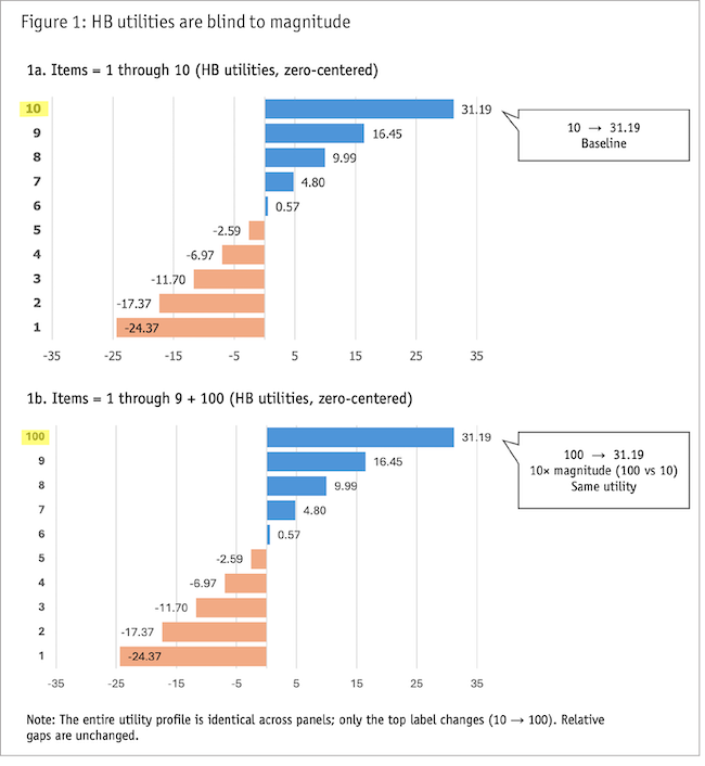
What MaxDiff actually measures (and the most transparent way to report it)
The raw MaxDiff signal is counts. The observations in a MaxDiff study are:
- How often each item was chosen best.
- How often chosen worst.
- How often it was shown but not selected (i.e., “unselected”).
That’s the raw signal. Everything else is processing.
Figure 2 shows the transparent MaxDiff signal: counts + net win score. MaxDiff records best, worst and unselected outcomes. Net win score (%best − %worst) turns that raw signal into an ordered, stakeholder-legible decision list.
Why consistency doesn’t equal magnitude
Some readers may be thinking: But wait! Doesn’t the consistency of winning tell us about magnitude? If someone always beats everyone else, doesn’t that mean they’re much better, not just slightly better?
A notable defense of MaxDiff’s ability to “recover metric differences” is that people are not perfectly consistent (Orme, 2018). When two items are genuinely close, respondents will sometimes flip their rank order; whereas when they are far apart, flips are rarer. And therefore, greater consistency in a preference can be a result of greater separation between the items being compared. However, that same consistency also reflects respondent certainty.
You might like chocolate only slightly more than you like vanilla. But you’re certain about it.
Win consistency reflects both differences in value intensity and differences in rank certainty.
For MaxDiff (or any ranking task for that matter) to accurately model metric differences, it must assume that people are equally certain about all items. But in real preference and importance work, certainty is rarely uniform across our lists. People are often more certain about the extremes (top/bottom) and less certain about the middle, so the model can’t reliably tell the difference between “This is much better” and “People are simply more certain about it.”
Both create fewer flips. Both create separation between scores.
For some business questions, such as predicting reliable future behavior for situations resembling the MaxDiff task, certainty may be exactly the signal we want. But it's still not value intensity and the two shouldn't be conflated.
So here’s the summary: MaxDiff measures win tendency. While it can express win tendencies as modeled choice dominance, that’s a transformation, not a raw observation.
Here’s the reset: MaxDiff is a tournament signal. The simplest reporting is ... the votes.
And once we see MaxDiff this way (as a tournament that produces a win-loss signal), then we’re ready to dispel an even broader and more consequential myth.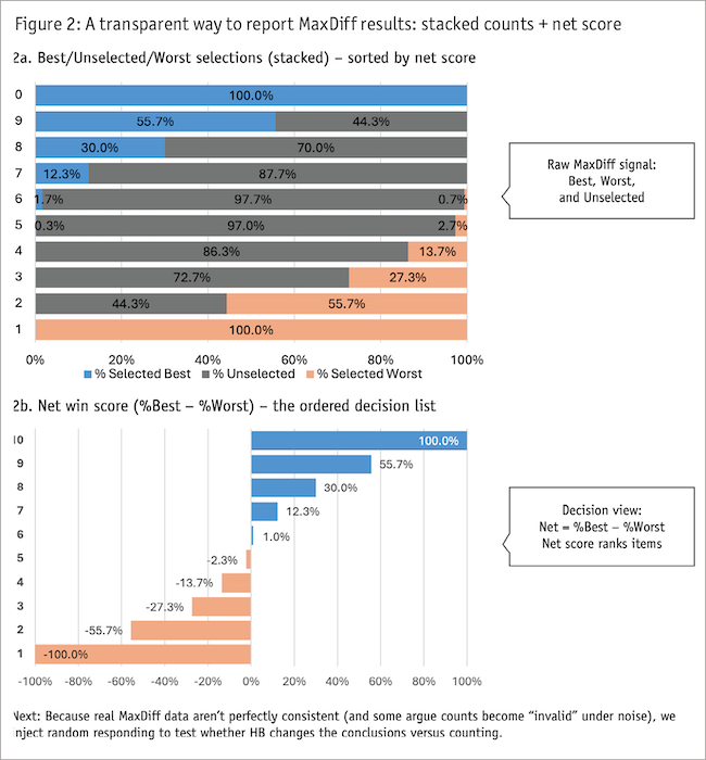
The “alternatives are lesser” myth
Here’s the myth in plain English: If you want a defensible prioritization study, you need MaxDiff. Ranking is simplistic. Top-N selection is amateur. Anything other than MaxDiff is “unprofessional” or lacking in rigor.
Quantilope describes MaxDiff data as "far more powerful than other traditional scale/ranking tactics" (Quantilope, n.d.). Note what's missing: no qualifier. Not "more powerful when lists are long." Not "more powerful when you need the full hierarchy." Just far more powerful, period. This kind of framing turns a situational tool into a default and it turns alternatives into something you settle for.
This myth drives the MaxDiff-by-reflex phenomenon. But it rests on a misunderstanding: the belief that MaxDiff captures something simpler methods can’t. In fact, MaxDiff’s core measure is win tendency; i.e., who wins how often.
We don’t need MaxDiff to count votes.
And to be clear: The alternatives we're proposing aren't rating scales. There are other forced-choice methods (e.g., ranking, Top-N) that also require trade-offs but with less overhead.
Even if “twice the votes” is strategically relevant for us, that’s not a MaxDiff-only superpower.
There are simpler methods that produce across-sample win-tendency ratios. And often they do it with fewer screens, less fatigue, less cost and less interpretive risk. For example, in simple ranking, if Item A is ranked No. 1 by 40% of people and Item B by 20%, then Item A is “twice as frequent a winner.” That is a ratio. And again, we’re at a loss as to whether Item A is much better or whether people are just certain that it’s better.
MaxDiff does provide more than simple rank order. But so does aggregated ranking data. Both methods produce frequency-based signals with meaningful gaps that reflect preference strength and certainty. Neither method produces the ratio-scaled importance scores that MaxDiff is commonly understood to provide.
Simpler methods produce ratios too. To be efficient and effective, we should ask ourselves: What’s the least wasteful approach to give us the win-tendency signal we actually need? The decision framework helps us answer that question.
The decision framework
We can think of this as a “least force” principle.
Situation 1: You have a short list (up to about 10 items)
If your list is short enough that respondents can handle it on one screen, don’t run a more involved tournament-type format.
Bonus myth #1: “To save us from the tyranny of rating scales, where everybody can rate everything a 5, we need MaxDiff to force trade-offs.”
The reality: MaxDiff is not the only way to force trade-offs nor, more importantly, is it always the best way. The common framing of "MaxDiff vs. rating scales" (e.g., Raynor, 2025) overlooks simpler forced-choice methods. Simple ranking, for example, forces trade-offs too.
Ranking and MaxDiff trade survey difficulty in different ways: ranking asks for one global sort (which becomes increasingly challenging as the list gets longer), whereas MaxDiff asks for many repeated micro-choices (which becomes repetitive and fatiguing). For short lists, the one-screen simple-sort approach is often the least wasteful option.
The decision: Use simple ranking.
Optional upgrade: If you’re approaching 10 items and you’re worried about cognitive load, you can create a group-and-rank task. This is where respondents first sort the items into buckets (e.g., high importance, medium importance, low importance) and then rank order the subset within each bucket. This can still be completed on just one or two screens.
Simple reporting options: % ranked No. 1 (winner frequency); top-three frequency; average rank (if you truly need a full ordering signal).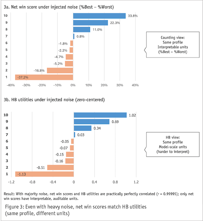
Situation 2: You have a long list but only care about the winners
This is the most common real-world situation. Teams ask for “the full ranking,” but what they act on is usually the top few.
Bonus myth #2: “To be rigorous, I need the full hierarchy of everything.”
The reality: If the decision is “What do we build next?,” measuring the middle of a long list often changes nothing. It just adds cost.
The decision: Use Top-N selection (Top 2/Top 3).
Why it works: Top-N is brutally efficient. One screen. Minimal fatigue. Transparent analysis. Easy to explain (“Here’s what people picked”).
Optional upgrade: Ask for Top-N and Bottom-N and report a net score. When you aggregate the data, you get most of the same decision signal without turning the survey into a tournament. And by reducing 10 or 12 survey screens to just one, that leaves you lots of room for important follow-up questions like, “Why is this an important factor for you?”
Situation 3: You have a long list and you genuinely need the full hierarchy
If the list is too long to rank and you truly need ordering across most items, MaxDiff can be justified on its own terms.
The decision: Use MaxDiff, but treat it as cognitive-load management, not magic.
MaxDiff also earns its keep here by providing cleaner discrimination in the middle of the list than a single full-list ranking.
First, the non-negotiable: use a decent design (reasonable exposures, balanced appearances, not absurdly sparse). Thin data with sophisticated math is still thin data.
Bonus myth #3: “Counting analysis is invalid. You must use HB.”
Many teams treat a MaxDiff study as incomplete until it’s run through a Hierarchical Bayes model. Counting summaries (“best” counts, “worst” counts, net scores) get dismissed as naive or amateurish. Some documentation states this explicitly: "Counts analysis is not valid, because it ignores the experimental design" (Displayr, n.d.).
But in standard, balanced commercial designs, the data say otherwise. To show this, we injected substantial noise into our simulation (two-thirds of the data was entirely random) and compared count-based net scores to HB utilities. The correlation between them was r = 0.99995 (or rounds to 1.0 at four decimal places). Figure 3 shows the comparison: the ordering and profile are the same; only the units differ.
When we inject substantial random responding, the count-based net scores and HB utilities remain nearly identical in ordering and profile (units differ; conclusions don’t).
This pattern holds in practice. Across our five most recent MaxDiff studies for large technology companies, the correlation between count-based net scores and HB utilities ranged from
r = 0.99 to r = 1.00.
This does not mean HB is never useful – see Situation 4 (below) – but for most prioritization studies in our field, counting analysis will give you the same answer with more transparency.
Situation 4: When you need modeled individual-level utilities
Most segmentation doesn't require individual-level modeling. If you're comparing results across known segments (demographics, roles, personas, customer tiers), just run the analysis separately by group. You can do that with any of the earlier approaches.
But if you need to discover new segments from the MaxDiff preference data itself (clustering people by their preference patterns rather than by observable characteristics), HB is the right tool. Individual-level count scores are noisy; HB's smoothing produces cleaner estimates and cleaner clusters.
HB is also the right choice for:
- TURF/reach optimization, where simulation quality depends on stable individual utilities.
- Personalization, where you're making predictions at the individual level.
- Sparse or unbalanced designs, where borrowing strength across respondents is doing real work.
Reporting after HB: Utilities, shares and the scenario problem
Even when using HB for the reasons above, you might prefer to report the aggregate level with a stacked counts chart and net scores (e.g., Figure 2) because they are transparent and easily understood.
Bonus myth #4: “You can use whatever output your platform defaults to.”
This advice is common. A recent textbook recommends using "the default scores that your platform or code reports" and avoiding technical explanation (Chapman and Rodden, 2023). But that guidance suggests the defaults are interchangeable when they’re not.
Three things often get blurred.
- Utilities (HB outputs). Utilities (e.g., Figure 1a) are model parameters. They are not percentages. They are not “importance units.” And “twice” doesn’t mean much on that scale.
- Standard preference shares (SoP). Standard shares (e.g., Figure 4a; note: same simulation/data as Figure 1a) typically answer a very specific question: If all items were shown at once and someone picked exactly one winner, what is the probability each item would win? That can be useful, but it’s a scenario output, not value intensity. This scenario (pick exactly one from the full set) matches some real decisions (e.g., which brand will they buy?) but not others (e.g., which features matter most?), so check whether the modeled scenario fits your actual question.
- K-alternative shares. K-alternative shares (e.g., Figure 4b; note: same simulation/data as Figures 1a and 4a) answer a different question: If items are shown in sets of size k (like the tasks), what is the probability each item wins those k-set contests? That can be appropriate only when your real decision environment resembles “choices from small rotating sets.” In many prioritization contexts, it doesn’t.
Looking at Figure 4, standard shares (“pick one from the full set”) and k-alternative shares (“win within k-item tasks”) can tell dramatically different stories from the same utilities. Use shares only when the modeled scenario matches the real decision.
Interpretation guardrails: If you show shares, put this on your charts: “Modeled top-choice probability for this scenario: [define scenario in plain English].”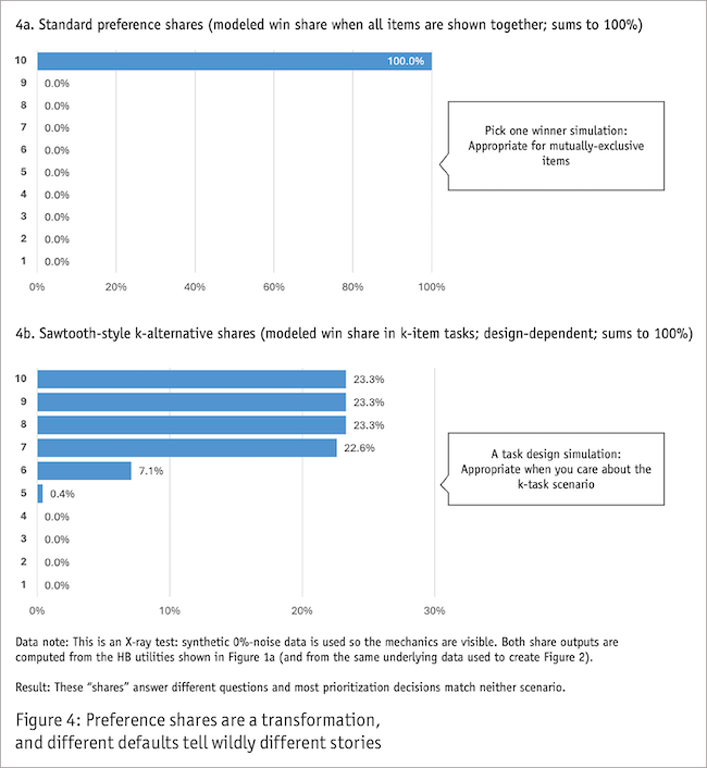
Moving from reflex to deliberate choice
MaxDiff is a useful tool when it solves a real problem: extracting a win-tendency signal from long lists without forcing respondents to do a difficult full ranking. But MaxDiff itself is time-consuming. And it is not a measurement tool for value intensity. And it is not uniquely capable of producing the “who wins” signal teams actually use in practice.
It needn't be the default. We should always ask: What is the simplest method that gives us the answer we need? Then use MaxDiff when it’s truly the simplest honest choice.
References
Chapman, C., and Rodden, K. (2023). “MaxDiff: Prioritizing features and user needs.” In “Quantitative User Experience Research: Informing Product Decisions By Understanding Users At Scale” (pp. 185-234). Apress.
Displayr (n.d.). Counts analysis of MaxDiff data. Displayr documentation. Retrieved January 6, 2026, from https://docs.displayr.com/wiki/Counts_Analysis_of_MaxDiff_Data
Orme, B. (2018, July 1). “How good is best-worst scaling?” Quirk’s. https://www.quirks.com/articles/how-good-is-best-worst-scaling
Quantilope (n.d.). “MaxDiff explained.” Retrieved January 6, 2026, from https://www.quantilope.com/resources/maxdiff-explained-how-the-advanced-method-works-non-research-examples
Raynor, L. (2025, November 4). “Testing what works: MaxDiff and dynamic message bundling.” Quirk’s. https://www.quirks.com/articles/testing-what-works-maxdiff-and-dynamic-message-bundling
Sawtooth Software (n.d.-a). MaxDiff scores. Sawtooth Software Discover Help. Retrieved January 6, 2026, from https://sawtoothsoftware.com/help/discover/analysis/maxdiff/maxdiff-scores
Sawtooth Software (n.d.-b). Standard rescaling methods. Sawtooth Software Help. Retrieved January 6, 2026, from https://sawtoothsoftware.com/help/maxdiff-analyzer/manual/standard-rescaling-methods.html
SurveyKing (n.d.). MaxDiff analysis: Guidance, examples, tools. Retrieved January 6, 2026, from https://www.surveyking.com/help/max-diff-analysis